
The Wikipedia app has long offered widgets, but they haven’t been refreshed in quite a while and look like something from the early days of Android. An update today greatly modernizes the design.
“Wikipedia search” features a logo at the left and a proper pill-shaped field at the right. It has a nice 2×1 configuration that stretches to 5×1. You can shrink it to 1×1, but there are some visual errors. Tapping opens search and your keyboard.
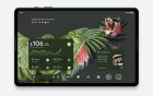
Then there’s “Wikipedia featured page” that shows the article title, a brief description, and accompanying image. You can make it taller, but it won’t show any more information.
These widgets have a light and dark theme after previously only supporting the former.


Version 2.7.50475-r-2024-03-06 with the updated Android widgets is widely rolling out via the Play Store, while Wikipedia also offers a separate Beta release.
Wikipedia for Android was updated earlier with a Material You bottom bar that uses pill-shaped tab indicators, though it’s ever so slightly shorter than the tall version used by Google apps. There’s no Dynamic Color theming, but link previews make use of rounded sheets. A Themed icon is also available.
Meanwhile, the app has a tab switcher UI for articles that is straight from Chrome. It uses the pre-grid layout for a nice dose of browser nostalgia.
FTC: We use income earning auto affiliate links. More.

Comments