The last big design change to Contacts for Android removed the navigation drawer, and Google is now either replacing the FAB or putting it everywhere.
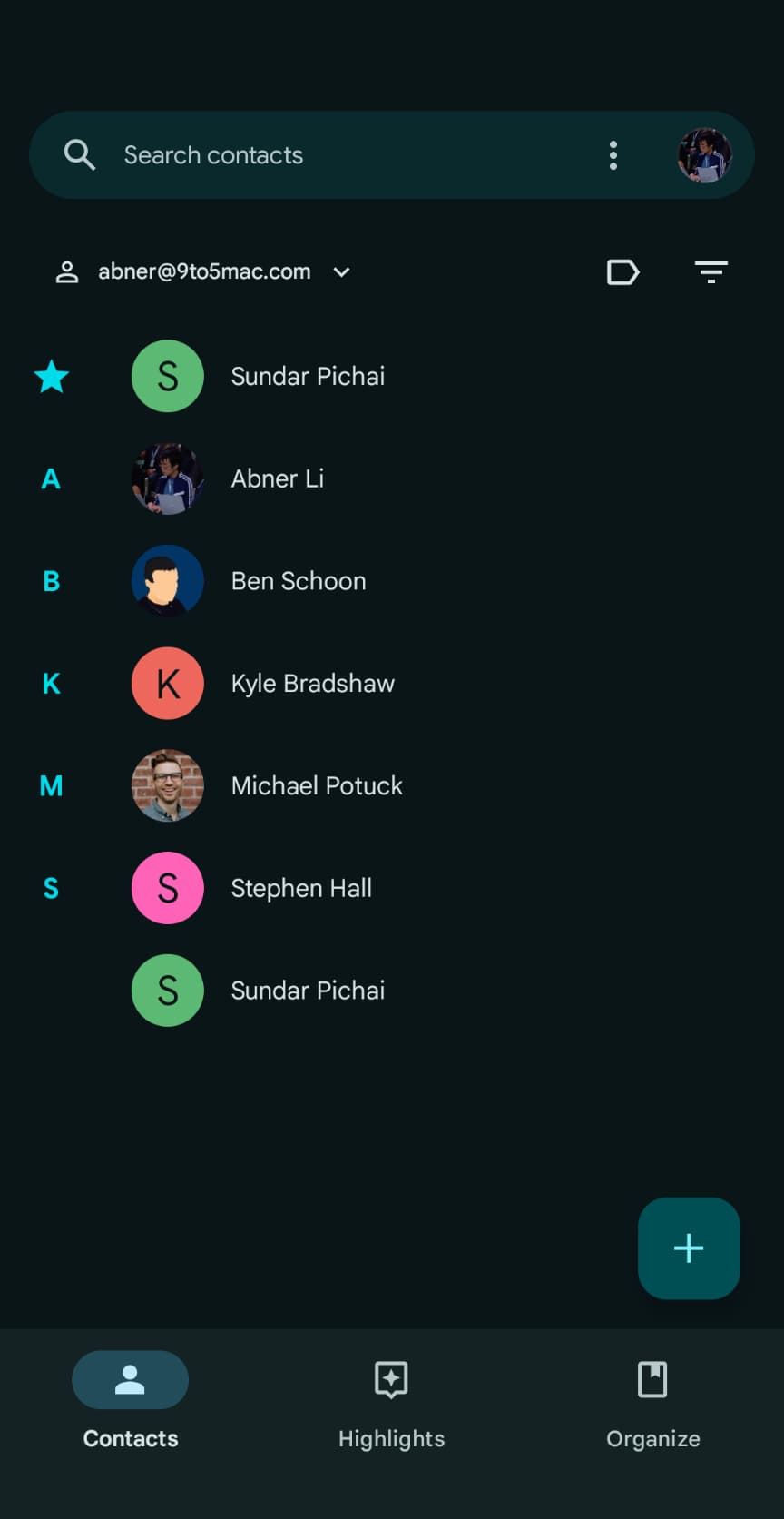
Instead of a floating action button for adding contacts, Google is now using a ‘plus’ sign in the top-right corner. It appears to the left of your profile avatar, which is no longer part of the search field.
This plus button appears across all three tabs compared to the FAB, which was only available in the main contacts list. The “Organize” revamp in April made it so that a search field appears across all three screens.


The change looks like the Play Store, which is in the process of moving search to the bottom bar.
The search bar does not really need to span the entire width of your screen as it’s already a large enough touch target.
However, for familiarity’s sake, dropping the FAB and widely accepted way to add content, is somewhat of a curious move.
This FAB removal is rolling out with version 4.31 of Google Contacts for Android. We’re only seeing it on one of our devices today.
Update: On another device, we’re seeing a design where the FAB has been added to the “Highlights” and “Organize” tabs.


More on Google Contacts:
- Google Contacts will make it easier and faster to add a new contact [Gallery]
- Google Contacts rolling out ‘Organize’ tab to replace ‘Fix & manage’
- Google Contacts is making it way easier to set custom contact ringtones on Android
FTC: We use income earning auto affiliate links. More.
Comments