After a fairly successful first Android 12 Developer Preview launch, Preview 2 is now rolling out for those that have enrolled on the developer-facing builds of the next OS iteration, and we’ve been delving into the top new user-facing features.
Much of what has been added will undoubtedly develop over the next six or so months as the Developer Preview evolves into a truly user-facing Beta phase just a few months out from the full Android 12 release. This is still only the second Developer Preview, which means we’re in phase 2 of potentially 7 builds. If you were expecting something fully formed, then we’d suggest waiting a little longer.
But some of you might be excited to sideload this particular Android 12 taster session and try out some brand new features. As we always warn, we DO NOT recommend doing so; as we have mentioned, this is not really meant as a user-facing build. Like almost every preview before it, it’s also still currently full of bugs and random issues that make it hard to recommend on your main smartphone. Open betas will come later down the line with added stability, and hopefully, a ton of extra features slapped on top.
Summary
Video — Android 12 Developer Preview 2 hands-on: Top new features!
Subscribe to 9to5Google on YouTube for more videos
Picture-in-picture mode tweaks
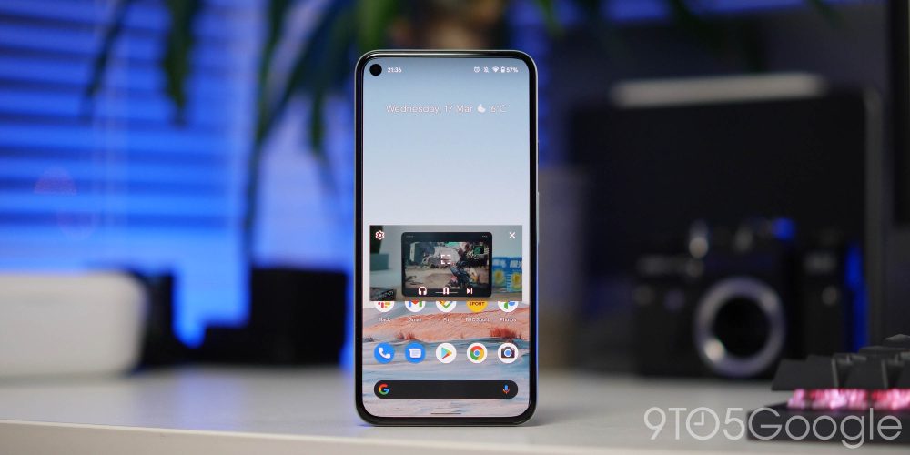
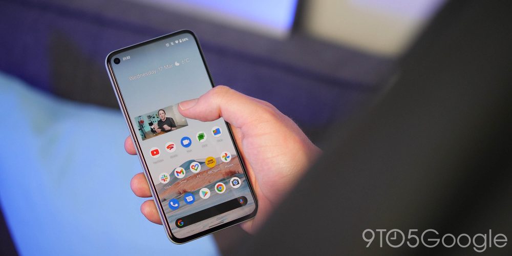
The Picture-in-picture mode experience on Android has needed some work for a little while. With the Android 12 Developer Preview 2, we’re getting some enhancements to usability and a few extra controls.
You can “stash” a picture-in-picture window to the left or right side of your screen if you need or want to focus on another app or webpage. This even works for those without YouTube Premium – at least in this Developer Preview – meaning you can listen to video content while doing other things.
A single-tap of the window shows playback controls like play/pause, skip, and more. Double-tapping the window switches back and forth between a small window size and a larger one. Or if you’re looking for more refined window size controls, you can now use pinch-to-zoom to resize the window.
More Media player UI tweaks
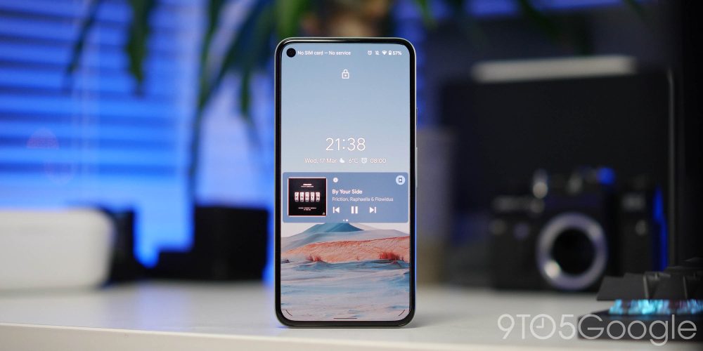
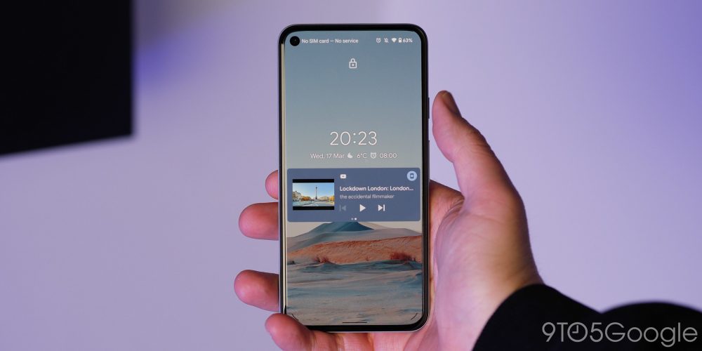
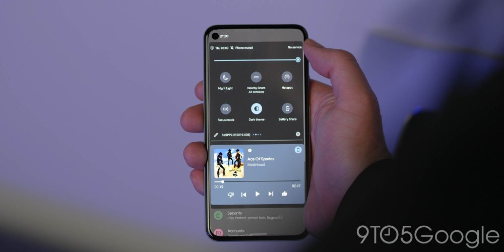
We saw the media player UI get a fairly big change in Android 12 DP1, but in Developer Preview 2, there is one notable new tweak. When selecting an accent color for your device theme within the “Styles & wallpapers” section, the media player will adorn the same background tone.
It does make the biggest difference on the lockscreen, as previously the media player would adopt a background color determined by the album art of any currently playing music. Now it’s far more prominent and might factor into your wider theming choices.
Widgets UI redesign
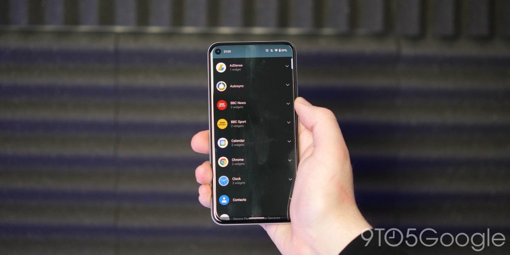
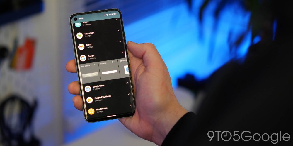
We do hope that widgets become a wider focus point in Android 12, but Developer Preview 2 now organizes the quick access section somewhat. When you want to add a widget to your Pixel homescreen, the new page is far more compact, with collapsible sections with a count for the number of widgets available from an app. It’s a fairly minor change but does help tidy things up.
Lockscreen PIN and Pattern tweaks
Your Pixel lockscreen is getting some attention in the Android 12 Developer Preview 2, with some fairly minor tweaks to the formula that we have become accustomed to.
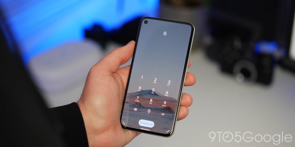
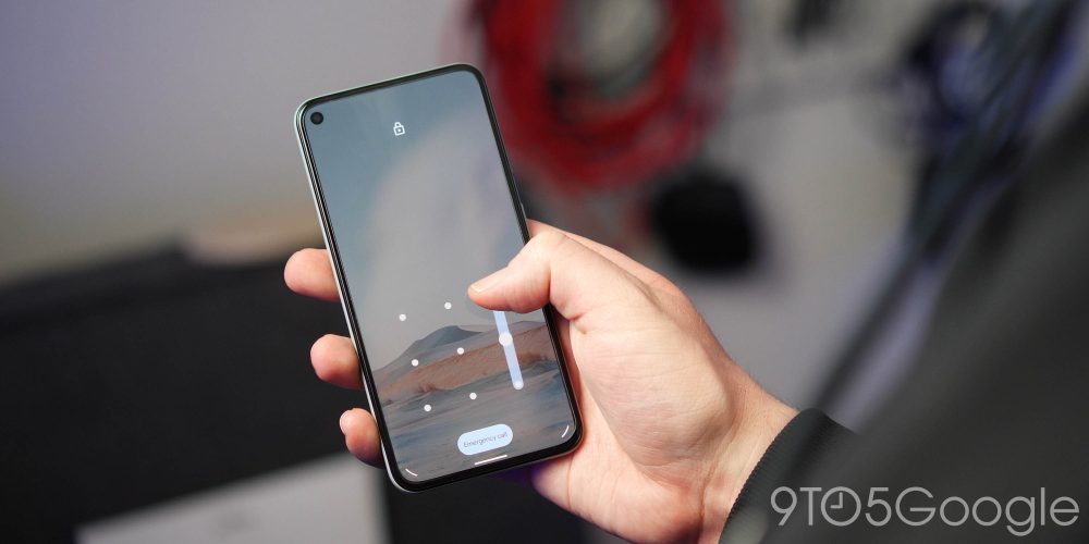
When using a PIN, the line that separates the keypad is no longer there, while the enter key stops using a blue button in favor of a cleaner line icon. Instead, the “Emergency call” pill is now a shade of blue and is now more prominent by being filled in.
If you use a unique pattern rather than a PIN, the major change here is that the trail line is now much thicker, which might make it easier to decipher what path you have taken.
One-handed mode
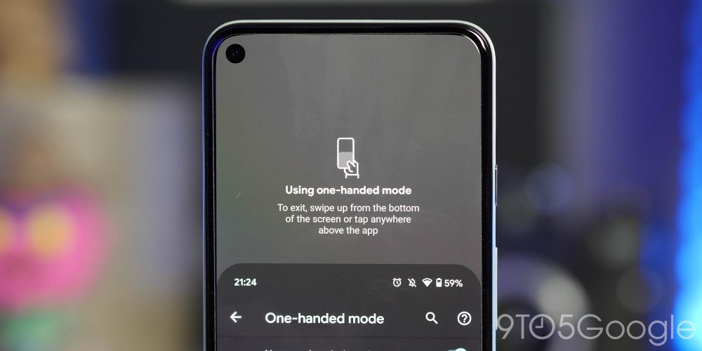
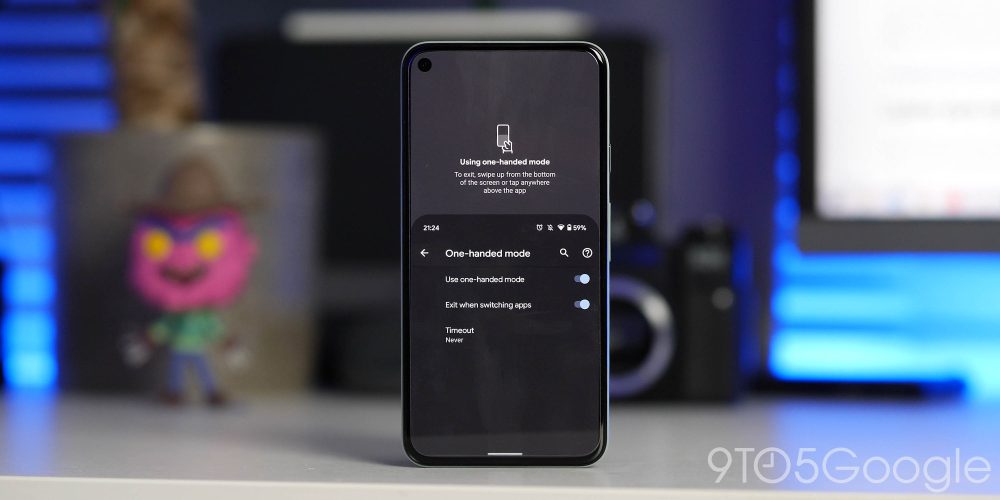
The one-handed mode that was technically available in Android 12 Developer Preview 1 is now live and fully usable in Preview 2. Under the “Gestures” section of the Pixel’s settings menu, Android 12 DP2 adds the “One-Handed mode” option, which is triggered by swiping down on the very bottom of the display. This gesture turned off by default on several of our test devices.
If you were unaware, it works a lot like Reachability in iOS. There are three menu options to adjust, you can toggle the one-handed mode on or off, disable when switching between applications, and set a timeout option in 4-, 8-, or 12-second increments.
Lighter dark theme (potentially a negative)
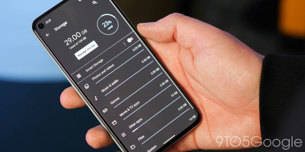
The first Developer Preview hinted that Google had plans to tweak the dark them in Android 12. Developer Preview 2 goes a step further by actively adjusting the entire system dark theme – and maybe not for the better.
Many people often prefer an AMOLED dark theme, which can have battery benefits. With this latest Developer Preview update, Google has changed the color from pure black to a darker gray shade. Sure, it’s more cohesive across the entire OS, but it really is an acquired taste. We do hope that an option to toggle AMOLED dark does come at some point, as we can foresee this change bet met with outright hatred.
Another change to the dark theme or potential bug sees the Wi-Fi sharing option now always appears in light mode, even if you have the system-wide dark theme enabled constantly. It’s likely to help make QR codes easier to scan, but to be honest, it’s anyone’s guess, but it’s something to note if you do update.
Android 12 Developer Preview 2: What is your favorite new feature?

There are more than just surface-level changes in the Android 12 Developer Preview 2, making this fairly small selection the likely tip of the iceberg. With that said these are the most prominent user-facing features that we’ve found after delving in. Naturally, we expect to see more little things that might slip through the cracks over the coming days and weeks. We have a deeper dive into everything that has been added, including some features that require a little work to get fully operational in our full overview.
What is your favorite new feature or features? Let us know down in the comments section below!
More on Android 12:
FTC: We use income earning auto affiliate links. More.


Comments