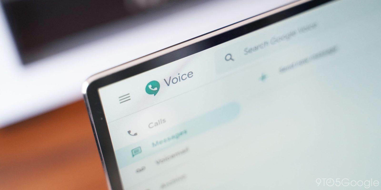
Following Voice for Android adopting a Material Theme account switcher, the Google Voice web app is gaining three usability updates. These changes are particularly catered towards enterprise G Suite customers.
It’s important for a telephony system to be quick and intuitive to use. These improvements will make it simpler to use Google Voice, so users spend less time navigating the product interface and more time communicating through it.
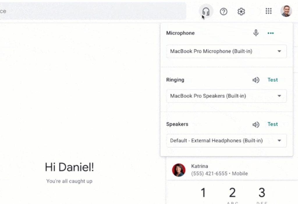
Google Voice on the web now features an “always visible call panel.” Your screen is divided into four columns, starting with the compact navigation rail, list of calls/texts/voicemail, conversation body, and the new shortcut.
“Call as” lists your active Voice number and contact suggestions appear underneath. A number pad is at the bottom, though it can be hidden. Google wants to make it easy to place and control a call regardless of what other parts of the app you’re interacting with.
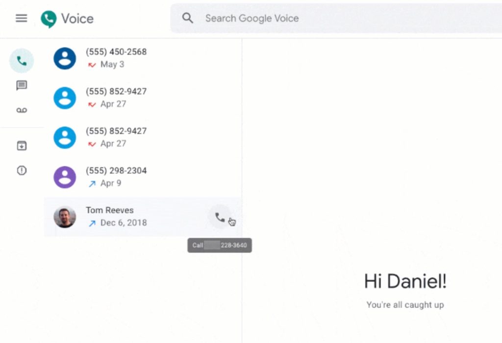
In a similar vein, a new quick call option appears when you hover over a contact in the call list. The last addition is a headset icon in the app bar to the right of search. “Common audio settings” available here include microphone, ringing, and speaker menus, with the ability to test each one before a call.
These new features are very much catered towards enterprise users where calling is a primary task. It’s available to all G Suite editions with Voice licenses, as well as free user accounts. The Google Voice web updates begin rolling out today and will be widely available in the coming weeks.
More about Google Voice:
- Google Voice 2019.26 adds Material Theme avatars, preps ‘Driving Mode’ [APK Insight]
- Google Voice for Android regains unread message, call count in bottom bar
- Android Auto now supports Google Voice messages w/ proper playback, replies
FTC: We use income earning auto affiliate links. More.


Comments