Last year with the release of Android 12, Google completely overhauled the world’s biggest mobile OS. The huge addition of Material You coincided with the launch of reimagined Pixel series. Almost a year on, Android 13 is here for Pixel phones and, while not a drastic update, contains a ton of new user-facing features and functions that you need to know.
Our goal with each and every OS update is to cover as many of the new features that get slowly introduced and refined over the Developer Preview phase and the public-facing Beta program.
If you’ve already been updating your own Pixel from the very first beta or even during the early developer-focused previews, then, sadly, there likely won’t be any surprises right out of the gate. Even so, there may be some tweaks and enhancements you simply weren’t aware of or haven’t even used yet.
Some additions have been concurrently tested throughout the confusing QPR3 Beta phase. In many cases, we’ve omitted any of these additions because, while they may have appeared in Android 13, they have since gone live in the most recent stable Android 12 builds.
Navigate this guide
- Video — Hands-on with every MAJOR new change and feature in Android 13!
- UI changes
- New pop-up permissions panel
- Overflow lock screen notifications housed in shorter pill
- Vibration settings screen redesign with additional options
- Combined Display size and text menu
- Dark Theme in Color and Motion settings
- Increased “Basic color” within Wallpapers & style section
- Media player squiggles for previously played media
- New fingerprint unlocked set-up UI on Pixel 6 series
- Tweaked Pixel Tips app
- Adjusted Swipe unlock registration and entry
- Brand-new photo picker
- Combined Security & privacy menu
- Redesigned Screen saver menu
- Usability changes
- Pixel Launcher supports multiple layouts
- Taskbar adds 6-icon slots
- Taskbar for tablets & big screens gains app drawer button
- Disable hold Home for Assistant with 3-button navigation
- New QS tiles to turn off One-handed mode and access QR code reader
- Power menu and Settings shortcut improved reachability in Quick Settings panel
- Redesigned Now Playing media notification
- Notification permission pop-up on first app launch
- Per-app language controls
- Stylus handwriting option in Developer Options
- Copy/clipboard bottom left notification
- Smart home tech controls available when device locked
- Battery saver minimum raised to 10%
- Ability to pause app activity if unused
- Tweaked Pixel Launcher homescreen drop targets
- Quick Tap includes flashlight toggle option
- Pixel Launcher app drawer search improvements
- Focus mode ranks apps by most distracting on first setup
- Predictive back animations
- High battery usage notification in Settings section
- Cosmetic changes
- Custom device profile pictures
- Minor size adjustments to two-line lock screen clock
- Device controls QS tile renamed “Home”
- Updated Home icon on lock screen
- New “Hold Home for Assistant” animation in Settings
- Tweaks to PIN entry screen
- Material You revamped Cast picker pop-up
- Tiramisu Android System icon
- Pulsating homescreen unlock animation
- Pill-shaped buttons within Settings
- Wider and thicker Gesture navigation bar
- Updated Google Lens icon in Pixel Launcher search widget
- Improved animation easing and smoothing
- Themed icon shortcuts for Chrome webpages on homescreen
- App widget minor spacing changes
- Smaller pop-up card/windows when in landscape mode
- 6×5 grid in Pixel Launcher when in tablet mode
- Android 13 easter egg
- What is your favorite new addition or feature within Android 13?
Video — Hands-on with every MAJOR new change and feature in Android 13!
For more video content, subscribe to 9to5Google on YouTube.
To help you navigate the extensive tuning and features added in Android 13, refer to our fully categorized guide with sections covering the three core user-facing bases including UI changes, cosmetic alterations, and direct usability functions.
For the purposes of the average person using a Pixel (or another Android phone), then this is likely the most comprehensive and extensive reference for Android 13 you’ll find online. Here’s every new feature and function in Android 13 that you need to know:
UI changes
Core user interface changes are part and parcel of any Android update as things get tweaked and tuned to help improve the cohesion of specific sections and subsections. All UI changes relate to commonly used areas within Android 13 with changes over the previous Android 12/12L builds noted.
New pop-up permissions panel
When launching an app for the first time after updating to Android 13, you may see a slightly altered permissions panel with more rounded corners. In addition, rather than giving access to “Files and media,” you enable access to “Photos & videos” or “Music & audio,” depending upon which files an app requires access to.
This also includes more colorful and obvious buttons within the floating pop-up. The “Allow” and “Don’t allow” buttons will adhere to Dynamic Color settings and your system theming.
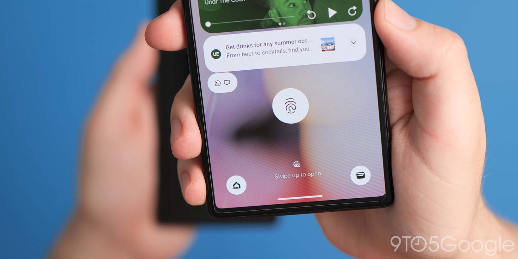
Overflow lock screen notifications housed in shorter pill
On the lock screen, if you have multiple unread notifications you may see truncated alerts to help reduce information overload. A shorter pill will show with line-style app icon housed within. Tapping, opening or dismissing any notifications will make space and remove the smaller pills.
Vibration settings screen redesign with additional options
The vibration menu within Android 13 now contains more options and new “Calls,” “Notifications and alarms,” and “Interactive haptics” headings helping to direct you to the controls that you need. That’s not all as you can manually adjust the strength of vibration feedback for each notification type to suit you best.
To adjust how your phone reacts to notifications and alarms. A new toggle lets your phone vibrate before initially a ringtone kicks in if you do not answer right away. This relies on sound being enabled on your device.
You are now able to disable alarm vibrations from this menu and even enable interactive media vibration. This mimics a similar function found on many devices where haptics are used in conjunction with audio to enhance media viewing but is available in a limited capacity.
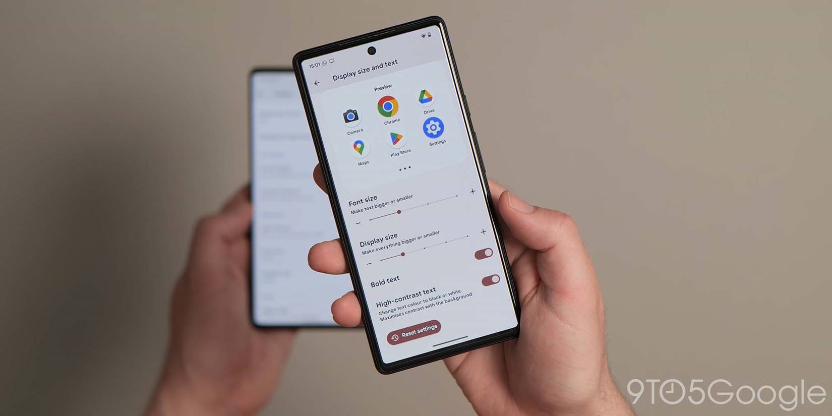
Combined Display size and text menu
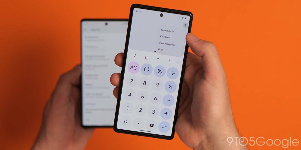
A new menu combines the Display size and related text adjustments into one easy-to-manage panel for all things related to screen scaling, text size, and style. This eliminates the two-section approach used in Android 12 and older for increased ease.
Dark Theme in Color and Motion settings
Within the Color and Motion settings section, there is a new toggle to quickly enable or disable Dark theme scheduling and more while adjusting other visual and display options.
Increased “Basic color” within Wallpapers & style section
Google has increased the volume of colors available within the “Basic colors” section in the Wallpaper & style app. This now includes 16 options with at least seven single tones along with a further nine dual tone options to apply alongside the wallpaper-based Dynamic Color options.
Media player squiggles for previously played media
As part of yet another media player overhaul, when playing media in music, podcast, and selected video streaming apps, the playback progress bar will display a squiggly line to the left of the playback head indicate how much media has been played.
Anything unplayed is visible as a thin solid line to the right of the playback head. Visually this makes it easy to see at a glance just how much of a song, podcast, or even video that you have completed. This change is visible from the lock screen and Quick Settings media player.
New fingerprint unlocked set-up UI on Pixel 6 series
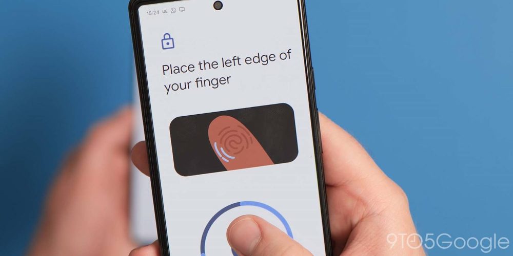
Although spotted with the launch of the Pixel 6a running Android 12.1, when registering a fingerprint on Pixel 6 series handsets, a new enrollment setup interface is now present.
An animated GIF shows which areas of your finger or thumb to place on the optical scanner throughout the process. This helps ensure more accurate registration with heat zones shown to help get a full coverage.
Tweaked Pixel Tips app
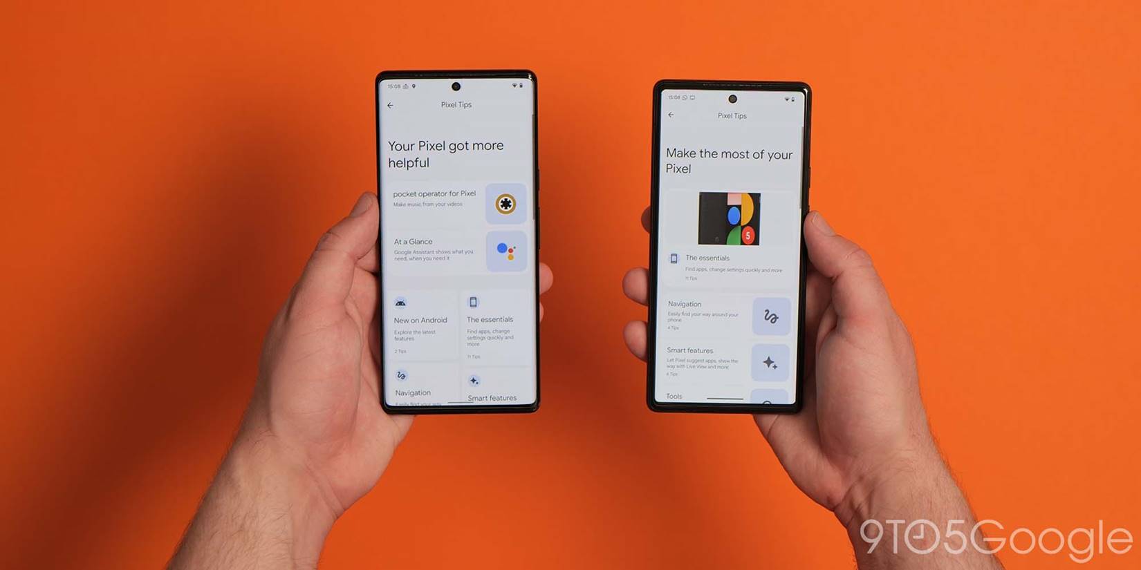
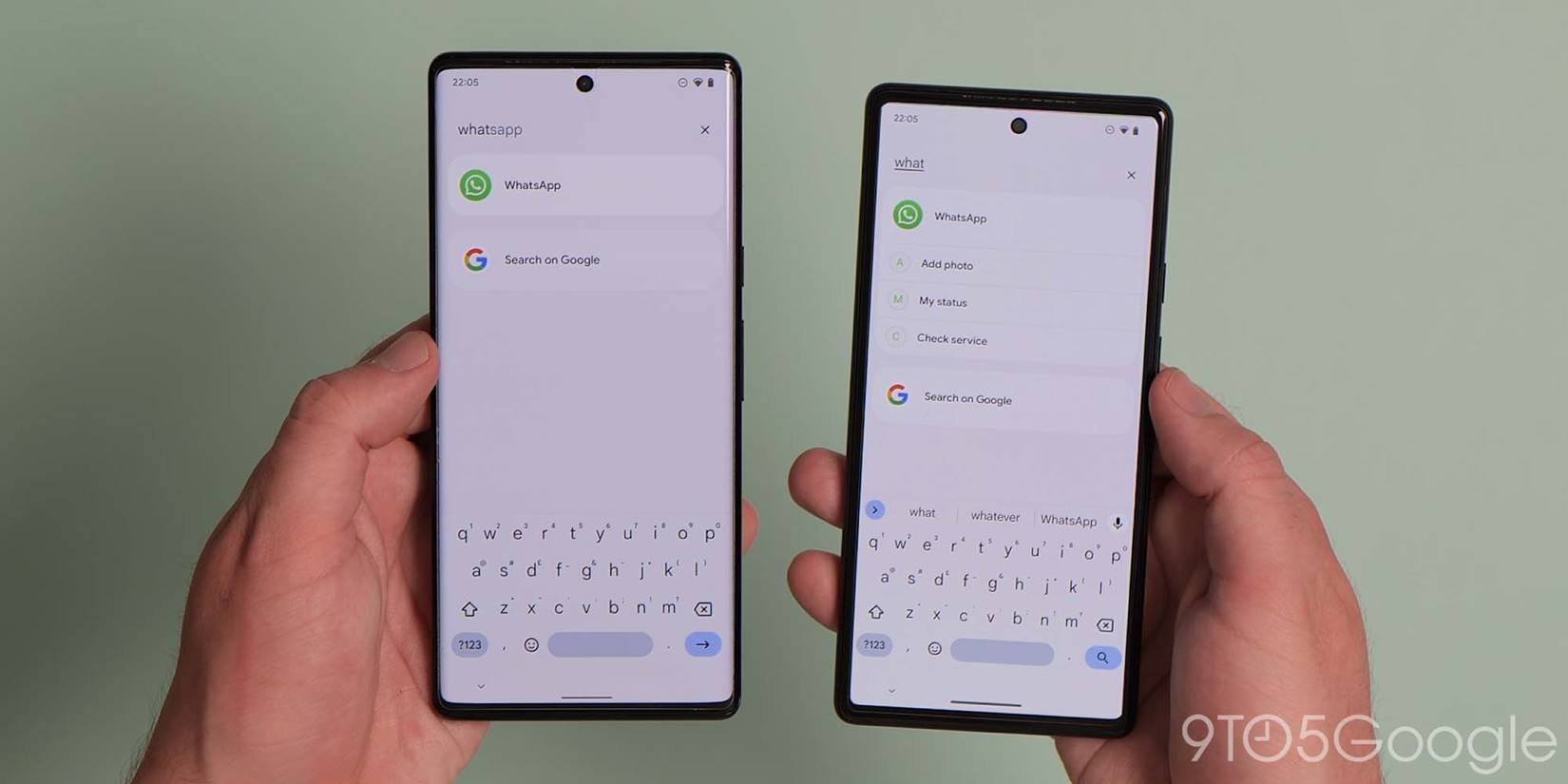
The Pixel Tips app layout has been altered with larger tiles and more prominent device or OS highlights at the top of the homepage. All features and functions remain identical to previous updates.
Adjusted Swipe unlock registration and entry
If you prefer to use a pattern for your device screen lock method, then the registration process has altered. The pattern drawing tool is now more spacious with a slower trail when swipe patterns are visible within the deeper security setting. This makes it easier to see where you have swiped from and ensure a more accurate entry.
Brand-new photo picker
Android 13 features a brand-new photo picker that is streamlined and more privacy-conscious as apps and services no longer need access to all of your on-device media. Instead, you can select a small pool of photos and videos to give access.
Combined Security & privacy menu
After introducing Security hub to Android 12, the latest release is adding a combined “Security & privacy” menu that fuses on-device and account settings. It features color-coded safety status indicators and prompts to remove apps deemed insecure or potentially harmful. Upon launch it’s not yet visible, but will come later in the year. Google has not specified just yet but it was noted and shown off during the IO 2022 keynote.
Redesigned Screen saver menu
The Screen saver menu has been updated with options no longer hidden in sub-menus. The “Start now” option is now renamed to “Preview.” While selecting options lets you access customization settings.
Usability changes
Some alterations are aimed specifically at device usability with a focus upon enhancing the daily experience. This can even include new functions but relates primarily to how we use Android 13. In this section you’ll find all of the core changes related to usability within Google’s latest Pixel update.
Pixel Launcher supports multiple layouts
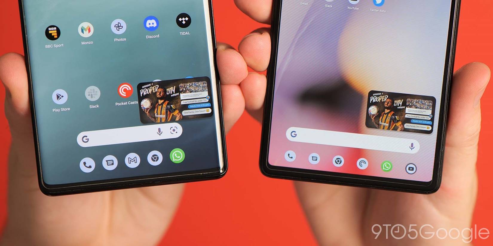
Likely in preparation for the upcoming Pixel Tablet, the Pixel Launcher now supports multiple saved layouts when in portrait or landscape mode. Ideally suited to devices with bigger screens, this doesn’t quite mimic the iOS feature seen on iPads, but it does mean that apps and widgets will appear in different locations depending on how you customize within each orientation.
Taskbar adds 6-icon slots
While the app taskbar was introduced for screens later than 600dpi in Android 12L, Android 13 now features an extra slot for quick app access. App suggestions will appear here if you do not choose up to six apps.
Taskbar for tablets & big screens gains app drawer button
Google has not only added a further app slot for the taskbar on larger displays, there is now a persistent app drawer button that removes the need to swipe up, therefore, accessing all on-device applications.
Disable hold Home for Assistant with 3-button navigation
If you prefer the classic three-button navigation method, you’re able to disable the long-press of the circular home button when invoking or activating the Google Assistant. It’s important to note that if you disable this option, the corner-swipe to invoke the Assistant is not available when using on-screen buttons.
New QS tiles to turn off One-handed mode and access QR code reader
There are two new system Quick Settings tiles to access and activate modes quickly in Android 13. You can add a dedicated One-handed mode toggle to activate or deactivate the swipe-down gesture to enter the Reachability mode.
A Google Lens-powered QR code reader is also now available. This lets you quickly launch into Lens and scan QR codes from any screen within Android 13. Scanning is very quick and lets you copy text, open webpages, and much more.
Power menu and Settings shortcut improved reachability in Quick Settings panel
To help access, Android 13 features Power menu and Settings shortcut access buttons have moved to the very bottom-right of the Quick Settings panel. This means that you do not need to stretch up to access two important areas and this also has the benefit of cleaning up the main notification panel.
Redesigned Now Playing media notification
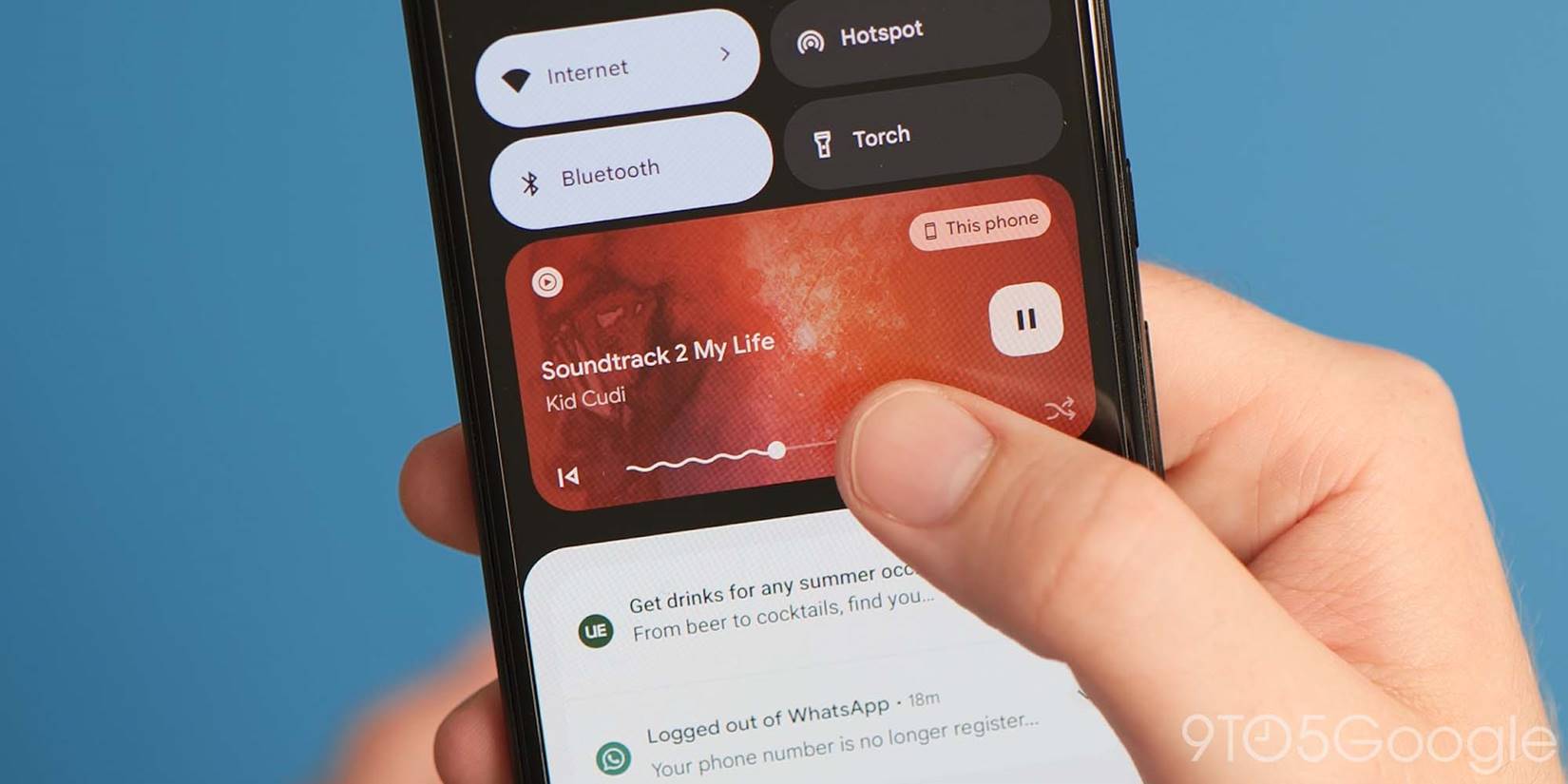
The notification and lock screen Now Playing media notification pane has gained a substantial overhaul in Android 13 with changes to almost all aspects. The new UI also shuffles up the design as a whole with a dedicated play/pause button off to the right, skip and back controls along the bottom row with the track scrubber in between, and shuffle and like buttons present for Spotify.
Album art has also returned, but in a throwback move, this envelops and themes the entire mini player to show exactly what you’re listening to at any point in time. The playback progress bar is also more prominent with the “squiggles” showing just how much has been completed.
Notification permission pop-up on first app launch
When launching apps for the first time or after an extended period without usage, you’ll get a pop-up panel to confirm that you want to “allow” incoming notifications. This ensures that only the apps you want to send pings will be able to do so and is part of even greater privacy controls within Android 13.
Per-app language controls
Google is making it easier for bilingual Android 13 users to set apps to their preferred language without adjusting the system-wide locale or language with an enhanced per-app language option. This feature allows you to dive into Settings and if an application supports multiple languages or dialects, set it to another default upon launch.
Stylus handwriting option in Developer Options
Within the Developer Options section, there is a new toggle to enable Stylus handwriting support. This means that palm and stylus touches are registered completely separately. It also hints that we might see stylus support for the upcoming Pixel Tablet later in 2023.
Copy/clipboard bottom left notification
When you copy any text or images to your clipboard in Android 13, you’ll get a bottom-left overlay showing a preview of what has been captured. In the case of text, you’re shown an enlarged preview of what you copied along with an edit button. As you’d expect, this opens up a very simple text editor view where you can tweak the text. This can be helpful for removing unwanted parts of URLs that you’ve copied, such as stripping Twitter’s share identifiers.
Smart home tech controls available when device locked
To help you quickly control any of your connected smart home devices, Google has introduced a new toggle simply titled “Control from locked device.” This option, which is off by default, allows control of “external devices” without unlocking your phone, and therefore does not require a passcode or PIN to access and control. This doesn’t work for all devices that may require an external app to communicate and control via the Google Assistant or Google Home.
Battery saver minimum raised to 10%
If you have automatic Battery saver mode enabled when your battery hits a specific percentage, the minimum limit has been raised from 5% to 10%.
Ability to pause app activity if unused
You may notice a new section within the Quick Settings panel that will show any Active apps. These are listed as apps that are running in the background even without user input. Expanding the Quick Settings panel fully and tapping the Active apps section will show just what apps are running. These can be fully stopped to help improve device performance and battery longevity as required. However, some may be required for ideal functionality.
Tweaked Pixel Launcher homescreen drop targets
When moving widgets and apps around your homescreen pages, the drop targets at the upper portion of the display have been adjusted. When moving an app or app icon, the “Remove” and “Uninstall” options are now closer together.
Quick Tap includes flashlight toggle option
If you have a Pixel 5 or newer, the back panel Quick Tap gesture is gaining a much needed option to quickly toggle the flashlight. This will save time and means you do not need to access the QS tiles or unlock your device to enable the function.
Pixel Launcher app drawer search improvements
The Pixel Launcher app drawer search bar can now show app shortcuts as well as some selected in-app content. Direct web searches powered by the Google app are also available with app-specific searches now joining the app drawer widget.
Focus mode ranks apps by most distracting on first setup
If you have not yet set up Focus Mode within the Digital Wellbeing settings, upon first launching or creating a new schedule, Android 13 ranks or lists which apps are “Your distracting apps” or most used and makes it easier to set up quickly.
Predictive back animations
The back gesture is fairly uniform in Android, in that it will go back one screen each time the motion is used. Android 13 features, a new predictive back animation will show you just where you’ll be taken after holding the back or edge screen gesture. This makes it easier to determine just what page or screen you are heading back toward.
High battery usage notification in Settings section
If you have apps that are actively drawing more power or using more battery, then you may see a pop-up from within the Battery settings pane that will inform you of this. Tapping will show just what applications are draining the internal cell the most and the notice indicates that you “may run out sooner than” the battery normally would. There is no option to force stop or disable these apps, meaning you’ll need to manually adjust this.
Cosmetic changes
Android 13 includes a number of features, but there are plenty of visual or cosmetic alterations to better suit some of the upgrades and improvements over last year’s introduction of Material You. Almost all of these changes do not affect the daily experience but enhance how certain features and functions work.
Custom device profile pictures
If you have Guest profiles enabled, you’re now able to add colorful profile icons. Eight generic color presets are available, but you’re able to set custom profile images either via your device camera or from any image saved within your gallery.
Minor size adjustments to two-line lock screen clock
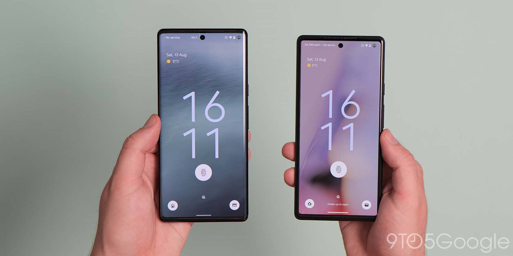
The large two-line clock on the lock screen hasn’t changed drastically, but the text size and gap between the fingerprint icon for devices with in-display scanners has been adjusted by a few pixels to gain a little more space.
Device controls QS tile renamed “Home”
The QS tile for Device controls has now been renamed to “Home” to more closely align with the Google Home application. This also includes a new thicker line-style icon.
Updated Home icon on lock screen
The new bolder Home icon is also now visible on the lock screen when the “Show device controls” option is active within the dedicated Lock screen settings page.
New “Hold Home for Assistant” animation in Settings
A brand-new animation has been added explaining just how the “Hold Home for Assistant” works when the three-button navigation method is active. It shows you how to activate by long-pressing the circular “home” button while using the button navbar.
Tweaks to PIN entry screen
Some minor changes to the lock and PIN entry screen sees the “Emergency call” button renamed to “Emergency.” Key entries are shown just above the keypad rather than toward the upper portion of your display.

Material You revamped Cast picker pop-up
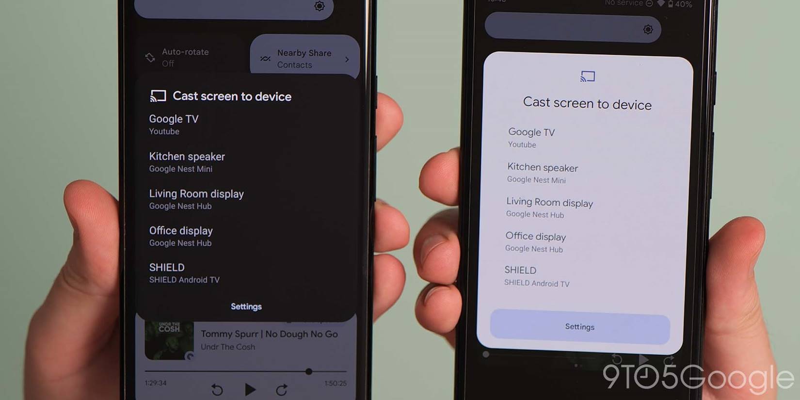
When casting your device display out to a supported Android TV or Chromecast device, there is a new pop-up UI that includes rounded corners and larger more prominent buttons. The entire pop-up is altered with a larger “Settings” button that is themed by Dynamic Color settings. Text is changed to Google Sans Text and space is reduced. A larger “Cast screen to device” header is placed beneath a more prominent Cast line-style logo.
Tiramisu Android System icon
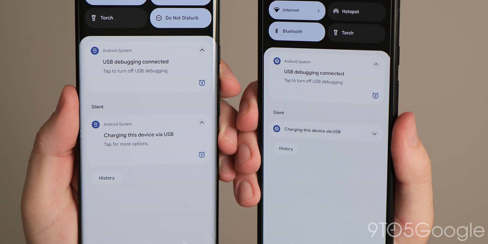
Google has updated and added the new Android 13 or “Tiramisu” system icon. This is visible when plugging into a computer or another device. The new icon is shaped like a gear with the famous Bugdroid atop a squat “T.”
Pulsating homescreen unlock animation
When unlocking using the in-display fingerprint scanner, apps on your homescreen will now pulsate into view or increase in size before being animated into view.
Pill-shaped buttons within Settings
More prominent pill-shaped buttons are being utilized across the OS in Android 13. This is most notable in the Settings menu and associated subsections with rounded, Dynamic Color-powered M3 buttons.
Wider and thicker Gesture navigation bar
Android 13 includes an updated gesture navigation bar, making this the first change since it was introduced with Android 10. The thin gesture navigation bar in Android 12 is getting beefier and subtly bolder in Android 13. This certainly helps make it clearer but has more than a faint whiff of iOS — which has exclusively used gestures on selected handsets since 2017’s iPhone X.
Updated Google Lens icon in Pixel Launcher search widget
To follow changes made to the Google Lens icon back in March 2021, the icon has been updated in the Pixel Launcher search widget. It now resembles a consolidated line-style camera icon in Google’s iconic colors.
Improved animation easing and smoothing
More attention has been paid to animations, easing, and smoothing when switching between applications or even accessing common control tabs.
Themed icon shortcuts for Chrome webpages on homescreen
When adding Chrome or webpage shortcuts to your device homescreen, if you have the “Themed icons” setting enabled, the mini Chrome icon will appear themed as part of the webpage or app shortcut.
App widget minor spacing changes
An almost inconsequential change in Android 13 sees extremely minor adjustments to app widget spacing. With quick options moved by a few pixels.
Smaller pop-up card/windows when in landscape mode
If auto-rotate mode is active, when expanding the Quick Settings panel or receiving pop-up notifications, cards, and windows are now centrally aligned and smaller. These options no longer take up the full-screen width and are easier to manage.
6×5 grid in Pixel Launcher when in tablet mode
A new 6×5 grid is available for larger or tablet-sized device screen when using Pixel Launcher. This only activates when you’re using a device that’s large enough, or you can change the “Smallest width” in Android’s Developer Options to at least 600 dpi. Once enabled, quite a few tweaks happen throughout Pixel Launcher, optimizing it for tablet use.
When held in landscape, the Google Search bar no longer has its own row, but is now tucked away to the left side of the pinned apps in your hot seat. You are also able to add icons or widgets to the At A Glance area.
Android 13 easter egg
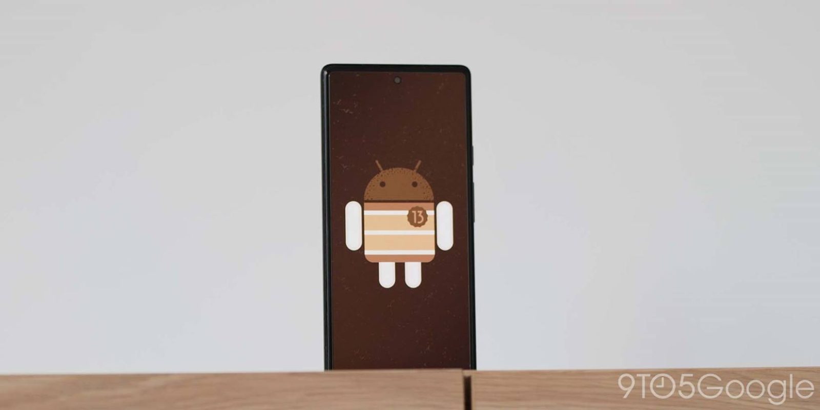
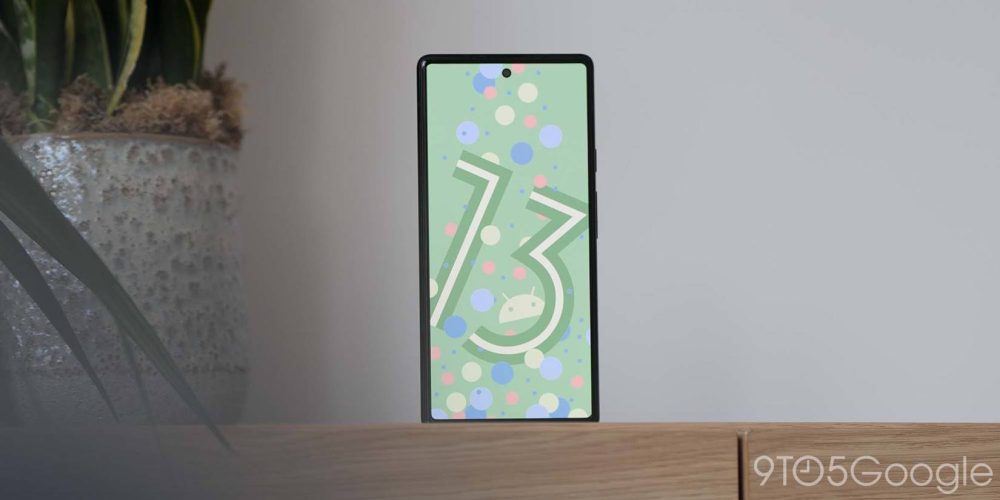
There is always room for an Android easter egg and in Android 13, this is a revision of the Android 12 fun not-so-hidden feature. You can activate by heading to Settings > About phone and tapping the Android version number multiple times until a clock widget appears. Set this to 1 p.m. or 13:00 and a new rosette-style Android 13 logo will appear surrounded by bubbles. Long-pressing the bubbles will switch these themed circles for a random assortment of emoji that can be changed be tapping or holding anywhere on your screen.
What is your favorite new addition or feature within Android 13?
That’s every new “user-facing” feature and change that you’ll likely see or encounter in the full release of Android 13 for Google Pixel phones. As you will likely know, Google’s latest OS release includes a number of under-the-hood improvements and enhancements. However, this is not as feature rich as Android 12 but certainly feels more refined and stable. We’re expecting a slew of OEMs to offer their own take on this build over the coming months including Samsung, Oppo, OnePlus, and many more.
If you haven’t already installed it, we have a handy guide showing you just how to get the latest version on your Pixel here so that you can enjoy all the latest new features as part of this, frankly, massive Android update. It’s also very important to note that due to some bootloader changes if you have a Pixel 6/6a series handset, you will not be able to downgrade back to Android 12. So only install if you are happy to upgrade.
Those of you that have been enrolled in the previous Android 13 Beta program or ran the Developer Previews, and, therefore, know the new features inside out and used them to death, then let us know your favorites down in the comments section below. Even though we’re far off, what would you like to see in Android 14, which is likely to start testing again in early 2023.
FTC: We use income earning auto affiliate links. More.


Comments