In 2019, Google announced a new brand identity for its mobile OS. Almost four years later, Android is updating its logo with a new wordmark and a 3D version of the iconic robot head.
Update 6/30: Following our Monday report, Google is now out with a much better look at the new Android workmark and 3D logo. It released a brief “Android App Safety – Always on protection” video this morning that shows the updated design at the very end.
In this full version (as seen in our cover image above), the ‘A’ is not as tall, which was one complaint that has emerged. Otherwise, the flat top and inner point still feels off compared to the rounded ‘n’ and ‘r.’
Original 6/26: This new wordmark starts with the “A” being capitalized after years of Android opting for something that’s entirely lowercase. This new font sees the ‘n’ and ‘r’ being perfectly rounded, returning to the style of the futuristic 2008 and toned-down 2014 wordmarks.
Meanwhile, the robot head is no longer flat with Google, instead opting for a 3D Android head that does indeed stand out more.
Left: 2008 | Middle: 2019 | Right: 2014
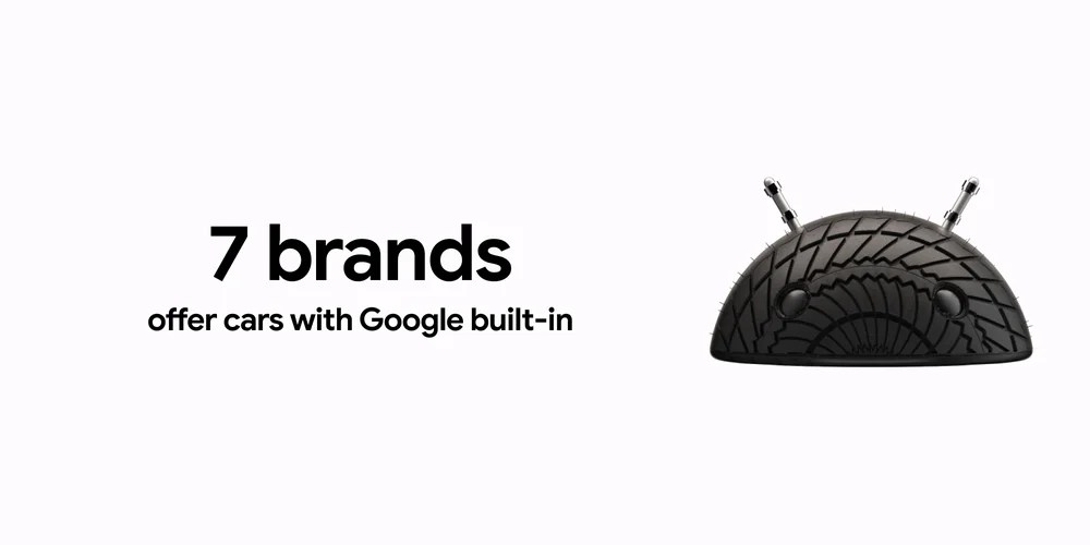
We first started seeing the 3D heads at CES 2023. It was still shown next to the lowercase “android,” while Google generated a number of expressive versions using different materials. For example, a tire was used when talking about Android Auto.
Top comment by Uh_Umm_Eh_What
Why? Most of the logos of Google apps now have no 3Dness and everything is written in Google font. At least the new Android logo seems to have the green color from those other logos, but I liked the previous one better. It doesn't make sense, just like making the roundest UI I've ever seen and starting to make devices with small corners. I've disliked pretty much anything Google does for a while now, not just design. It all feels like a step backwards.
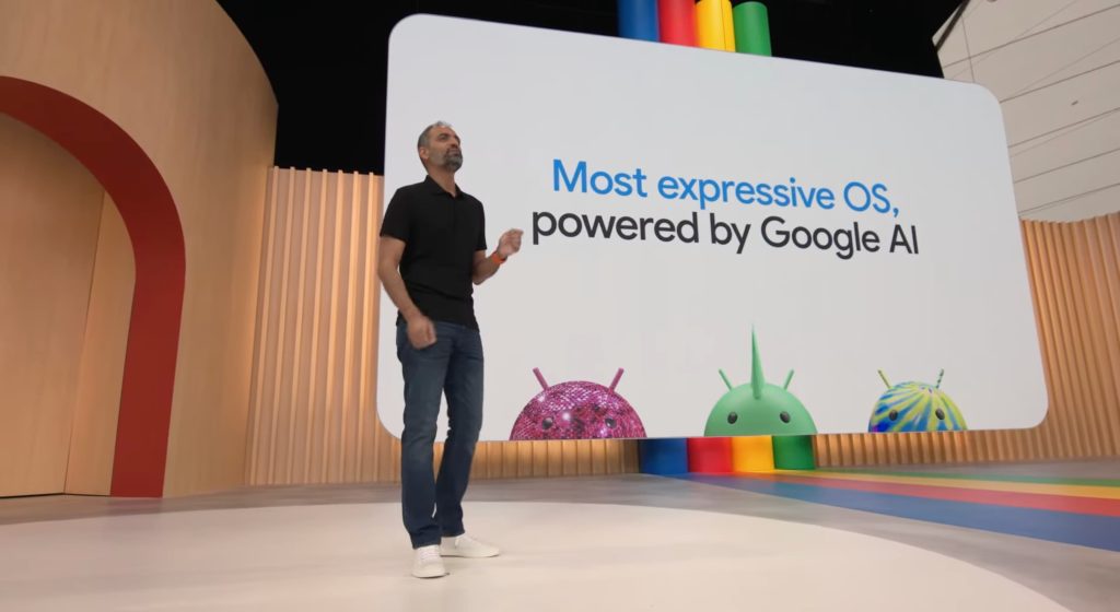
This new figure made another appearance at I/O 2023, with those different designs and materials (e.g., disco ball) coming into play when Google described Android as the “Most expressive OS.”
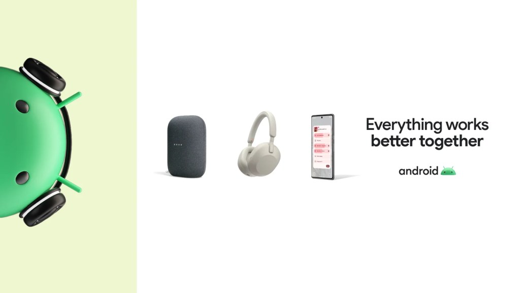
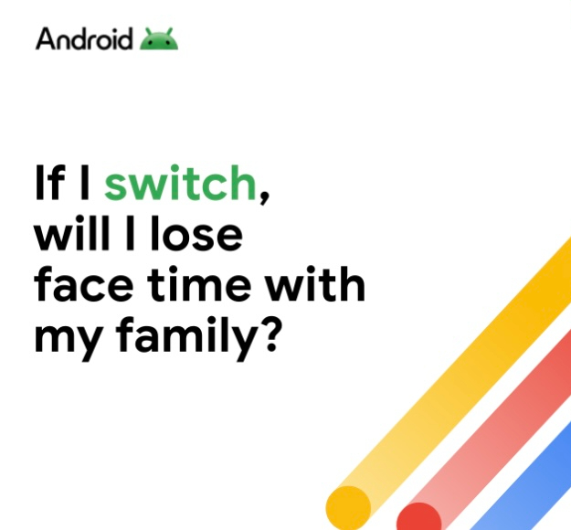
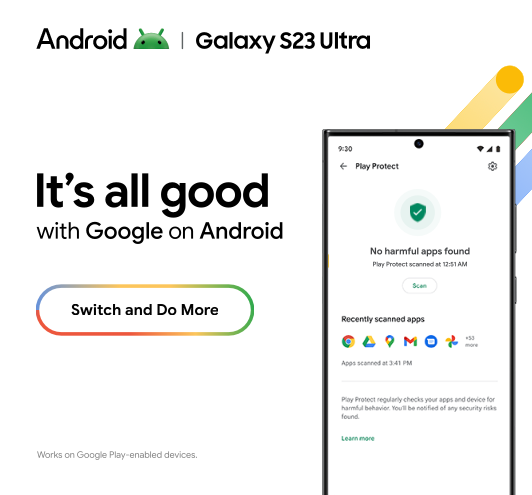
We first saw this updated wordmark and head side-by-side in an ad for Android talking about first-party apps on the Samsung Galaxy S23 Ultra and Flip 4.
Google confirmed the “new brand identity” to us today and said that we’ll hear more about it in the future.
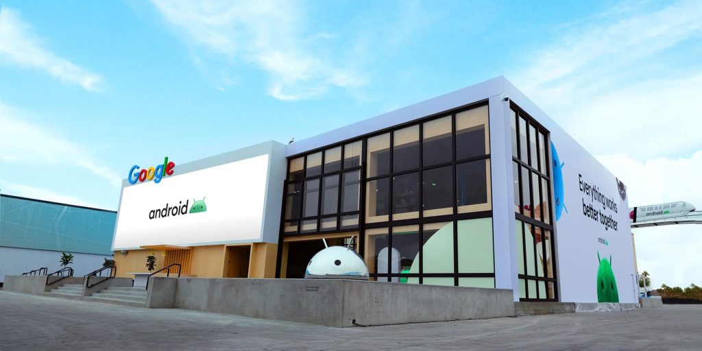
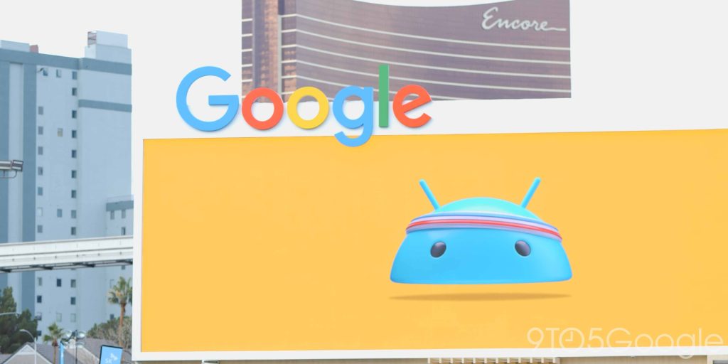
We’re showcasing some elements of our new brand identity on various surfaces, including our CES booth from earlier this year and other campaign materials like digital & banner ads. We’ll have more to share in the coming months.
The new logo will presumably make an appearance on the boot screen for all Android devices. The brand currently appears as “Powered by Android.” It would make sense for Google to launch this update alongside Android 14 later this year.
FTC: We use income earning auto affiliate links. More.

Comments