
homepage

See All Stories

Google shuffles its notification interface around, puts most functionality in Google+ (Updated)

Google has decided to mix up the way it handles Google+ notifications, and you may have noticed the beginning of this shift yesterday afternoon when the design of the normal notification button changed suddenly. Previously a simple bell, the new button has a smaller bell within a circle (see above)…
Expand
Expanding
Close

Google celebrates 15th birthday with new doodle and 1998 homepage

Site default logo image

1998

As Google turns 15, it is celebrating with an animated doodle and an Easter Egg that takes us back to its birth in 1998. Simply google google in 1998 to see the page as it looked then.

The 1998 page is fully-functional, but the time travel doesn’t last long: any search conducted on the page is carried out using today’s index and with the results returned in today’s design … 
Expand
Expanding
Close

Google testing new homepage design, shows off flatter logo, removes black bar

google

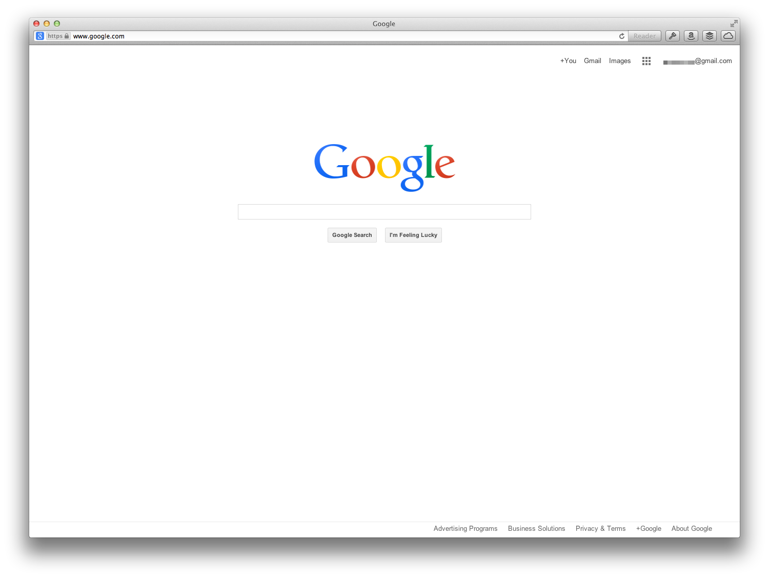
Google is currently split-testing a new Google homepage layout. The redesign is not drastically different to tradition, but Google seems to be testing a different look for its persistent top-bar. As shown, the black strip as well as most of the shortcuts to other Google properties have been removed. In this version, the only shortcuts in the top navigation are links to Google+, Gmail and Google Images.

Notably, this design uses the flatter logo previously seen in the new Chrome for Android beta. At the time, The Verge said a source refuted claims that this is a new logo, saying that the flatter look was only meant for places where the traditional logo would not display well, such as when printed onto banners. However, this homepage redesign shows that Google is at least considering to use this new logo as their main branding in the future.