
Are you a holdout who’s been using the classic Google Drive ever since Google unveiled the new design over a year ago? Unfortunately, it seems that your time to give in has come.
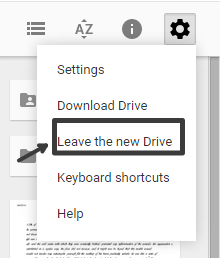
Initially spotted by a tipster talking to the (unofficial) Google Operating System blog, the toggle in Drive’s settings dropdown which allowed switching between the new Drive experience and the classic version appears to be disappearing. I can no longer see it myself. It was possible to switch to the classic version by clicking the settings icon in Drive and then choosing “Leave the new Drive”.
We don’t have our own image of it, but thanks to techinfoweb.com here’s what the toggle did look like:
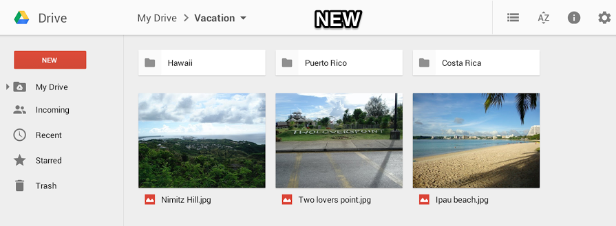
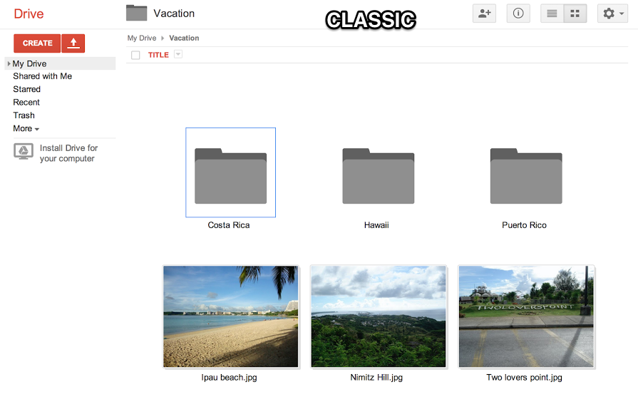
And from a Google support page on how to switch between the two (it’s still live), here’s a comparison of the design and user interface of the new Drive and the classic Drive:
I know a lot of diehard users were upset when Google unveiled the new Drive, but I’m not quite sure what exactly is believed to be worse about the new experience. Maybe one of you can enlighten me?
FTC: We use income earning auto affiliate links. More.
Comments