
Pixel owners were this year presented with Android 12 and Google’s Material You, a radical update that is one of Google’s biggest and best in years. However, there are some tweaks we’d love to see made to Android 12 in future updates. Here’s our list, what’s yours?
Android 12 is all about what the user wants, so really mean it
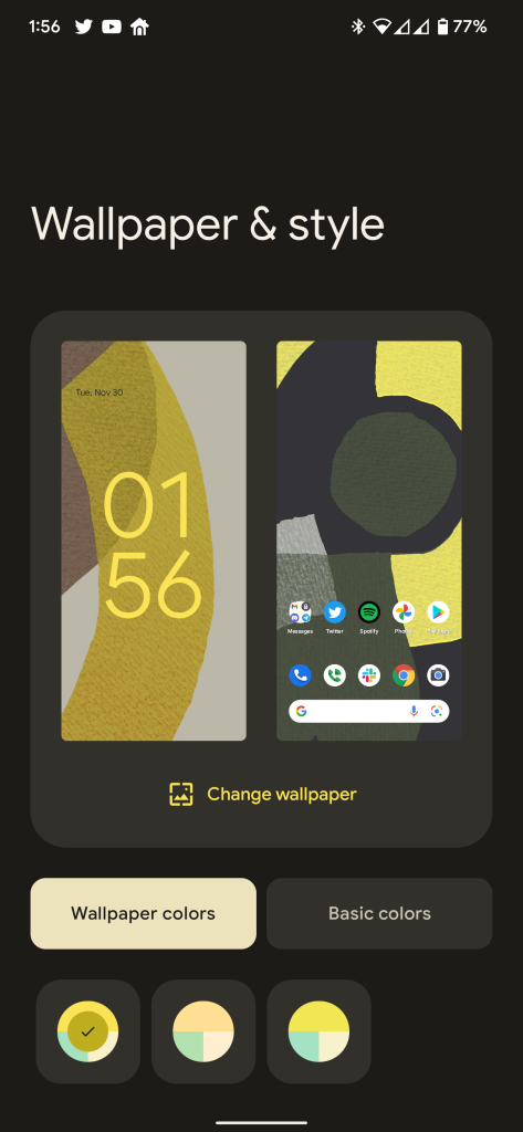
The best part of Android 12 might also be the most frustrating. On Pixels in particular, Android 12 is all about the OS reflecting what the user wants in their smartphone. By pulling colors from the wallpaper, the phone can reflect your favorite things.
However, this added customization comes with its own set of limitations. For one, the colors are still pretty limited. While the wallpaper-based palettes are fun, they are inherently limited to only a certain subset of colors, and Google’s static options are even more limited. Where Android 11 had a handful of different color options for the homescreen, Android 12 has just four.
More disappointing than that, though, is that Android 12 also stripped the OS of its clever font and icon options. Just a year ago, Pixel owners had the choice to change up the font throughout their device as well as change icon shapes on the homescreen and in other areas. It was theming that Google’s version of Android never offered before, at least without a lot of additional work using third-party apps and even root, in some cases. Now, just two years after being introduced, these options are nowhere to be found.
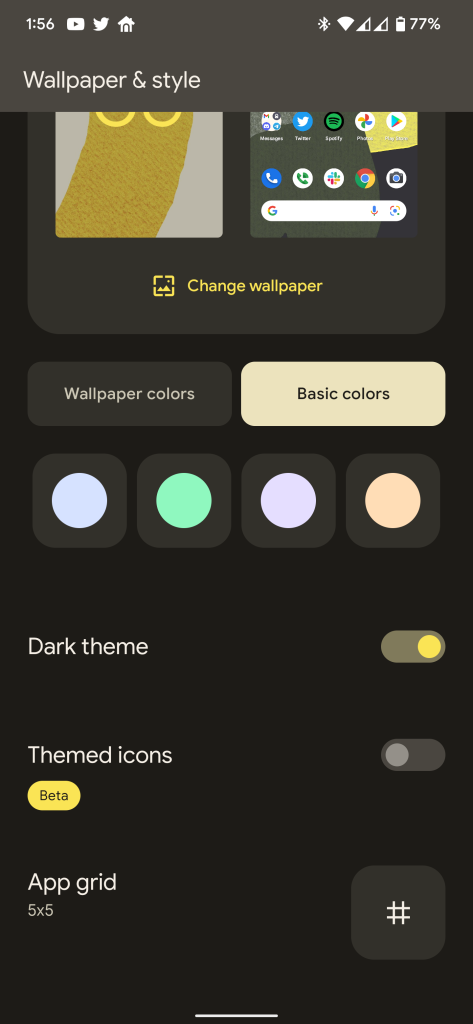
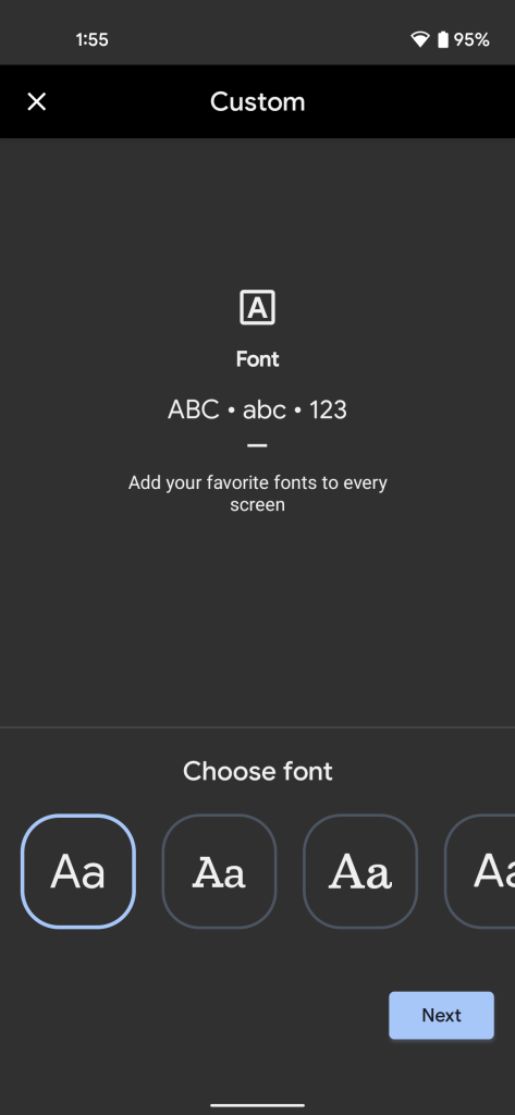
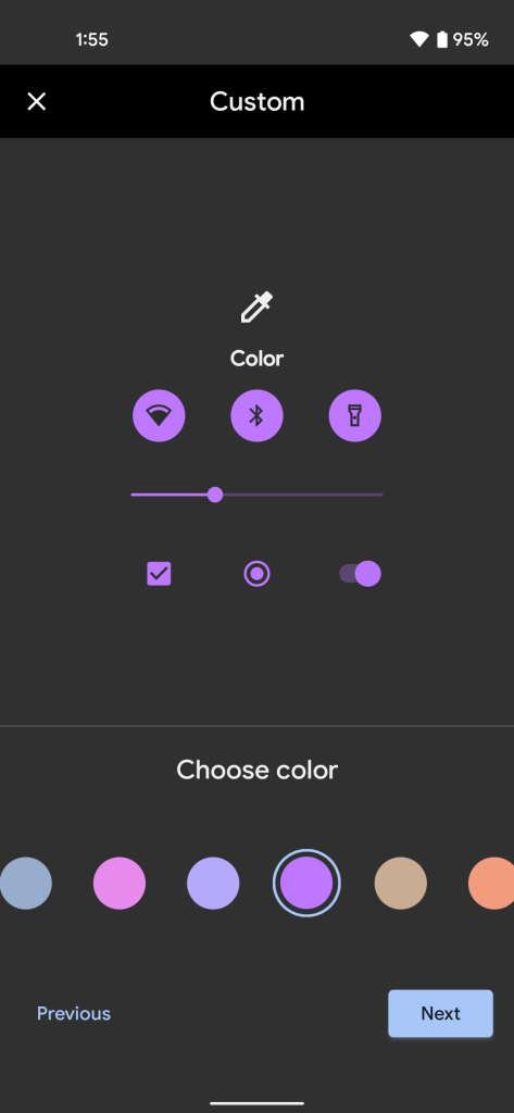
If Android 12 is all about reflecting who the user is, the platform needs to be more open to the choices of that user. A good step would be bringing back the font changer, as well as adding more “Basic Color” options.
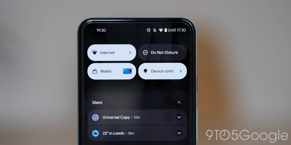
The Quick Settings menu isn’t so quick anymore…
Android’s notifications tray has always been an excellent place to quickly get tasks done, and the Quick Settings menu was a key part of that. In Android 12, though, Google has tweaked this menu to where it only shows four tiles at a time, essentially requiring that the full menu is accessed to get anything done. While the visual look is great, this is a section of the OS Google ought to revisit. Quick Settings are supposed to be fast, as the name implies, and this new design just slows everything down.
Google’s lockscreen clock needs just one little tweak
A small, but frustrating thing for some users in Android 12 is the lockscreen clock. Google’s huge digital clock takes up nearly the entire display when there are no notifications, and in my opinion it looks pretty great. However, it’s can also prove a problem for some. One user with dyslexia took to Reddit to explain their frustration with the clock that’s hard for them to easily read.
The clock goes back to its normal size and layout when there are active notifications on the device, but really Google should just offer a toggle for this. Accessibility is key for Android, and a simple toggle to turn off this behavior would go a long way.

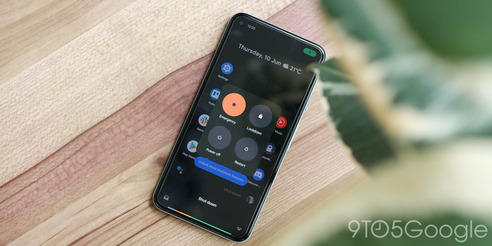
Stop copying Apple and bring back a useful power menu
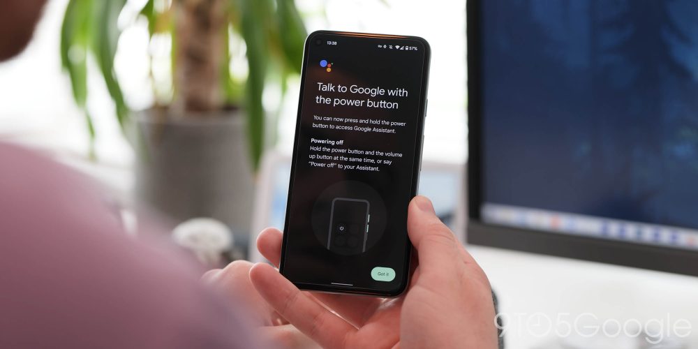
Another change that Google brought to its Android 12 update was the default behavior that assigns Google Assistant to a long-press of the power menu. The inspiration for this is clear, and it’s Apple’s iPhone, which has assigned that behavior to Siri for the past few generations of the iPhone.
While this may be useful for some as an option, it’s frustrating to see Google go in this direction when, just a year prior, the company had reinvented the power menu to be something legitimately useful. In Android 11, a long-press of the power button would bring up power controls, of course, as well as shortcuts for smart home controls and a “Quick Access Wallet” for Google Pay. It was a handy tool that really came as a unique idea for Android.
Then, Google scrapped it entirely.
Android 12 instead buries these useful menus under Quick Settings toggles which take much longer to access, thus making them pretty much useless. The lockscreen shortcuts are admittedly a decent middle-ground, but they shouldn’t be needed. Google should just bring back its clever idea, at the very least, as an option.
Android needs a faster way to access your digital wallet
On a similar note, Google really needs to figure out a faster way to handle its digital wallet. Google Pay, misguided as it is today, just buries the ability to quickly access credit/debit cards, and the situation is so much worse for loyalty cards. Where your credit/debit cards are easily visible and you can sort through them, loyalty cards are buried down yet another tap, and then a swipe down to find the one you need.
This is a place where Apple really does excel over Android, as Apple Pay’s full wallet is accessible with a quick double-tap of the power button. There’s no world where we’d dream of asking Google to switch the camera shortcut for Google Pay, but there just has to be a better way. It should take no more than a tap or two to access this vital tool while you’re standing at checkout at the grocery store.
What do you want to see changed?
Well, that’s our list. As mentioned, Android 12 has been a great update on the whole, full of stunning design changes and great new privacy features. But like any change, tweaks are needed to nail down the little things. Luckily, Android 12L will present Google with a great opportunity to fix some of Android 12’s most glaring bugs, and hopefully some of these features too.
But what do you want to be changed in Android 12? Is a certain feature not finished in your eyes? Or perhaps something needs to be built upon to really be useful. Let us know in the comments below!
More on Android 12:
- One UI 4.0 hands-on: Android 12 for Samsung devices [Video]
- How to add camera and mic access tiles to Quick Settings in Android 12
- Code suggests Android 12’s wallpaper-based Dynamic Color coming to OnePlus, others
FTC: We use income earning auto affiliate links. More.

Comments