
Branding is always remarkably revealing. When you open Gmail, the splash screen shows that it’s part of “Google Workspace.” That brand was introduced in 2020 and compared to G Suite makes very clear that Gmail, Meet, Chat, Calendar, Drive, Docs, Keep, and Voice help you be productive. People obviously utilize Gmail for work, but many more are using it in their personal lives, and that use case, as of late, has been somewhat ignored by Google. One way to address that lack of new innovation can be found in Gmail’s past: Inbox.
State of work
To its credit, the phenomenal change brought on by the Workspace rebrand is the speed at which new features are now introduced. Google is moving quickly to make its family of apps the best place to get things done no matter the scenario (remote, hybrid, or in-office). At the center of this push is an integrated Gmail that lets you multitask and access Chat, Spaces, and Meet, as well as Docs, in one place to cut down on tab switching.
However, since Google proclaimed that its email service is the new “home for work,” the overwhelming majority of new features and changes have been to improve the experience for enterprise customers. While free users have benefited, they aren’t the intended audience.
Those personal users, at best, are ambivalent about the Meet tab, while it would certainly be interesting to see what the free Chat and Spaces usage numbers are mid-Hangouts transition. The biggest non-Workspace changes as of late have been purely cosmetic with the Material You redesign on Android, which also introduced a new widget, and the “new Gmail view” on the web that’s defined by the new Sidebar navigation.
It wasn’t always this way
The last significant change to the core email experience was the previous redesign in 2018. This included the ability to take actions directly from the inbox view, including opening photos and other attachments, archiving, deleting, marking as read/unread, and snoozing. There was also the ability to quickly access Calendar, Keep, and Tasks add-ons, new security warnings, and unsubscribe prompts. The other big focus was Smart Reply, which was later augmented by Smart Compose at I/O that year.
The overwhelming goal was to make it easier to manage and triage your emails, as well as Google offering smart suggestions. In comparison, the Workspace rationale – while commendable – is very team-oriented, “getting things done”-aimed, and synergistic. It does not reflect non-work life.
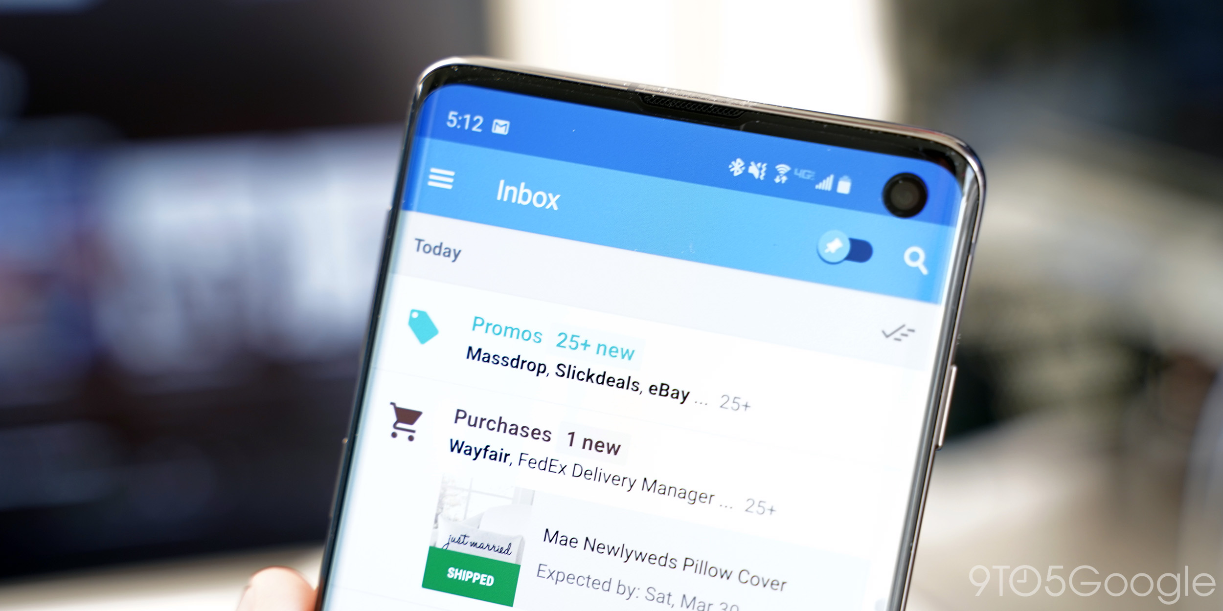
Many of those new Gmail features had their origins in Inbox, which the company announced was going away five months after announcing that redesign. Google said Inbox was a “great place to experiment with new ideas” and that it “learned a lot about how to make email better.” Its rationale for shutting down Inbox was that it wanted to focus on one app, and that consolidation was fine after years of Inbox development stagnating.
If Inbox was how Gmail was able to get new features – albeit four years later, Google needs to do it again.
Project Kennedy Inbox, or The Manhattan Inbox Project
As a free/personal user, you might not agree with all the Workspace changes to Gmail. However, the revamp does make sense for the intended audience as Google wants to sell an end-to-end productivity solution for businesses.
You can largely continue to use personal Gmail in a pre-Workspace manner (i.e. hide the new tabs), but the core experience is getting stale.
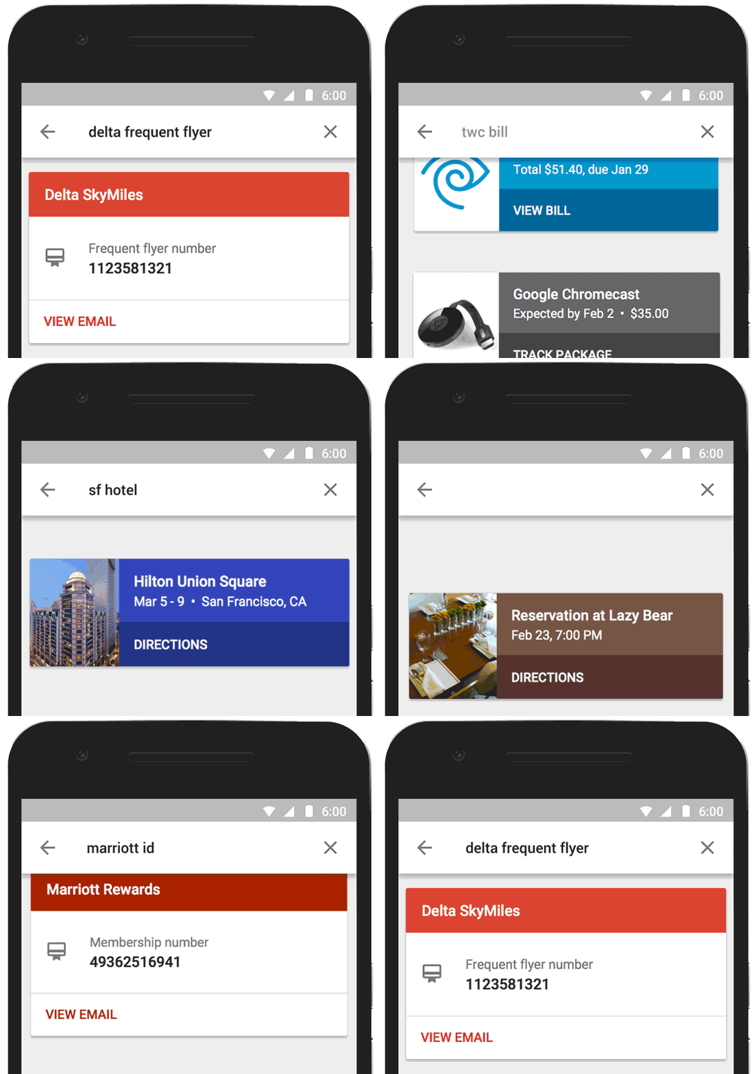
Today, email is just an input/piece of information and meant to be somewhat dumb in the Google ecosystem, with other apps meant to output it. Messages, like those related to travel and events, are often surfaced by other Google services (Assistant and At a Glance) as proactive notifications. That assistance shouldn’t be exclusive to other experiences. It has to also be built into the familiar Gmail app for wider reach.
When Inbox first launched, it was somewhat odd that Google had two email clients. That approach, however, made a great deal of sense in that the company needed a place to experiment without impacting most people’s day-to-day work. Gmail is just too critical to drastically change in unproven ways.
In the past decade, Google must have had bold ideas, others certainly have, on how to make email management better and make Gmail more helpful. AI-backed smarts should step out of the Compose window, while – at the very least – many ideas are worth revisiting.
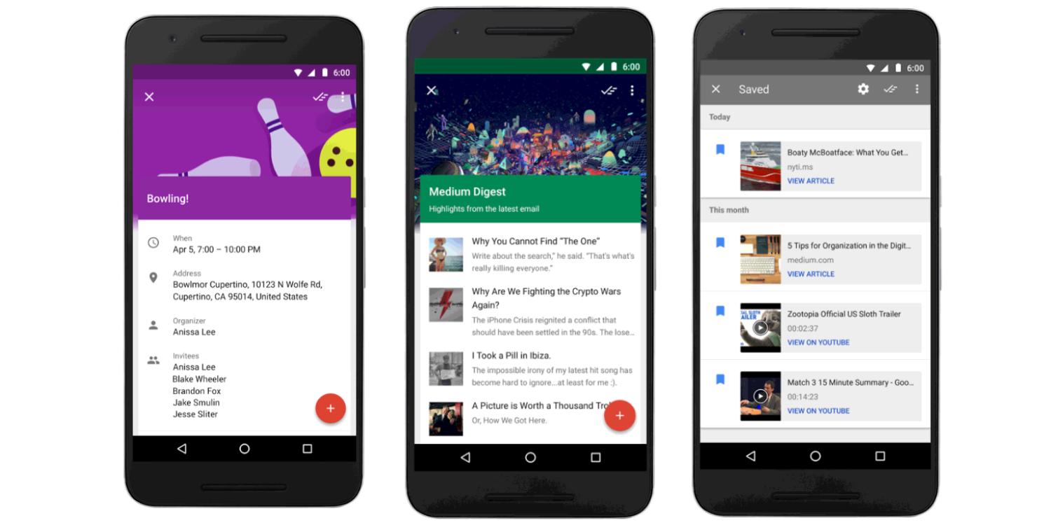
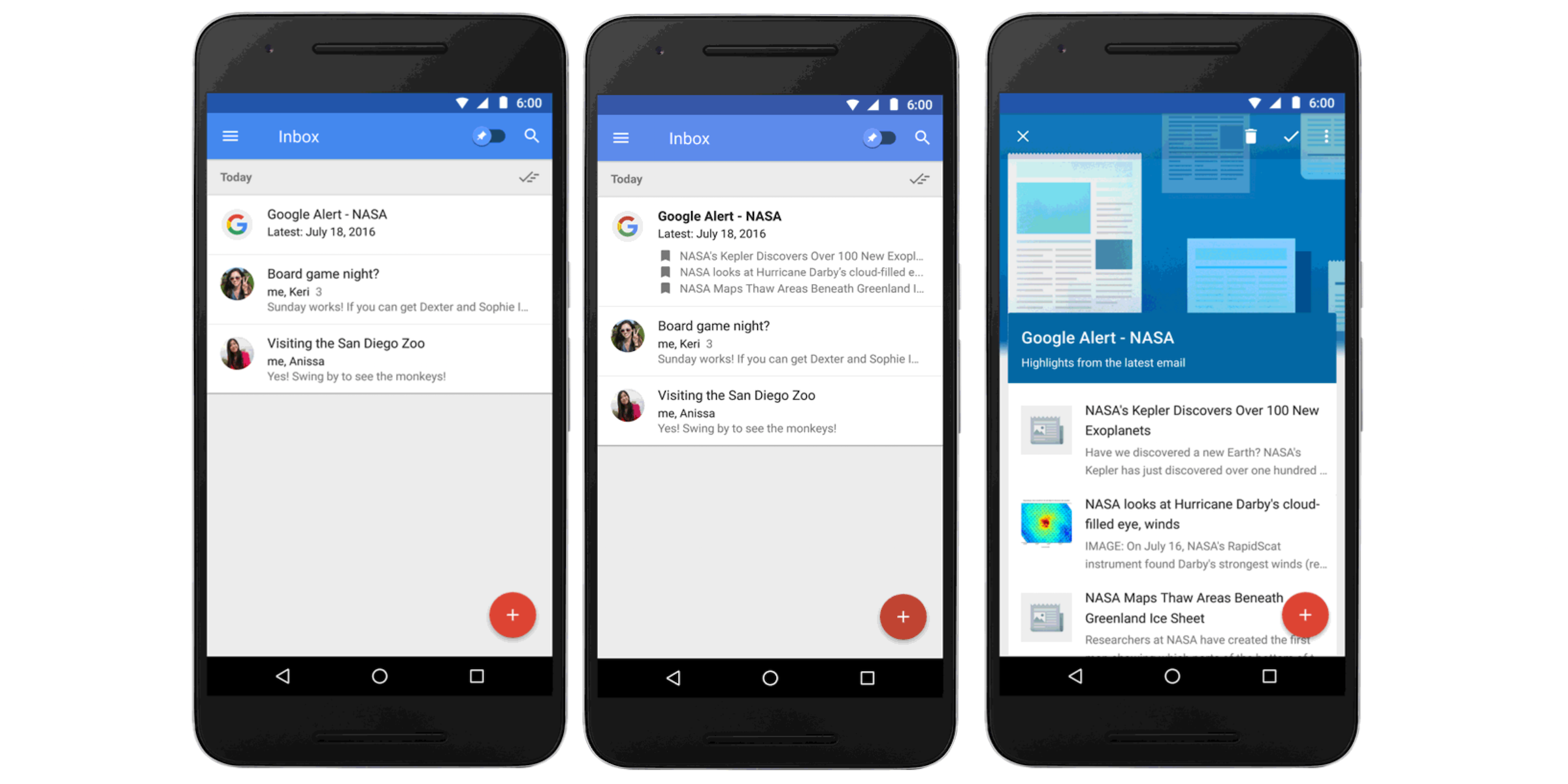
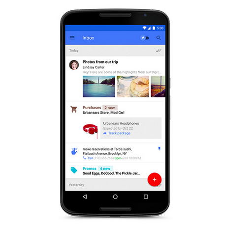
For example, Bundles never made it out of Inbox into Gmail and there was a newsletter feature that would highlight articles directly. In general, Inbox was great at summarizing emails on your behalf and presenting information in a more glanceable manner. Gmail does some curation, but it’s not willing to be as prominent or editorial as Inbox was in the past. If anything, that’s needed more than ever with today’s deluge of content.
It’s time for Google to start innovating on personal Gmail usage and provide help with something that people interact with daily: their inboxes. The Inbox route might be the best way to accomplish that to create a clear boundary from Workspace. After all, it worked in the past.
FTC: We use income earning auto affiliate links. More.




Comments