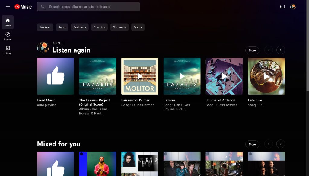
YouTube Music is getting a big redesign on the web that adopts a navigation drawer with very quick access to playlists.
Instead of having a top app bar with Home, Explore, and Library, those three core sections now appear in a navigation drawer that can be collapsed (for a nav rail-like experience). When open, which requires a click, you can scroll through 50 recent playlists with Liked Music and New (podcast) Episodes pinned to the top. There’s also a shortcut to quickly create new ones.
Hovering reveals a play button to quickly start, while a tap opens the full playlist. Given the collapsible nature, you don’t have to interact with it if you don’t want to, with YTM preserving the last open/close state between visits.
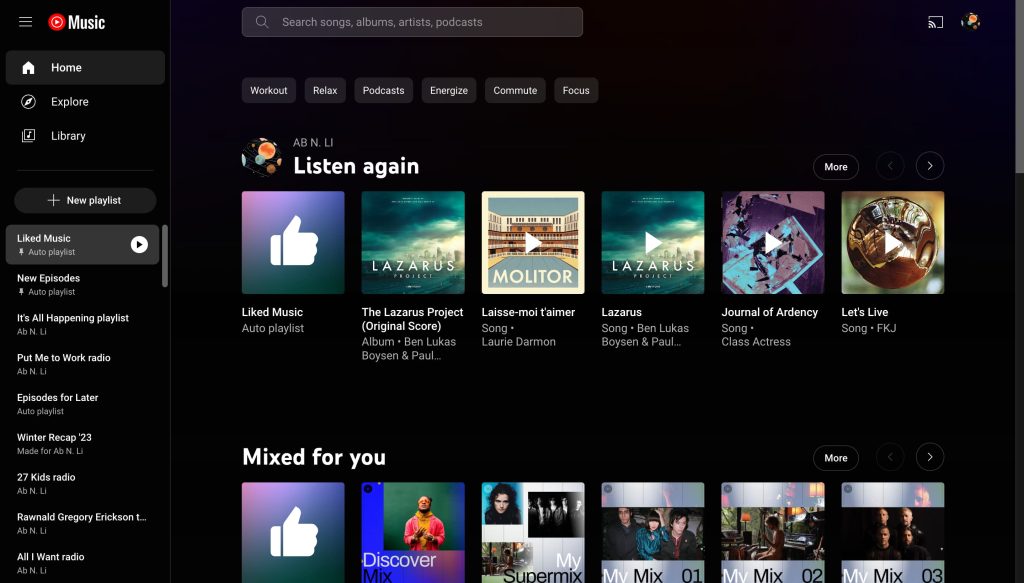
Meanwhile, the app bar is home to a search field, which shows a “songs, albums, artists, and podcasts” hint, while Cast is at the right.
Visually, this takes after YouTube.com and is the first major redesign and overhaul of YouTube Music’s web experience since the relaunch. The desktop experience sees functional tweaks now and again, but not as often as the mobile apps.
There are no changes to the Home, Explore, or Library feeds, which you might not need to access too often now.
More on YouTube Music:
- YouTube Music redesign adds a carousel to Now Playing
- YouTube Music tests a bigger Listen again section
- YouTube Shorts might be coming to YouTube Music with ‘Samples’ tab
- Spotify testing ‘Offline Mix,’ its version of one of YouTube Music’s best features
FTC: We use income earning auto affiliate links. More.
Comments