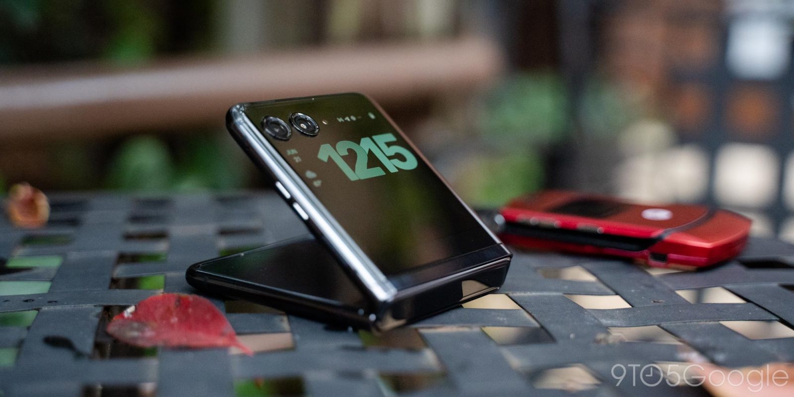
Flip phones were once a relic of the past, but the arrival of foldable smartphones has given new life to the form factor. And, now, the 2023 Motorola Razr+ is showing the modern flip phone at its best.
Table of contents
What the Motorola Razr+ gets right |
The cover screen (and the regular one)
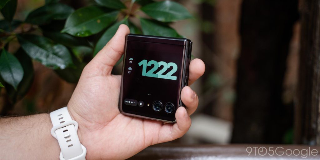
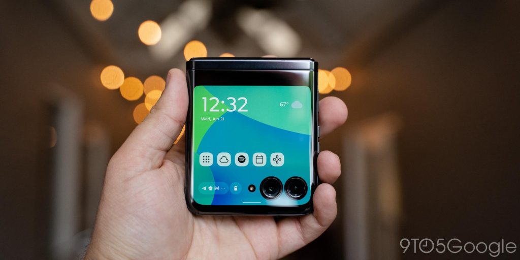
The big story on the Motorola Razr+, of course, is the cover display. The 3.6-inch nearly 1:1 panel stands out when you first see the phone and it’s groundbreaking for this form factor. The display itself is good, with it being bright enough for use both indoors and out on a sunny day, as well as almost being overkill with a 144Hz refresh rate.
But, the real question is if it’s actually useful. And, thankfully, the answer is yes.
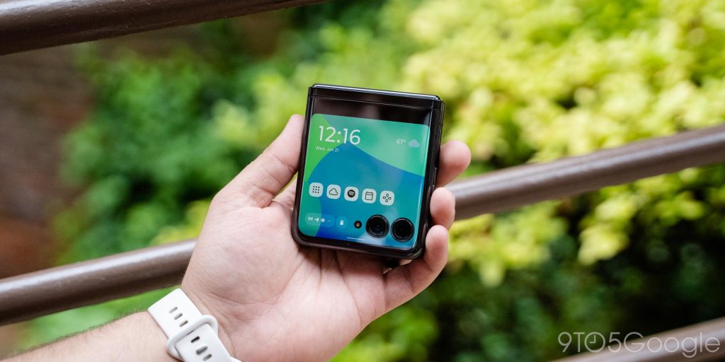
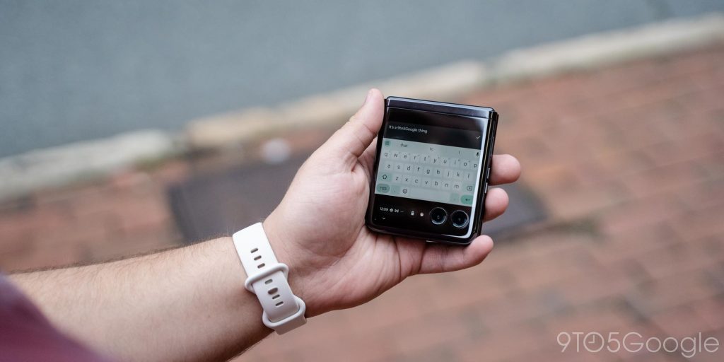
There’s just so much you can get done on this outer display on the Motorola Razr+. Cutting right to the chase, you can run virtually any app out here, whether that’s a messaging app, home controls, or, if you’re insane, full Android games. The only apps missing that I felt their loss were that of the Google app, as well as the full Google Assistant experience – instead there’s a custom UI tied to a long-press of the power button.
Using apps out here works surprisingly well. I found myself a bit slower to respond to messages out there, but with full Gboard on tap, it also felt familiar. Really, it was just the small text box and the additional tap needed to move from text input to actually sending the message that threw me off at all. Notably, the experience here is optimized for Gboard at its default settings. Adjusting the keyboard’s height will make things messy on the outer display, and, unfortunately, third-party keyboards don’t play nice either.
Where I found the outer display more useful was for more glanceable information. Checking the weather, calendar events, controlling music playback, and more were among my top use cases. I was also pleasantly surprised at how good the Google Home app is on the outer display, feeling almost completely uncompromised on this small panel.
Another way I found myself using the display was for UDisc, an app I use to track scoring during a round of disc golf. This was one of my main complaints on devices such as the Oppo Find N2 Flip and Galaxy Z Flip 4, as I was forced on those devices to open the main screen every single time I wanted to enter a score, which was particularly annoying in a group, and that experience just translates to so many use cases, such as just reading a message and sending a quick reply.
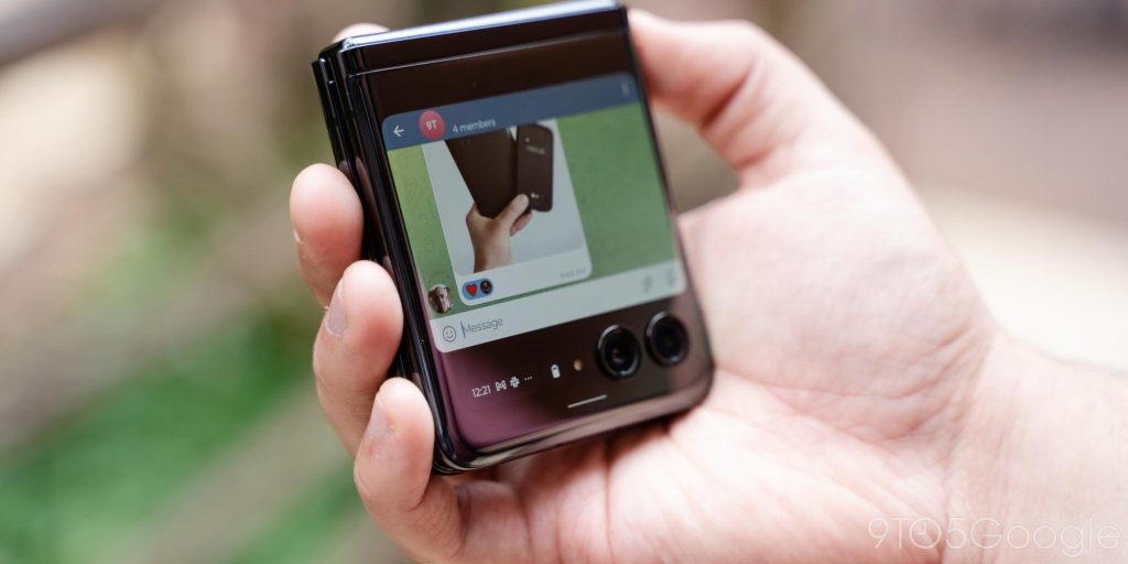
That’s just a couple of examples of where that outer display comes in handy, and Motorola has done more to make this useful beyond just running full apps.
The cover display’s software is designed as a custom homescreen. The main screen shows a clock widget, the date and weather, and shortcuts for up to nine “panels.” These panels can include an app drawer, a contacts list, weather, Spotify, your calendar (there’s an annoying bug with this one where it won’t auto-update the day), Google News, Google Fit, and even a dedicated list of games that are optimized for the outer display – most of these are powered by Google’s GameSnacks, and Stack Bounce is the best one by far. News and Fit are just Google’s stock widgets though.
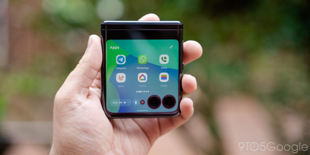
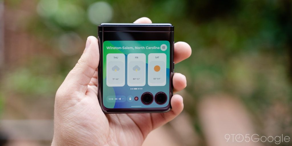
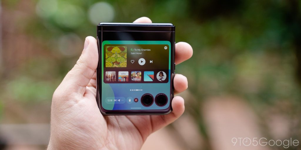
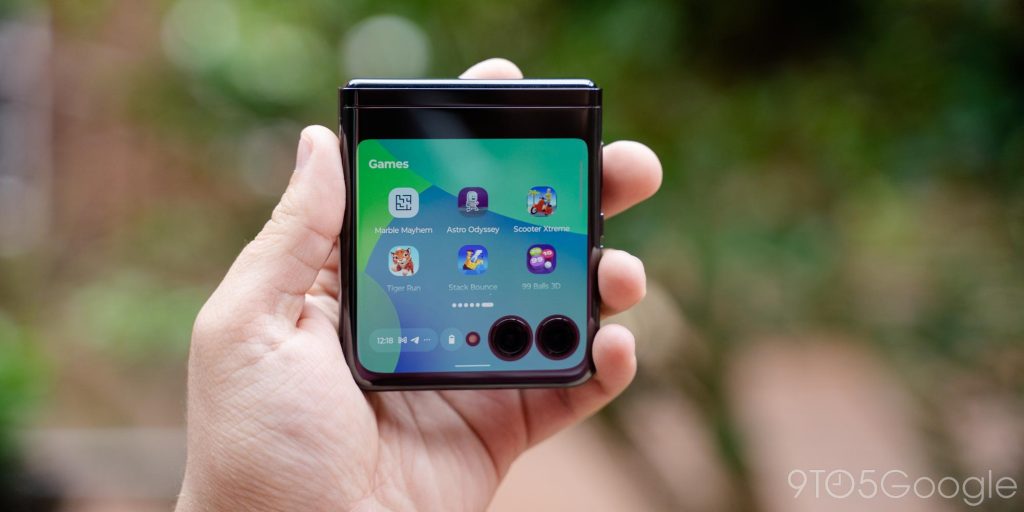
These panels are useful, though the one thing I found myself wanting more than anything else was the ability to create custom panels with my own widgets. While I just happen to be a Spotify user, even I can feel the frustration of having no option to have widgets for YouTube Music or Apple Music out there. I’d also love the option to throw a Google Keep widget, or one for Maps, or even just a widget from a weather app I chose on this display. And, really, I’m surprised you can’t do that, because Motorola used to allow this on older Razr models!
The same applies to the lack of always-on support, which is gone on this device. This also removes Motorola’s truly wonderful “Peek Display,” which shows notifications in what is by far the best use of always-on I’ve seen. This still works on the inner display, but it’s oddly kept away from the outside. And that’s another feature that was in place on previous models.
When you do open full apps, they’ll run by default in a compact view that keeps the UI from getting covered up by the camera and LED flash cutouts. But, as long as you’re using gesture navigation, you can long-press the bottom of the screen to expand the app fully to take advantage of the space. And having that choice is key, because it lets you actually use that bottom sliver of screen.
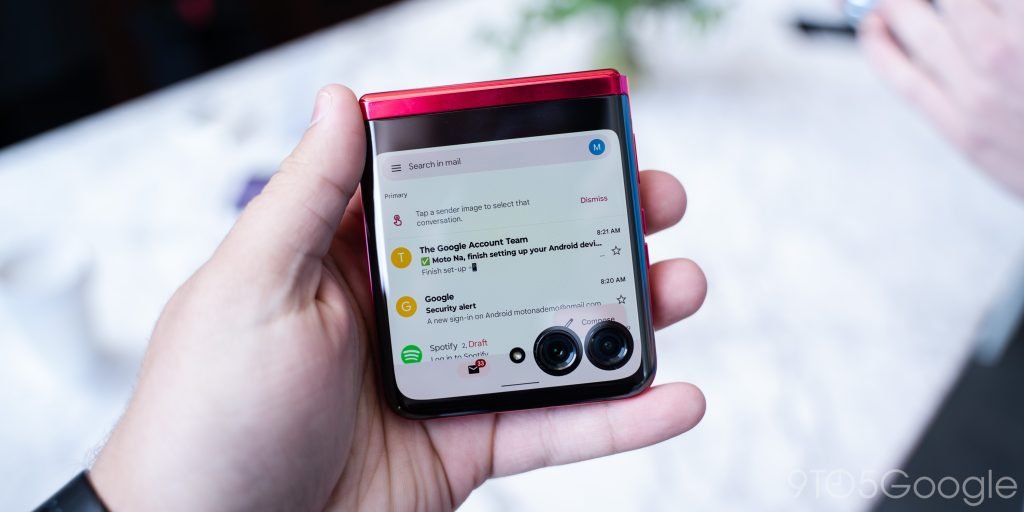

And, really, it’s hard to complain about anything here. This outer display is by far the most capable on the market today for a foldable flip phone, and Motorola has built an experience that is shockingly well done.
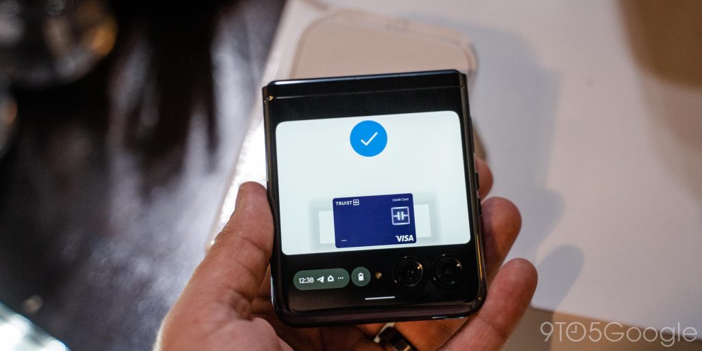
There’s even a perk over other flip phones, and that’s support for Google Wallet!
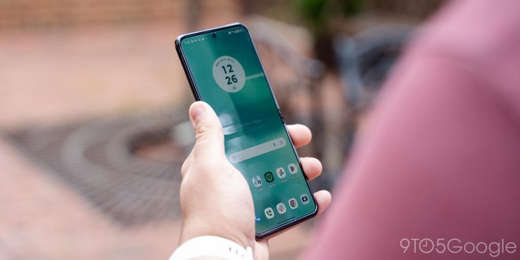
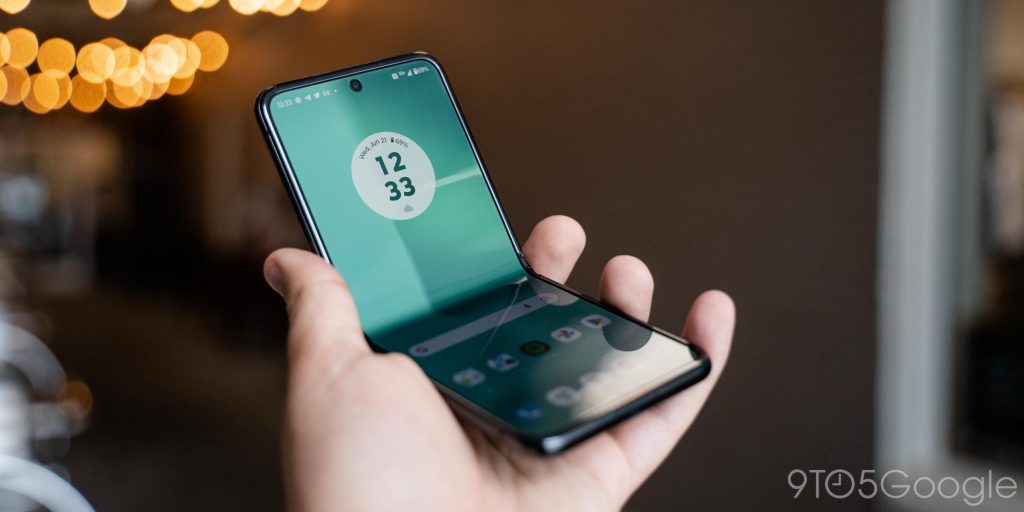
Of course, the whole point of a foldable isn’t just to have a smaller display on the outside. To that end, the Motorola Razr+ flips open to a 6.9-inch FHD+ panel that has a 165Hz refresh rate. The panel is bright enough, big enough, and fast enough to feel like a proper 2023 flagship. And, beyond all else, Motorola deserves a lot of credit for the hinge here. The waterdrop-style hinge prevents the display, at least in my near-two weeks so far, from having a trench in the panel like Samsung’s foldables. You’d be hard-pressed to even feel the little bit of a crease in this display, though it is visually noticeable in outdoor lighting. I’ve never been particularly bothered by the display crease on foldables, but it has been a little frustrating on flip phones in particular. Motorola nailed it here.
The software & performance
Motorola Razr+ finally breaks the streak of “mid-range” that past Razr foldables fell into. Under the hood is a Snapdragon 8+ Gen 1 chipset with 8GB of RAM and 256GB of storage. While the chip is technically a half-generation behind, the overall performance is generally excellent. I’ve encountered a handful of times where apps stuttered, but things felt smooth and fast for the most part.
That’s doubled down by the refresh rate on both displays. The main 6.9-inch display has a 165Hz refresh rate, while the outer display is at 144Hz. And with the Snapdragon 8+ Gen 1 running the show, I’ve actually been able to enjoy that full refresh rate.
Motorola’s skin on top of Android is also a delight, and surprisingly well-optimized for this form factor. The overall look and feel is very similar to Pixel, but with some definitive choices from Motorola. The Quick Settings ditches the conjoined “Internet” shortcut for dedicated Wi-Fi and Mobile Data toggles. There’s also a neat feature in for volume that lets you control individual apps, and that feature will also detect if you regularly mute the same app and offer to auto-mute it when you open it. It’s a good mix of useful features with a clean overall UI. I much prefer it to Samsung’s One UI on the Galaxy Z Flip 4, which can sometimes feel cluttered.
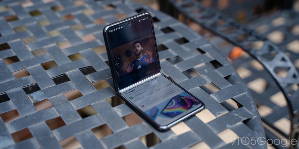
Plus, you’ll enjoy some of the benefits that Samsung’s foldables have brought to Android apps. YouTube, for instance, will split the UI when the Razr is propped up.
The hardware
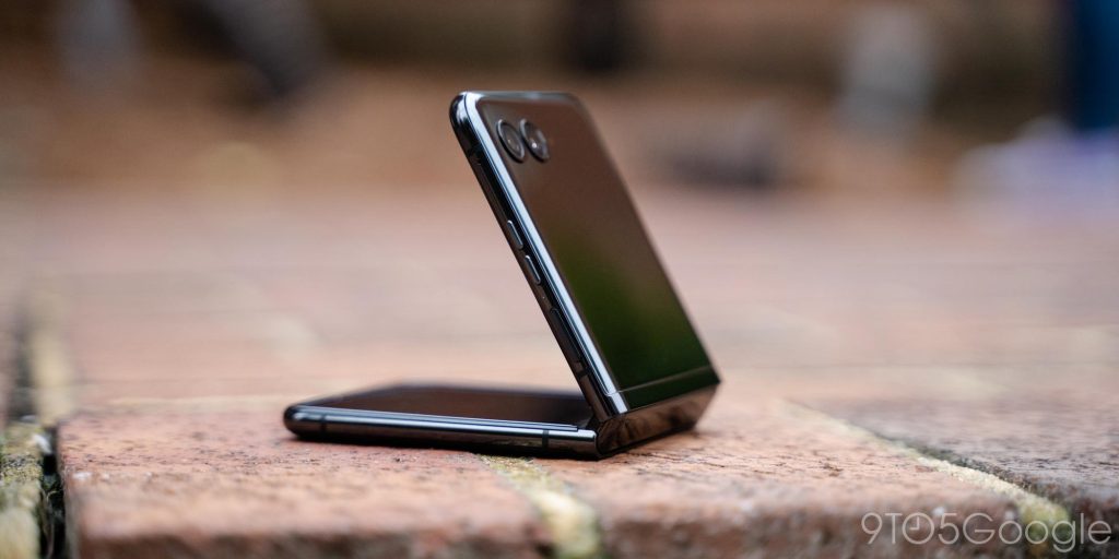
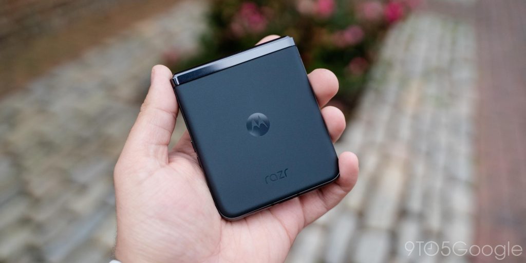
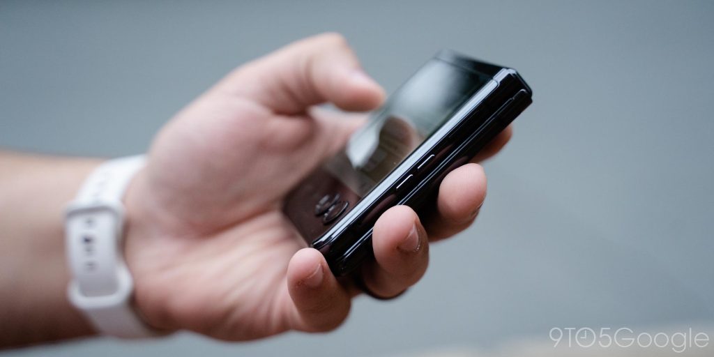
The Razr+ gives up most of the iconic looks of its predecessors, particularly with the “chin” on the bottom. And while I’m sad to see that go, it makes total sense. The chin was a weird design choice for a modern phone, and limited how much the design as a whole could do. This new look provides for a very thin phone, even when folded, and a screen that’s not covered by any big borders.
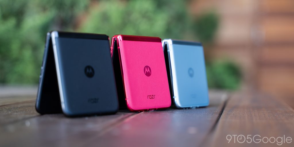
Motorola has done a great job on overall build quality, too. The textured glass of my black model feels nice, though a little slick. The “Viva Magenta” model solves that with a “vegan leather” (which is basically plastic with a texture stamped on) that’s much more grippy. The blue model uses glass, just like this black one.
The front panel, meanwhile, is a super-reflective glass when the screen is turned off, with the 3.6-inch OLED panel coming to life when you press the power button. The cover glass looks great, but gets dirty and grimy quickly from the oils on your finger and just what ends up on your phone through the day. Cleaning it often is pretty much a requirement.
My main concern here was with scratches, given the entire front is made of glass, but that thankfully hasn’t been a problem in my use thus far – I’m sure our Max Weinbach could stress test it, though.
Then, there’s the hinge. Motorola’s approach to the hinge is one that uses a “waterdrop” for the screen, resulting in a phone that’s completely closed when folded up, and also with a lesser crease. And that’s all great, plus it’s backed up by a hinge that feels pretty good while opening and closing. Not present are the concerning brushing sounds you hear when unfolding a Galaxy Z Flip 4, but instead a rather seamless open and close. The hinge is a little bit too resistant for my taste on a flip phone, though. The first 20% is a struggle to do one-handed, but if you use it two-handed, you’ll be fine. But still, it’s in stark contrast to the Razr’s of old, which were eager to flip open mostly on their own.
The only real qualm I have with Motorola’s hinge is that I’ve noticed it’s a little loose laterally, at least on my unit. Holding the closed phone I occasionally felt the top half “wiggle” a bit side to side. It wasn’t enough to cause a problem or even be considered uncomfortable, it’s just something I hadn’t run into on Samsung’s foldable or even Oppo’s. I’d be curious to see if this will change with age, but for the time being, it’s not worth worrying about.
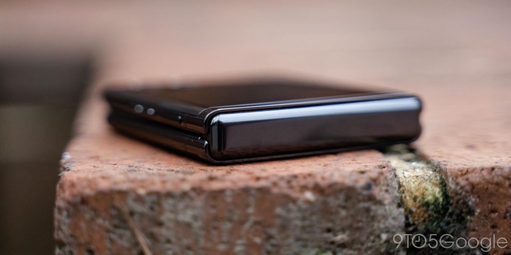
And that brings us to repairability. As with any foldable, this is a rightful concern for any potential buyer. Motorola says that Razr+ customers get a 12 month warranty from the point of purchase, and physical damage can be handled either through a mail-in program or at “a growing network of authorized carry in centers.” The pre-installed screen protector on the Razr+’s inner display (which you shouldn’t remove), is also eligible for a one-time free replacement at any uBreakiFix location in the US.
What still needs work |
The battery life is often good, sometimes awful
One of the difficult parts of foldable flip phones so far has been stuffing an adequately sized battery inside, and its a problem the Razr+ feels even more thanks to that huge display taking up additional room. Despite it all, Motorola managed a 3,800 mAh battery. That’s much smaller than you’d find in a typical 6.9-inch smartphone, but also bigger than the battery in the Galaxy Z Flip 4.
The verdict is that the battery is probably fine.
When the Razr+ did well, its endurance was actually quite great. I could get three hours of screen time over 16-18 hours without a problem, getting to bed around 10% or so. And, notably, the actual screen time figure is higher, because Android’s battery stats oddly do not recognize the outer display under the screen time metric.
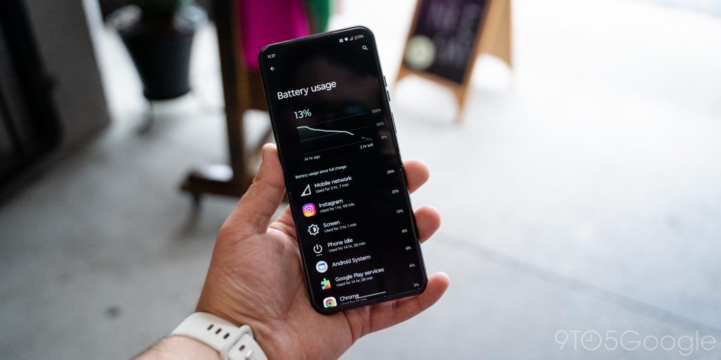
But that wasn’t the case every day. In what is seemingly a bug, my first few days with the Razr’s battery were quite dreadful. Barely an hour of screen time was throwing me under 50%, with mobile network usage absolutely draining the battery with speed. That bug seems to have subsided a bit in the time since, which has led to much better endurance. Now, I’m seeing more like 2-4 hours of screen time (again, it only tracks the inner display) with 15% or less by the time I’m in bed for the evening.
At its best, this battery will get you through a day. But if you’re planning to play games, spend all of your time on the inner display, or record a lot of video, don’t expect to get through to bedtime without a top-off.
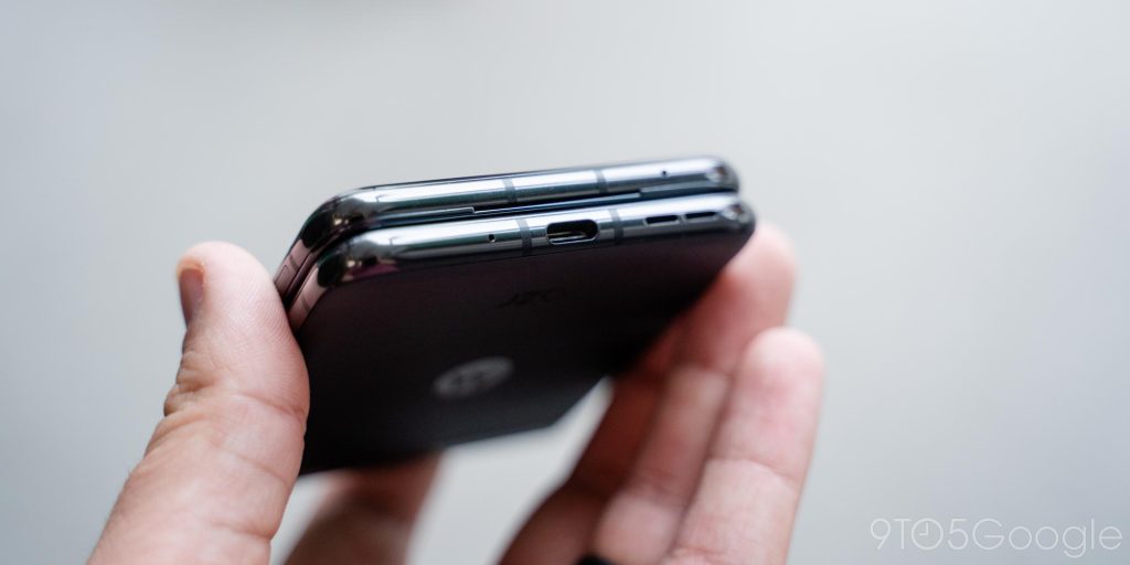
On the bright side, charging is solid. You’ll get 30W wired charging over USB-C. This can top off the phone in just over an hour, and felt plenty fast for me. On top of that you’ll have support for Qi wireless charging which works, but fell a bit short. On my Pixel Stand and my Nomad wireless charging pad, the Razr wouldn’t charge over Qi reliably. Multiple nights I woke up in the morning with only a partial charge, which led to me sticking with wired primarily for the rest of my review period. Motorola is selling a “TurboPower” wireless charging stand that works fine, but just keep in mind that your results may vary on the existing wireless chargers you have.
The cameras are not good, but somewhat redeemable
The Motorola Razr+ has a 12MP primary camera and a 13MP ultrawide camera for its main shooters and, frankly, they’re not very good.
Both rear cameras can take shots that are completely passable, but even in ideal lighting, I’ve never felt any shot from this phone is impressive, or really even all that great. Is it bad? I can’t quite go that far. Shots are just lacking depth and character. Motorola hands you a flat image that somehow feels both overprocessed and underprocessed. And even that fairly low bar falls apart even more in poor lighting, and video is pretty unimpressive, too.
More Motorola Razr+ camera samples
Now, this isn’t drastically worse than the Samsung Galaxy Z Flip 4 which is also well behind typical slab phones, but it is much worse than the Oppo Find N2 Flip. But either way, it’s a big flaw in a phone that Motorola is angling towards content creators. The “built-in tripod,” ability to shoot selfies with the main cameras from the outer display, and live preview on the outer display while you shoot a subject can’t make up for what is just, overall, not a good camera experience.
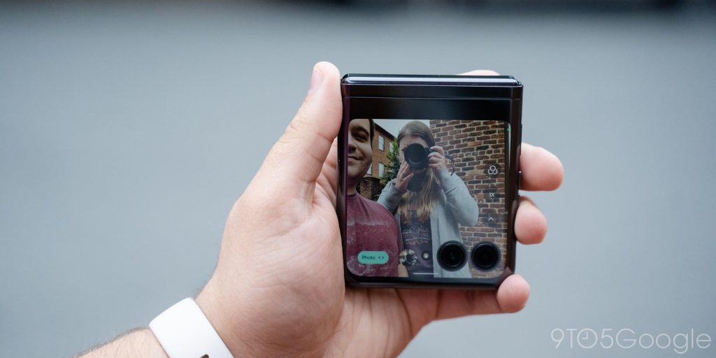
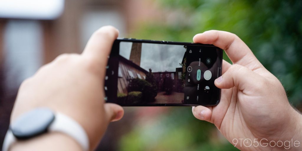
And that’s also not even to talk about a bug that further soured my experience. Throughout my two weeks with the Razr+, I’ve lost several shots that deleted themselves from the phone. The circumstances in which this happens for me comes down to taking a picture and then immediately leaving the camera app – something I do often to share pictures in apps. Without a couple of seconds or more for the shot to process, it just gets deleted, and it’s been happening consistently for me. Motorola tells me it is aware of this problem and that a fix will be coming in a future update.
Motorola’s update track record is… not good
My biggest concern on this phone over time is with the software. Motorola has built a great experience on top of core Android, but the company’s track record for keeping products up to date is just bad.
Motorola promises three major Android updates and four years of bi-monthly security patches, which is not terrible.
The problem lies in when those updates may arrive. It could be a month late, it could be a year late. We just don’t know. The 2019 Razr didn’t get Android 10 for over six months after the version’s launch, with Android 10 having been the current version of the OS when the phone itself launched. And with other devices, Motorola’s track record isn’t any better, with a general approach of “it comes when it comes.” With Samsung, Oppo, and others greatly accelerating the adoption of new Android versions, Motorola needs to change this.
Tidbits
Some of the minor bits with the Razr+ include the haptics, which are… fine? They don’t have much impact, but they’re also not unpleasant. There are also the speakers, which have a surprising amount of power for the size of this phone. They aren’t going to impress with quality, but the volume alone is impressive.
Signal strength is also something I noticed on this phone, and not in a great way. Using the phone on Google Fi, I consistently noticed weaker connection strength compared to my Galaxy Z Fold 4, which was also running on Fi. It wasn’t to the point where it was a problem in most cases, but in areas with particularly poor coverage, the Razr was first to struggle loading up web pages or messages from apps. Your results may vary.
Is it better than the Galaxy Z Flip 4? |
The big question, at least for now, is just if this phone is better than what Samsung offers. The Galaxy Z Flip 4 is the most popular foldable on the market right now, and for good reason. It’s priced well, offers a solid experience on its durability, performance, and even the battery and cameras.
But, really, I’d pick the Motorola Razr+ in a heartbeat.
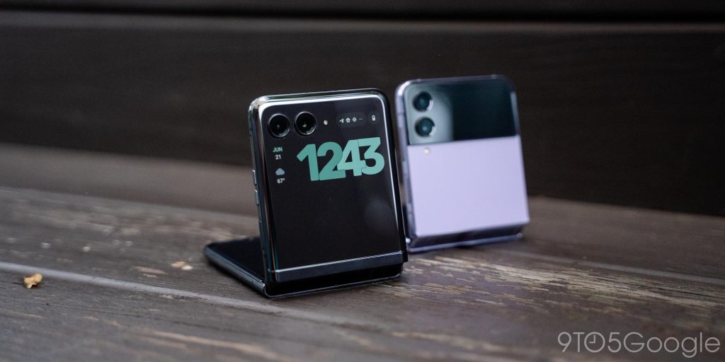
For the same price as Samsung’s phone the Razr+ offers a far more useful cover display, a better internal display and, at least in my opinion, better software too. I overall prefer Samsung’s cameras, battery, and hinge, but Motorola has built a killer competitor here that is currently the best foldable phone on the market when you consider all factors. So, yes, I think it’s better than the Flip 4, and to a considerable extent, too.
Final Thoughts |
The Motorola Razr is a beloved brand name, with over 130 million phones having been sold back in the early 2000s of the Razr V3.
The Razr+ channels that legacy and brings it into the modern era in a much more competitive way than past attempts. The 2019 and 2020 Razr’s had some serious nostalgia, but the Motorola Razr+ really focuses in on being a truly competitive flip phone, while also appealing to both the nostalgia and inherent trendiness of this form factor. This phone has its flaws, absolutely, but on the whole, it’s currently the best flip phone at being a flip phone.
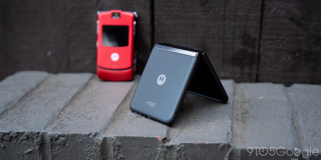
With its $999 price tag and all of the excellent points we’ve discussed so far, I’m certainly happy to call this the king of flip phones.
Where to buy the Motorola Razr+
- Motorola.com
- Best Buy
- Amazon
- T-Mobile
- AT&T (The best deal)
- Google Fi Wireless
- Optimum Mobile
- Soon: Spectrum Mobile
FTC: We use income earning auto affiliate links. More.


Comments