After getting a refreshed logo in April, the latest update to Google Lens changes the UI to now offer a light theme.
Previously, the Google Lens viewfinder had a black-and-white UI. The dark background was paired with a white accent color and ample amounts of transparency. It was very much modeled after camera apps so that the interface would not interfere with what was being captured.
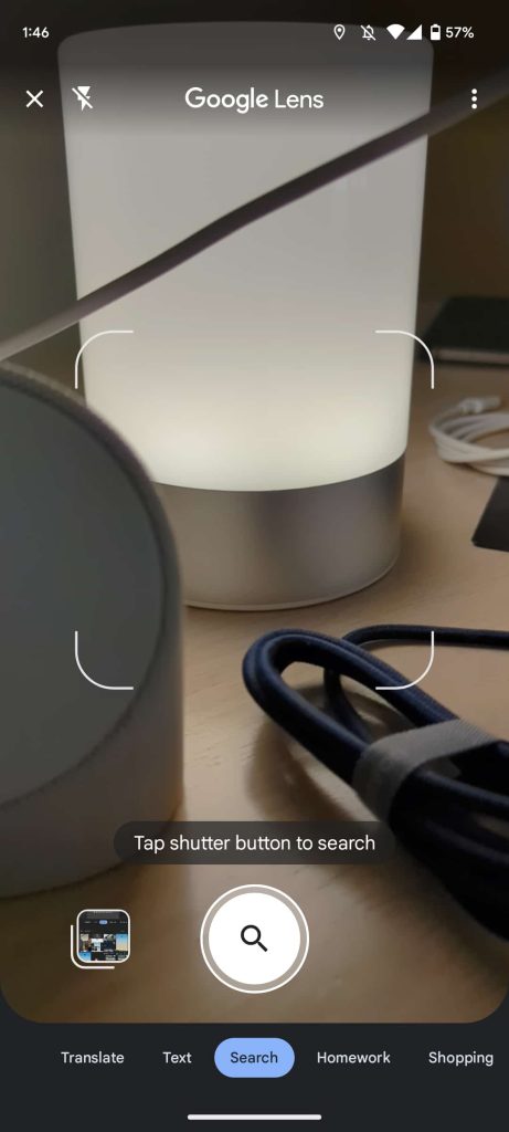

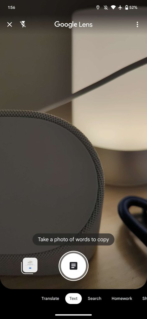
The carousel of filters is now displayed against a gray background with a light blue pill noting the one that’s currently set. This could easily be updated with Dynamic Color in the future, which is already present in the Translate tab.
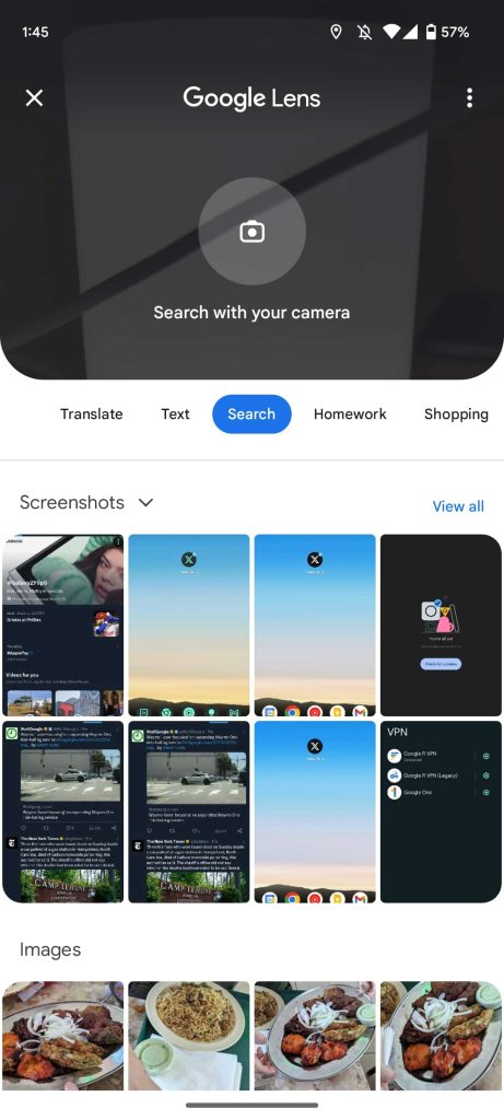


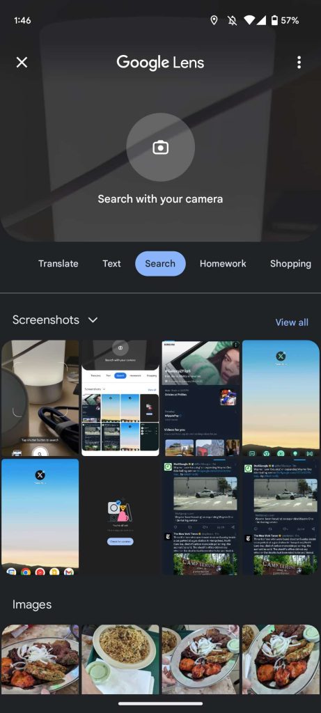
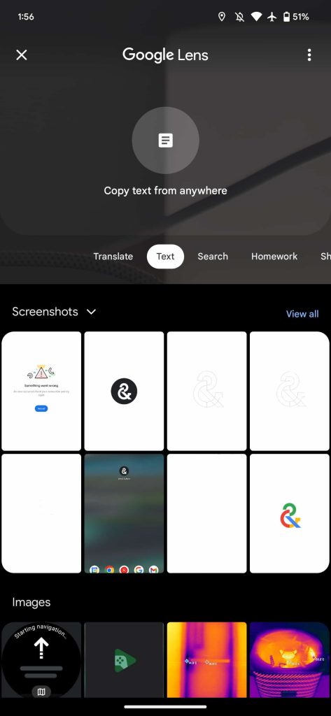
This new background also makes possible a light theme, which is most noticeable in the gallery UI that shows your grid of Screenshots and Images. Before this, Google Lens only supported light/dark themes when looking at visual search results. It’s now more consistently applied. The white background can be distracting when using Google Lens in a darker scene, but it’s otherwise fine.
We’re seeing this change live with the latest Google app (beta version 14.30) and on iOS.
More on Google Lens:
- Bard now in Europe, supports 40+ languages, pinning chats, and Lens
- Google Lens can now identify rashes and other skin conditions
- Chrome ‘Search Companion’ will use Google Lens to add context to the web
- Google Lens screen search coming to Assistant on Android
FTC: We use income earning auto affiliate links. More.


Comments