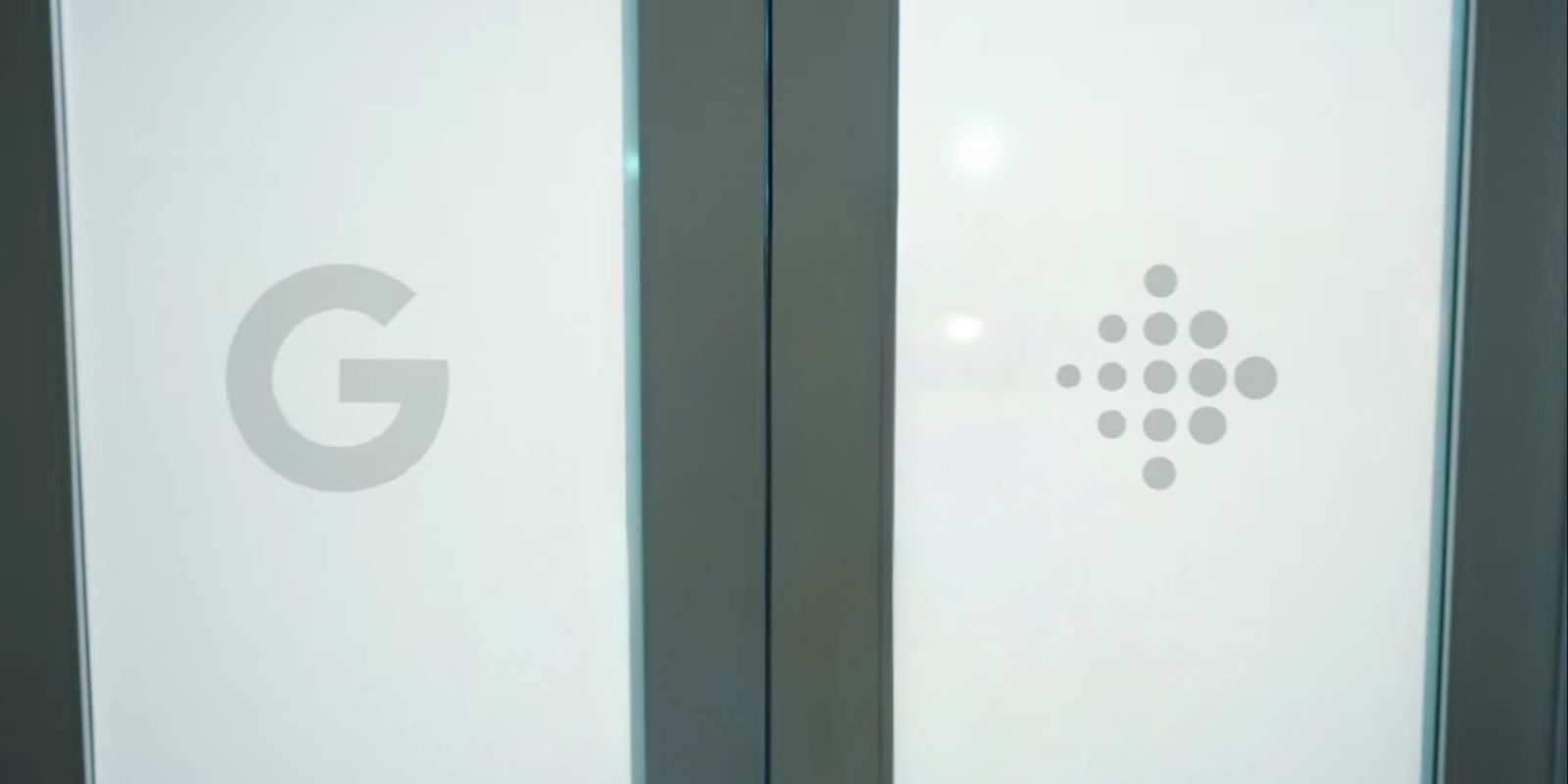
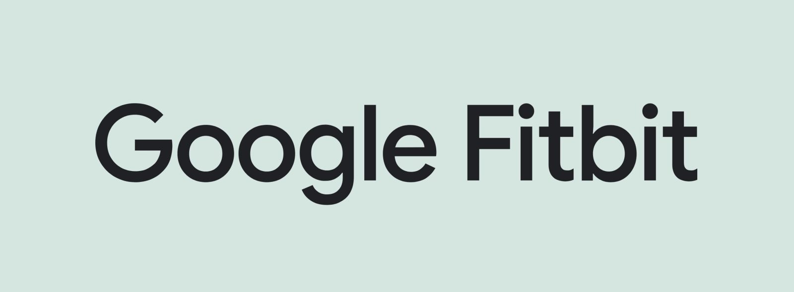
This is the least important part of Fitbit’s absorption into Google — seriously, where is the dark theme — but I hope its logo and brand identity survives. I’m specifically referring to the arrow logo comprised of dots, lowercase “fitbit” wordmark, and soothing green/teal color palette.
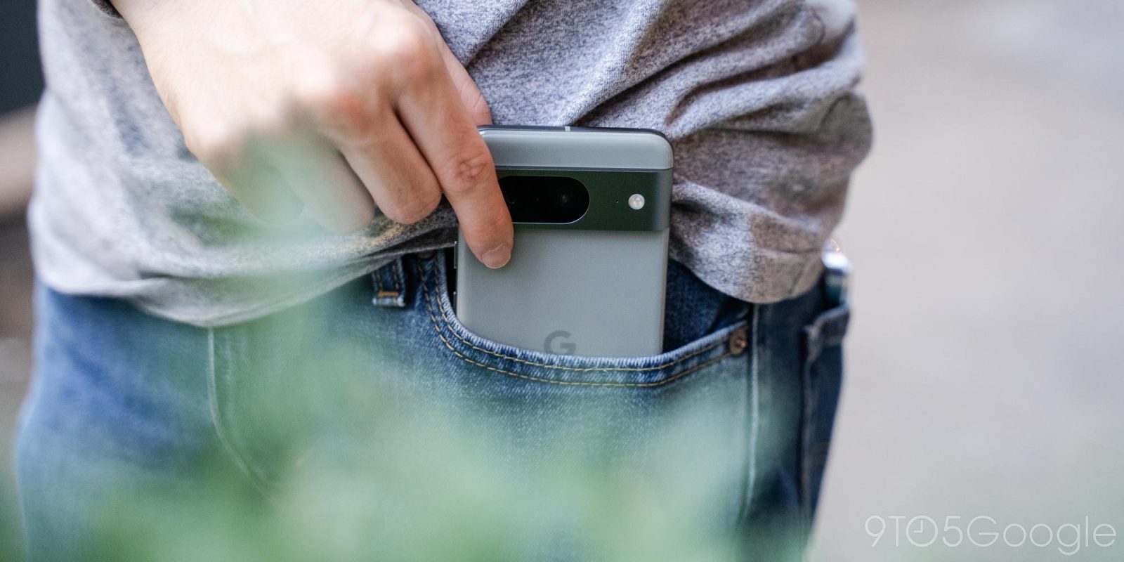
Expand Expanding CloseI hope the Fitbit logo remains or: The boringness of the ‘G’