
Fonts

See All Stories

SamsungOne font becomes the company’s official universal typeface for all of its products

samsung-one

Following Google and Apple, Samsung is the latest company to design its own font to represent its brand. SamsungOne is a universal typeface that will be featured on everything from smartphones to appliances. Reflecting the company’s global presence, SamsungOne is a family of scripts that covers 26 writing systems, more than 400 languages, and over 25,000 glyphs.


Expand
Expanding
Close

Google Fonts just got a huge Material Design overhaul, and it’s beautiful [Video]

Site default logo image

Google Fonts 2016-06-15 13-16-03

Google has today completely revamped its longstanding Google Fonts website with Material Design, making it easier — and more beautiful —  than ever to browse and try out the site’s huge collection of open source designer fonts. The old Fonts site — which first launched in 2010 — was practically begging to be reborn, and today Google delivered…


Expand
Expanding
Close

Site default logo image

Google officially introduces Literata, the new default font for Play Books

literata_1

Google today introduced its new default font family for Google Play Books, tweeting to show off the new typeface and saying that it’s “perfect for long reads on all devices.”

The new typeface default was actually included in Play Books version 3.4.5, released May 6th, alongside a new card-based interface for text translation and the ability to create notes in book samples. This, however, is the first time that Google has drawn any attention to the new font which replaces Droid Serif as the default.

The company commissioned the font from Type Together, a firm focused on creating new type designs tailored for corporate use. The group often works alongside companies like Google, and here’s what the design firm said about the challenge designing for digital books:

A new book typeface was needed that would provide an outstanding reading experience on a whole range of devices and high resolution screens running different rendering technologies. Additionally, the new Play Books type is meant to establish a recognisable visual identity for Google’s native eBook App and stylistically distinguish itself from other eReader competitors.

The electronic or digital book represents one of the most important challenge designers and developers face today. The technical limitations of devices regarding rendering of type, together with their variety of physical sizes, are only two of the main obstacles eBooks have to tackle. These facts contribute to an unfair yet appropriate comparison with their analog counterpart, where typography plays a leading role. The Play Books project offered an opportunity to approach some of these problems from a new perspective.

And further, how they arrived at the style they chose:

TypeTogether’s counterpart team at Google, lead by senior UX designer Addy Lee Beavers, agreed that the desired typeface should have a more interesting and varied texture than other fonts being used in eBooks or ones generally developed for on-screen use. This could be achieved by means of slanted stress, less mechanic letter structure and varied horizontal proportions of characters. Based on these premises and on an intensive iterative process, TypeTogether arrived at a solution of hybridisation taking inspiration from both Scotch and old-style Roman types. The resulting letterforms create a pleasant organic texture that helps to deliver very good results for ease of reading and comfort.

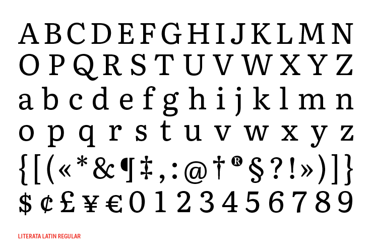
Literata most notably has a lower x-height and higher ascenders than Droid Serif, and features two different weights and matching italics. It includes PanEuropean language support—meaning that Western, Central, and Eastern European languages are all included—as well as type for full Latin extended, Polytonic Greek, and Cyrillic.

Type Together has made more pictures of the typeface available on Flickr.


Site default logo image

YouTube is now using Android’s official font

Screen_Shot_2015-05-13_at_9_43_58_AMIf you have a pair of sharp eyes and watch cat videos on YouTube a lot, you may have noticed today that the font used on Google’s video streaming website has changed. It is now Roboto, subtlety different from the previous font—Arial.

Roboto is the official type family used for Android. The font comes in several weights but the one Google has gone with is slightly lighter than what users may be used to compared to the Arial font. This will surely lead to some complaints about it being harder to read, but I think it looks fine, and going for consistency across platforms is logical.

The company previously tested the change with a small group of users, so they at least have data to back up their decision.

Have you noticed the new font? What do you think about it?

Site default logo image

Google Forms adds custom themes & new survey designs

Google-Forms-Custom-theme

Google announced today that it’s rolling out the ability to customize themes in its Google Forms web app. It’s also adding a number of new pre-made survey designs to the current selection of templates.

One of your top requests has been the ability to add your own personal touch to forms, and starting today you can with custom themes.

You can customize a theme using a new “Change theme” button in the toolbar (pictured above). From there, you can add your own photos or logos to the header, customize fonts and colors, pick a background, and more.

Google also gave a look at some of the new themes it’s added:

Google-Forms-Themes

More on adding custom themes in Forms here.

Google Web Fonts rebrands as Google Fonts, simplifies web interface

Site default logo image

Google has rebranded its font collection Google Fonts, which debuted in February 2011, dropping the ‘web’ from Google Web Fonts while still boasting its catalog of over 600 free, open-source fonts optimized for the web.

Google has also simplified the web interface with a more modern design, which allows users to view font examples in various formats, including word, sentence, and paragraph.


Expand
Expanding
Close