In addition to a trio of announcements around lists ahead of the summer travel season, Google Maps will be simplifying its bottom bar on mobile.
There will be a “cleaner home screen with fewer tabs.” Google confirmed to us that this is in reference to the bottom bar, and not the carousel of place suggestions/filters below the search field.
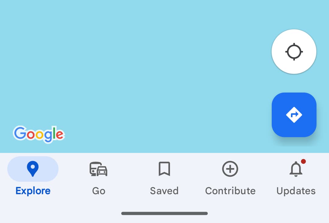
Right now, it consists of Explore, Go, Saved, Contribute (which looks somewhat FAB-esque with its plus icon), and Updates. We haven’t seen what the new design looks like just yet. It’s unclear if Google is removing them outright or consolidating to create new merged tabs.
Besides the bottom bar, Google is also introducing “new pin colors that make it easier to find places on the map.”
This follows the big color update to the map layer that launched last year, while there’s also the new interface for directions and the removal of fullscreen UIs.
More on Google Maps:
- Google Street View expands to Kazakhstan using pickup trucks
- Google Maps rolling out public transit directions on Wear OS
- Google Maps on Android Auto gives drive time a subtly bolder redesign
FTC: We use income earning auto affiliate links. More.
Comments