Slowly but surely, Google has been applying its Material Theme to Google Maps for Android. This week, it seems a server-side change has added Material Theme to the search interface of the popular navigation app.
Spotted by a handful of Android Police tipsters, a limited rollout is delivering a Material Theme interface to the search portion of the Maps application, at least on Android. The change doesn’t alter any of the functionality, but rather just gives the whole thing a visual makeover.
This includes more rounded buttons, the recent “wireframe” design on options like the Home and Work navigation shortcuts, and more. There’s also plenty of Google Sans, as well as some buttons in different locations. The “Choose on Map” button, for example, moves to the bottom of the screen rather than simply sitting at the bottom of the list.
This change has apparently been rolling out to some users for a number of days at this point. Personally, I’ve not been able to spot it on any of my devices. Hopefully, we’ll see a wider rollout soon. After all, plenty of other parts of Google Maps for Android have also adopted Material Theme designs.

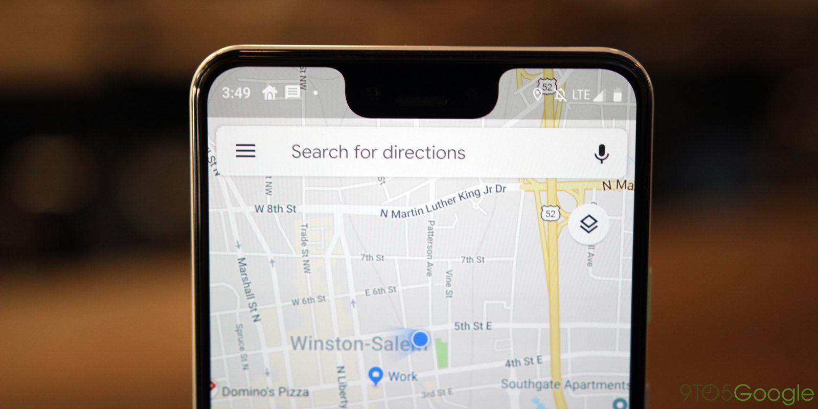
Material Theme on the search UI for Google Maps
More on Google Maps:
- Google Maps navigation lets users set departure or arrival times, rolling out now on Android
- Google Maps speed limits, speed camera alerts now rolling out widely on Android and iOS
- Assistant for Google Maps adds voice commands, replies w/ auto-punctuation, more on Android, iOS
Check out 9to5Google on YouTube for more news:
FTC: We use income earning auto affiliate links. More.

Comments