9to5Google has a rebooted newsletter that highlights the biggest Google stories with added commentary and other tidbits. Sign up to get it early in your inbox, or continue reading 9to5Google Log Out below:
Or rather the Google Fi Wireless logo. To begin with, I get why Google added “Wireless” to the end of the name as “Fi” does not particularly evoke cell service at a glance. Wi-Fi, I guess? (In fact, there’s a company called Fi that makes smart collars for dogs. It’s somewhat hilarious how that just happened.) However, the name is now a bit long, and begs to be shortened to “GFW.”
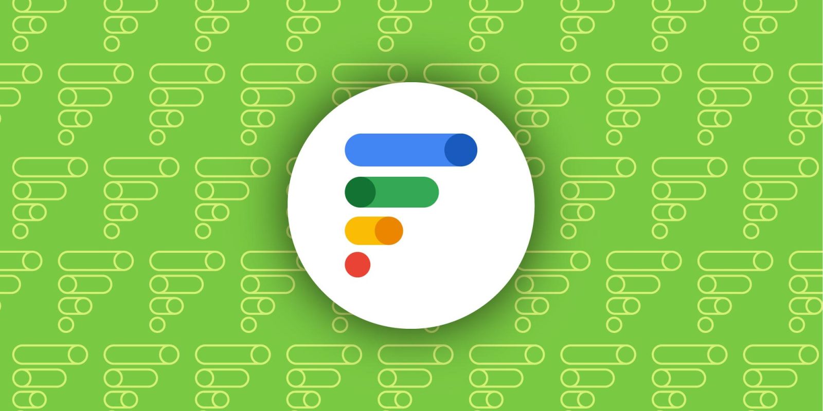
Anyways, to the main point. This new “F” logo looks different from any other modern Google logo/app icon. Yes, it’s using the company blue, green, yellow, and red, though there are actually seven colors in use.
Meanwhile, the four levels are made up of dots and pills that evoke modern Material 3 toggles. I believe this to be an homage to being able to easily control cellular service, which Fi does have going for it. Compared to other big carriers, Fi feels like the most modern one since everything can be controlled from the app, which is well-designed and modern and isn’t just a web view.
Another interpretation is that rotating the logo gives you cell bars, though the bars are descending instead of ascending if you don’t also flip it.
With this week’s rebrand, Google is heavily positioning Fi Wireless as a carrier for families. That’s another thing the logo’s switches (attempt to) convey. Speaking of that new focus, there’s a redesigned app with large people switcher in the app bar of the Home feed. The bottom bar is very clearly Material You, but the top is somewhat of a mix between chat heads and a touch of iOS. In a more minor nitpick, I’m not a fan of Material 3’s currently selected tab indicator. It’s definitely a holdover of Material 2, and I wouldn’t mind if it was modernized, though no good ideas come to mind.
Anyway, even with the colors and modern shapes, the new Google Fi Wireless logo feels alien to other first-party icons. The fact that it’s composed of four lines makes it very dense, especially when viewed as a homescreen icon or, worse, in the Android status bar. In those instances – which I’d argue is people’s primary interaction with it – the rounded shapes are not visible, and it looks like four rectangular lines, which is not very Google-y.
The one upside of that is how the icon stands apart from the similarity of Google logos – an extremely common complaint – so that could be a plus.
From 9to5Google
Decentralized Twitter competitor ‘Bluesky’ now has an Android app
The most interesting part about Bluesky is how similar the experience feels to Twitter. Fundamentally, I don’t think most users care about whether or not a network is decentralized, and Mastodon has been trying too hard to make joining an app feel like you’re making a technological statement, be it decentralization or microtransactions.
People just want an equivalent to Twitter, and I think Bluesky offers that and understands the appeal of something straightforward right off the bat. The complexity and decentralized aspirations feel much more hidden at this point, or they’re not at the forefront, at least.
Personally, I think decentralized technologies – at this point – come at the expense of a good and simple user experience. Bluesky might be the first to beat that.
I still think Google (YouTube), since the start of the current Twitter situation, should make a social network that’s just a real-time way to find out what’s happening and share. If not Google, I genuinely think a medium to large-sized company that has enough end-user awareness – which is the key here – could come in and do it. Microsoft or Meta (though their issue would be including every aspect of their network into a text-first app) could do it, and that would get people in the door.
Enabled: Android 14 Beta 1 preps custom lock screen clock, single-app recording, more [Gallery]
Google rolls out Android 13 QPR3 Beta 3 to Pixel
Video: The best Android launchers to use with your smartphone in 2023
Pixel season:
- The ‘Pixel Tablet Standalone Charging Dock’ will cost $129 per retail leak
- Google Pixel Tablet pricing starts to leak out
- Report: Pixel Fold will weigh 10 oz, offer water resistance, and cost over $1,700
- Google Pixel 7a leak points to Face Unlock support
- Pixel Fold leak details full specs, free Pixel Watch perk, more
- Here’s a real-life look at the Pixel Tablet, including new coral color [Gallery]
Comment: Google Discover is showing ‘Quotes for you’ – this is what Google Now died for?
What (else) is happening
Humane demos combadge-like wearable with projected screen [Gallery]
Google Assistant will stop speaking after turning on smart home devices
Upcoming Reddit changes may spell the end of free third-party apps
Facer brings 3D watch faces to Wear OS
Google Bard can now write, debug, and explain code
Google DeepMind is now the company’s combined AI team
YouTube tests removing the long list of playlists in your Library on Android, iOS
Latest Acer Chromebook Spin 714 is first ChromeOS device w/ 13th Gen Intel Core chip
From the rest of 9to5
9to5Mac: Apple makes headway on Reality Pro development, leaves testers ‘blown away’
Electrek: Tesla (TSLA) crashes despite strong earnings; is the credibility going away?
FTC: We use income earning auto affiliate links. More.


Comments