Material Design


YouTube is likely the Google product with the most frequent set of changes. Over the past several months, the company has been testing a series of new features for its mobile and desktop experiences, and today they are all launching alongside a refreshed logo.

In addition to opening sign-ups for the Indie Games Festival today, Google is now taking nominations for the 2017 Material Design Awards. A more open selection process this year will look at Material experiences on both iOS and the web.
Google News has received a massive redesign on the web that focuses on readability and simplified navigation. Feature-wise, it has more personalization, while better highlighting different perspectives and fact-checking.
After several months of testing, YouTube is finally rolling out a redesign of its Android app to all users. A new bottom bar is the primary change, with core parts and navigation of the app otherwise remaining unchanged.

The Material Design website got a complete revamp last year, and since, Google has continually added more content and useful information. Recently, Material Design even got its own Twitter account. Now, the Material Design site has been updated with Material Components to “make it easy to build user experiences with Material Design on Android, iOS, and the web.”
Google’s Material Design language continues its crawl into the nooks and crannies of the Mountain View company’s various web properties today, this time with the Android Open Source Project website. The website has a new, cleaner design that leaves much of the same functionality but makes it easier to access and prettier overall…
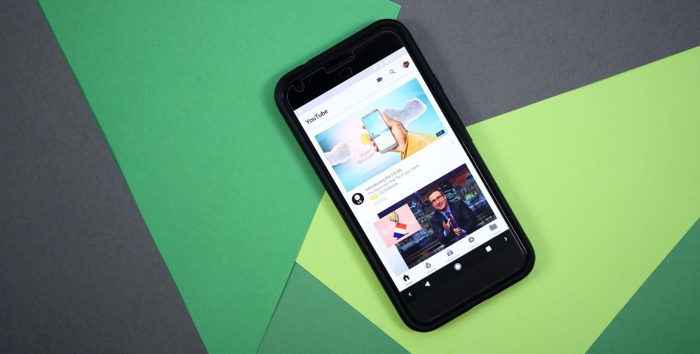
From minor tweaks to entire redesigns, Google is notorious for A/B testing a number of different versions of its YouTube app at the same time. The latest has the Android client adopt a bottom bar in line with many of Google’s other Material apps…
Material Design is adding more guidance on color systems and usability, with a new tool to easily design palettes when creating interfaces. The April 2017 guideline update also adds new recommendations for text fields and designing right-to-left icons.
Material Design, the design language that Google introduced alongside Android 5.0 Lollipop in 2014, now has its own Twitter account. It’s not exactly clear what the account will bring to the table beyond the things that the Google Design account shares, but I think it’s safe to say that it will be Material-related things, of course.
Google Chrome’s extensions page (chrome://extensions/, if you’re using Chrome) hasn’t changed in quite a while. Now, François Beaufort, Chromium evangelist at Google, points out that the Mountain View company has added a nice new Material Design extension page in the latest dev build of the browser…
Back in May, a minor tweak was made to the Google bar found at the top of all the company’s web apps. Now, the notification panel is receiving a Material revamp that also improves the loading speed.
Chrome OS 56 is now available in the stable channel with some visual changes. The bottom shelf and system menu have received a Material redesign, while an updated version of the ChromeVox tool simplifies navigation for the visually impaired.
Nicholas Jitkoff, a principal designer at Google since 2006 is leaving the company to be Dropbox’s vice president of Design (via TechCrunch). Responsible for helping create and lead Material Design, Jitkoff worked with product teams around the company to consistently deploy the design language.
After expanding Material Design to encompass design and prototyping tools, a new suite of modular and customizable UI components will make it easier to design apps in accordance with Google’s guidelines. Material Components will help developers implement Material Design on Android, iOS, and the web, with a preview now live on GitHub.
Announced two years ago, Material Design has yet to make its way to the most visited site on the web. There was an A/B test of Google Search back in June, but nothing came of it. The latest iteration seen by a few individuals is subtle, but noticeably different.
If you’re a consistent Spotify user on Android, you probably noticed that something’s a bit different today. It seems that Spotify has finally flipped the server-side switch to enable bottom navigation for all users in the stable channel, which means one fantastic, wonderful thing: no more hamburger menu.
Chrome OS 56 has just been released to the developer channel and along with bringing Android apps to a few new Chromebooks, it also brings along a few interface tweaks which introduce a bit more Material Design to Chrome OS…
Material Design was announced in 2014 as a cohesive design language for both first and third party web and mobile apps. Google is now expanding Material to be a “system that supports the principles of good design and strengthens communication and productivity” with a new suite of tools and open source projects (via The Verge).
Ever since the introduction of Material Design way back at 2014’s I/O, Google has put a lot more emphasis on design than ever before. “Google Design” itself became a thing, and among the initiatives promoted by the company to bolster its overhauled aesthetic sense, there are proper MD “Awards”, whose 2016 winners have just been announced…
Despite its recent foray in the hardware business, Google is first and foremost a company that relies on advertising. And so, in turn, lots of people rely on the company’s own online monetization tool, AdSense, whose website just got a Material Design coat of paint…
Earlier this year, Google added bottom navigation bars to the Material Design spec. Top navigation tabs are still permitted, but apps like Google Photos and Google+ have prominently switched over to the new style. Wikipedia is now the latest to adopt these bottom navigation bars across its Android app…
Geekbench, one of the most popular benchmarking applications on Android, has just been updated to version 4.0 — packing a few improvements. These include a new Material Design user interface, improvements to its CPU workload benchmark,, and the introduction of the GPU compute workload benchmark…
Over the past few years, Google has slowly been transitioning its apps and services to a material design UI. Now Google has applied these changes to the Goo.gl URL shortener. The new and improved appearance not only looks better, but it adds some better functionality to the service as well.
The Drive web app has received a slight revamp this morning that brings it in line with the Material Design of current Google sites. Additionally, Drive on the web is getting better downloads support, especially for large files and Google Forms.