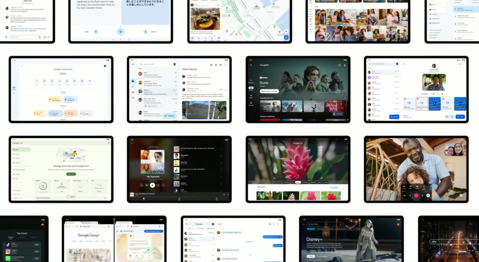
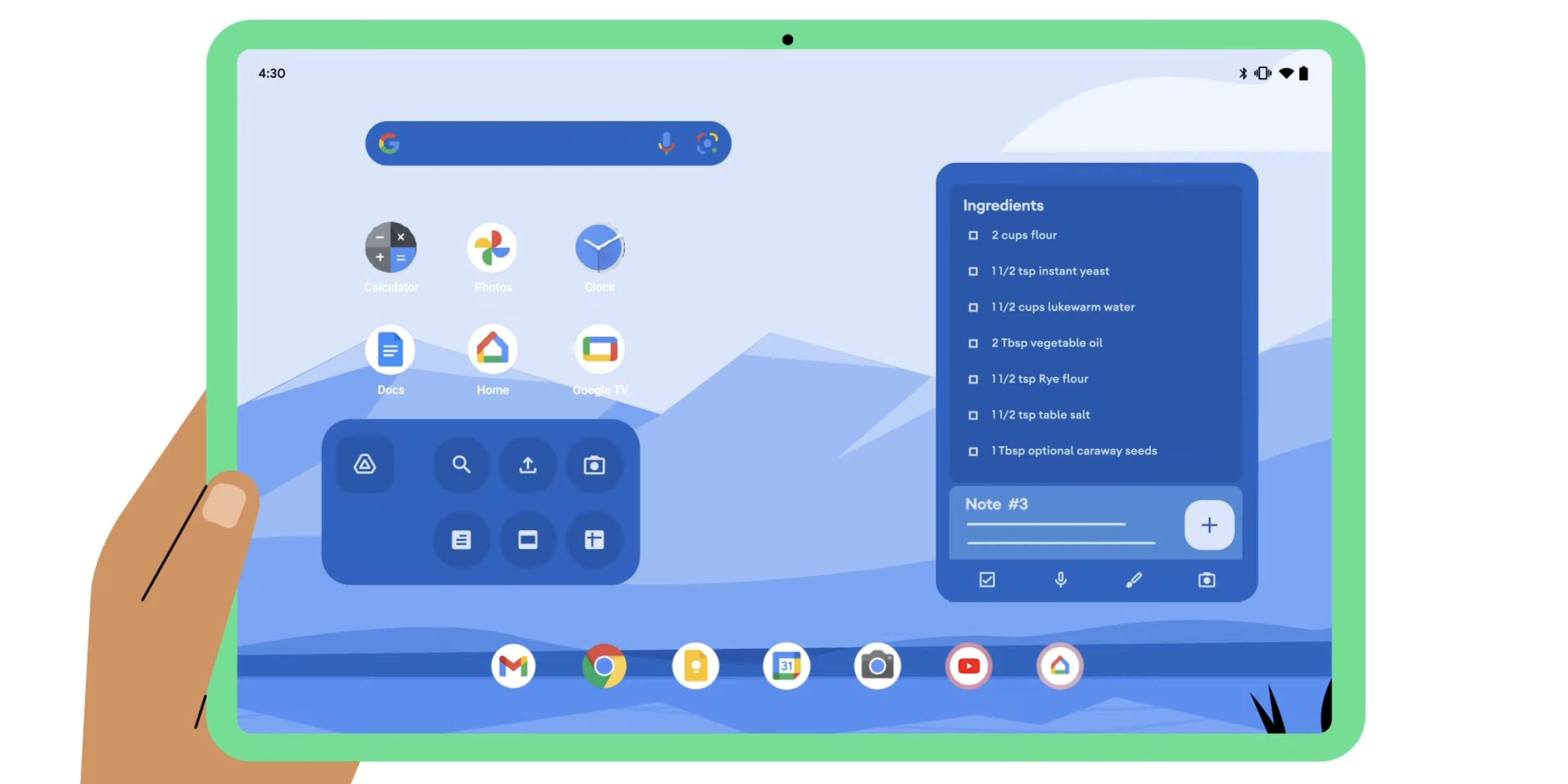
At I/O 2022, Google announced that it will update over 20 of its first-party apps for large screens in a show of its commitment to the form factor. This will undoubtedly improve the experience for existing owners and is meant to encourage other developers to do the same. Here’s every Google app on Android that has a tablet update and what’s still to come.
—Gboard IV
Update 2/17/24: Gboard is rolling out a toolbar when you connect (wired or wireless) a physical keyboard. This pill appears at the bottom of the screen by default, but can be moved anywhere. It serves as a suggestion strip and is flanked by a button that shrinks the toolbar down to a vertical pill on the left/right edge. An overflow menu provides access to clipboard, translate, and the full keyboard, while providing quick access to supported shortcuts.

Google, on the Pixel Tablet, is rolling out an Assistant voice typing toolbar so that the full keyboard doesn’t have to remain visible during transcription. The overflow menu is unchanged and you can move it around like the physical keyboard version.

—Google Docs, Sheets, Slides IV
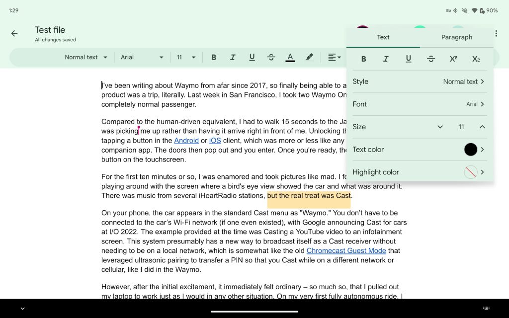
Google Docs/Sheets/Slides on Android tablets now offer a Format sidebar as an alternative to the toolbar. Tapping the button at the end of the strip opens a panel that appears to the right of the page(s). Besides better spacing, you get access to more controls in this persistent UI.

~
—Gboard III
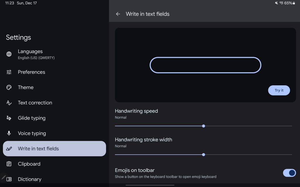
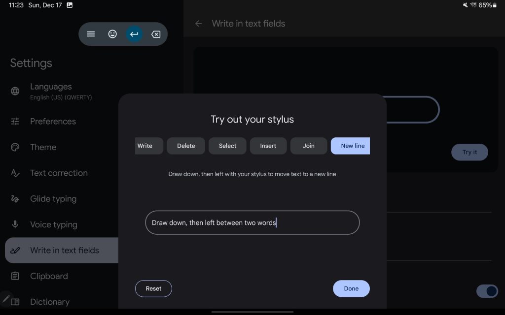
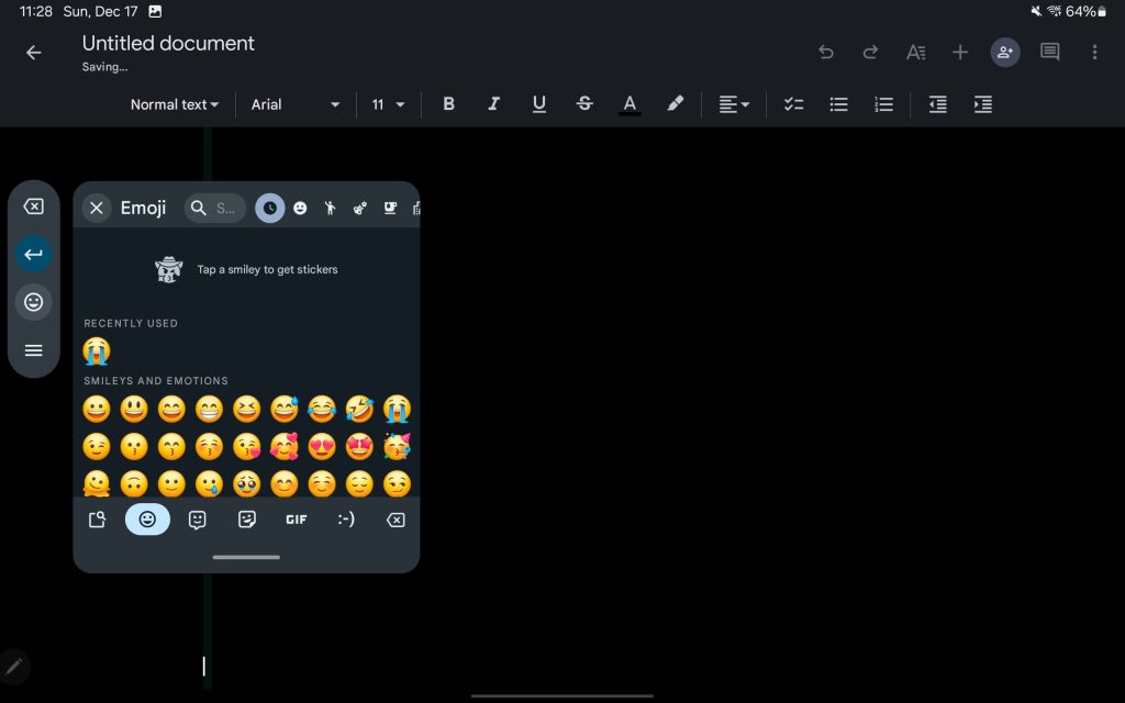
Update 12/22/23: Gboard’s new stylus handwriting support lets you “Write in text fields” with a stylus. Gestures let you delete, select, insert, join, and add a new line. As you write, a floating “keyboard toolbar” provides shortcuts, like the ability to launch an Emoji window and quickly switch languages. You can move this pill-shaped floating panel anywhere.
We’ve so far seen this on Pixel and Samsung Galaxy tablets. Meanwhile, the old handwriting approach, which gives you a dedicated keyboard surface, remains.
—Chrome III
Chrome now defaults to loading a website’s desktop mode on “premium” Android tablets, which Google defines as devices with at least 8 GB of RAM and a 10-inch or bigger display.

—Gmail II
Earlier this month, Google finally started rolling out the navigation rail to Android tablets after first introducing it on foldables. You get to see an additional line of text on the last (seventh) email due to the bottom bar’s removal, but you do lose some width because Google added the nav rail to the message column/list without changing the space for the email body.


~
—Google Maps
Update 11/26/23: The Google Maps bottom bar no longer spans the entire width of your screen. On foldables, it takes up half the screen, while it’s just under that on tablets. This matches the search bar on the sheet of info.
—Google Drive II
At this point, the UI of Google Drive on tablets is basically the website. This includes a tappable folder hierarchy that gives you an idea of where you’re browsing and allows for easy navigation. You also now get “Last modified” and “Storage used” columns in the list view, though this replaces the two-column layout.
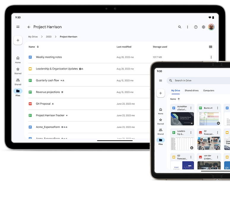
There’s also now a two-page view for PDFs by tapping the new button in the top-right corner of the toolbar.
—Gmail
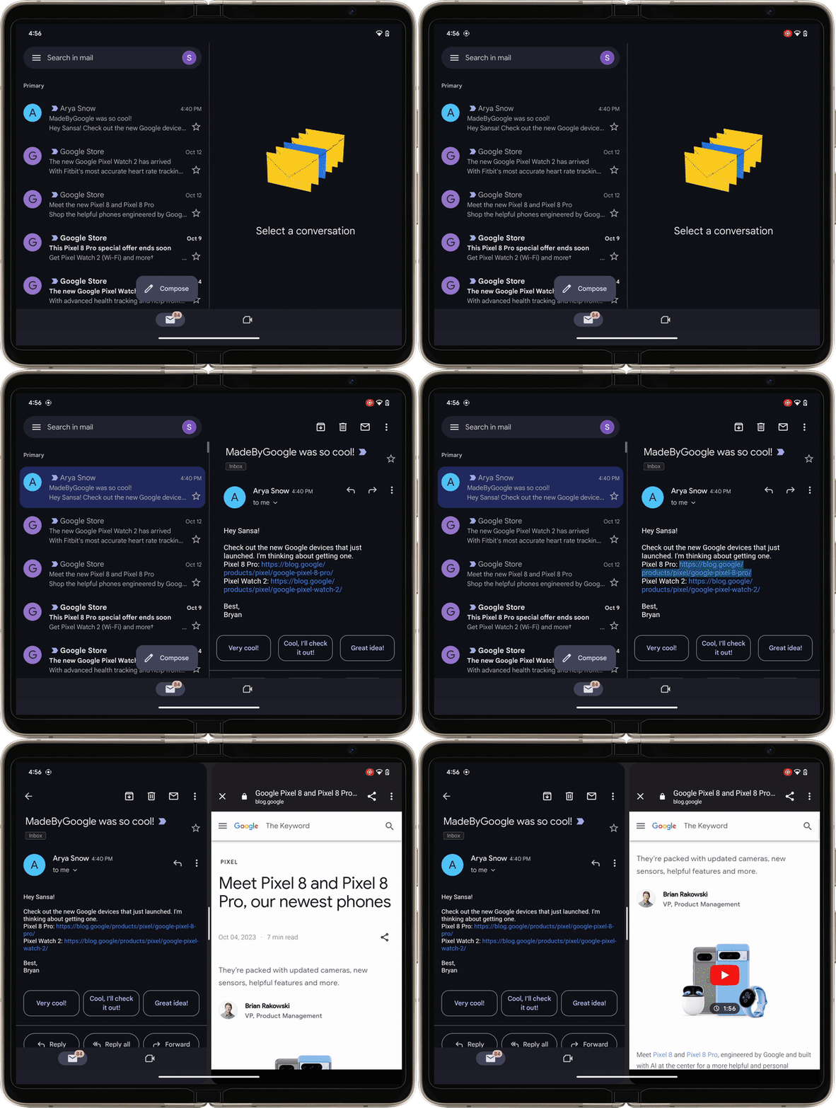
While a navigation rail exists on foldables, Gmail for Android tablets still uses a bottom bar. However, it did gain the ability to open links in a side-by-side Chrome Custom Tab instead of taking over the entire screen. The inbox/message list disappears from the left half and is replaced by the message body. Shrinking the web page will give you three columns of information.
~
—Google Docs, Sheets, Slides III
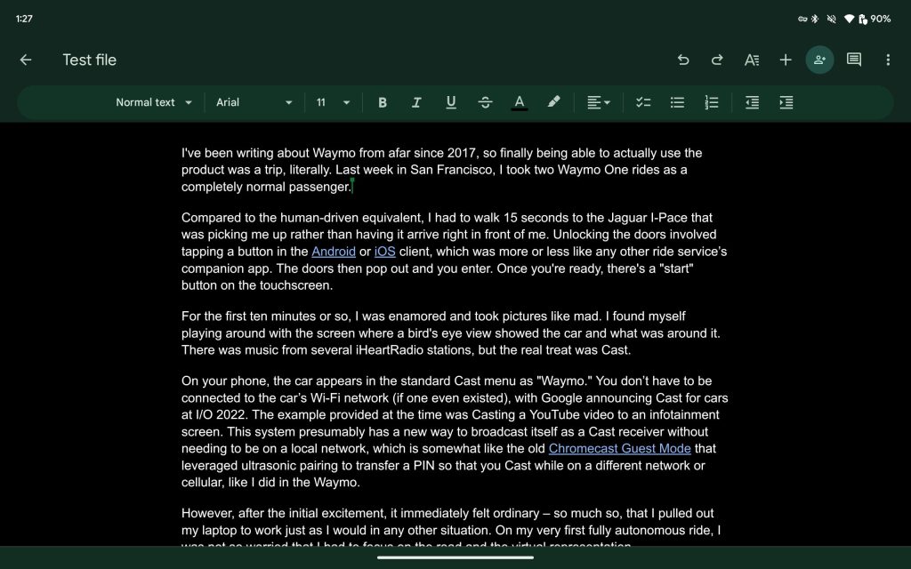
Update 9/10/23: Google Workspace’s editor apps on Android now look like their web counterparts. Instead of a solid app bar, there’s a pill-shaped Material 3 toolbar for font and formatting.
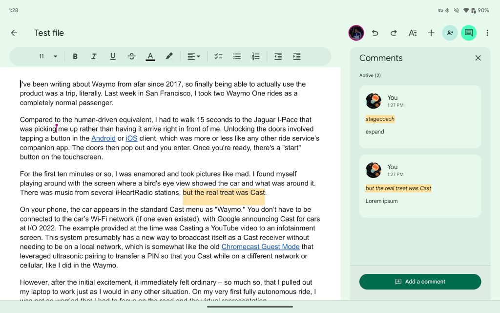
Other controls for undo/redo, text/paragraph (pop-up panel), insert, etc. appear in the top-right corner, along with live live collaborators. There’s also a side panel for comments, while Docs now defaults to opening in paginated and editing modes.
~
—Files by Google II
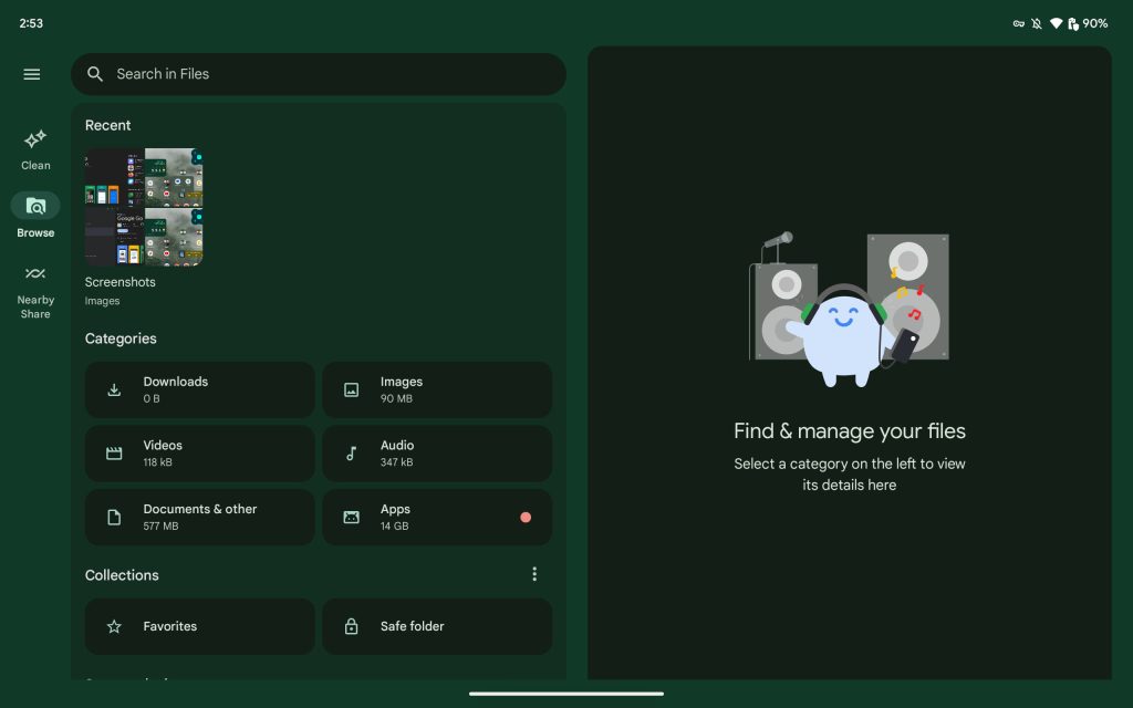
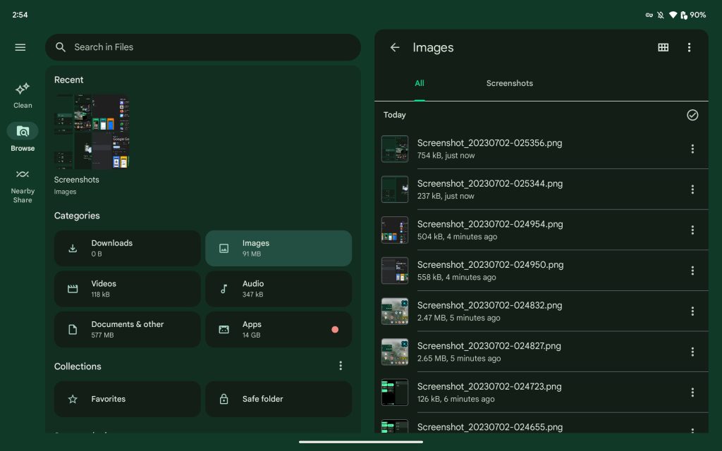
Update 7/2/23: A dual-column view lets you “select a category on the left to view its details [on the right].”
—Play Books
Google Play Books adds a navigation rail as we wait for Material You tweaks — amusingly, the app has had a M3 widget since March of 2022 — and you got the (new) app logo in the top-left corner. A search bar appears at the top along with top tabs (in Library) and a carousel of filters.
—Google Play Store III
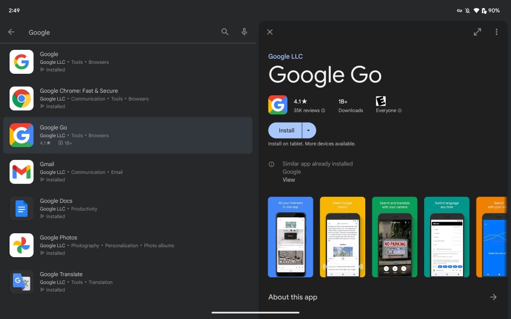
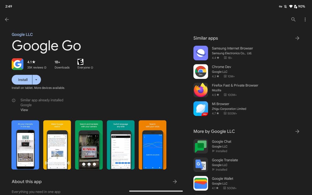
Dual-column layouts are leveraged when viewing search results and in app listings to see suggested downloads.
—Google Calendar
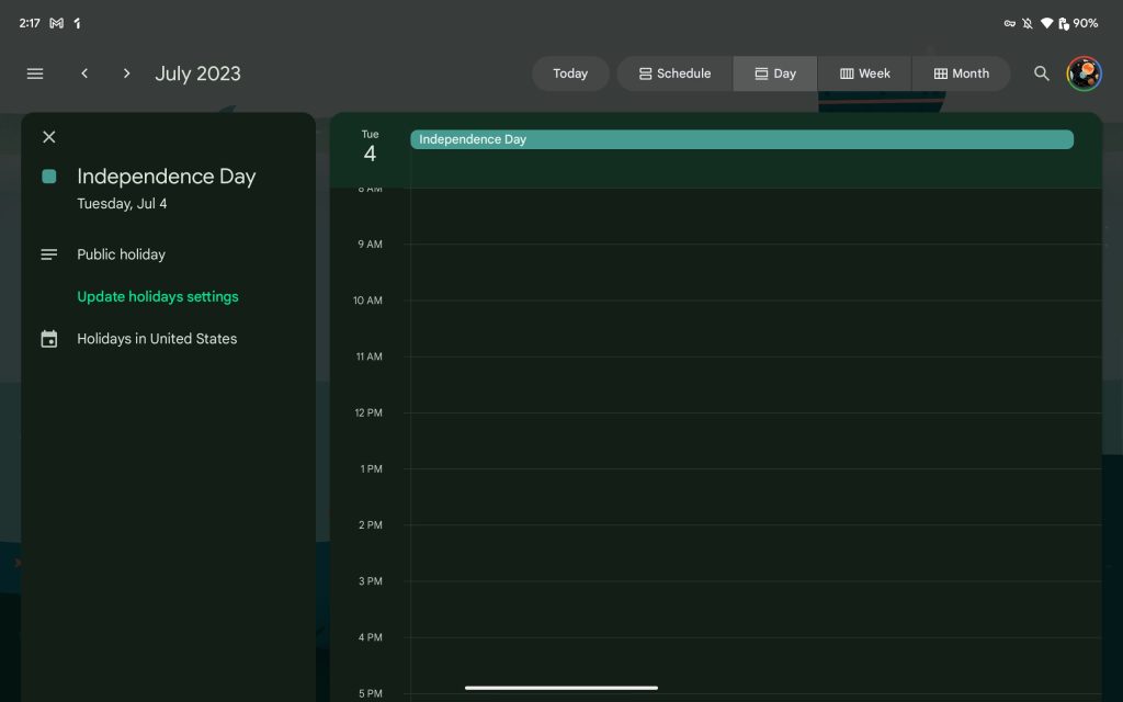
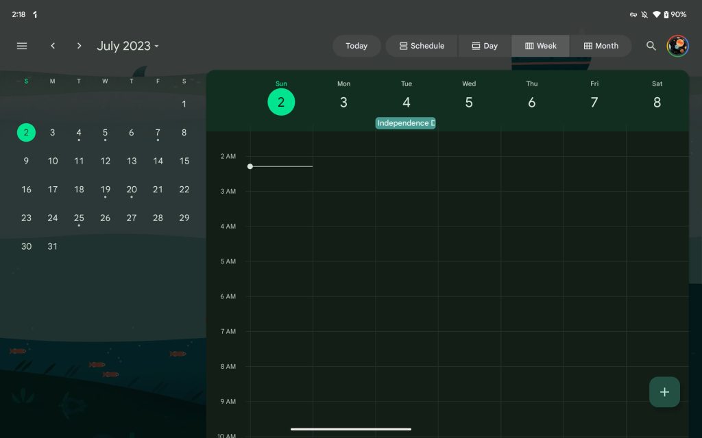
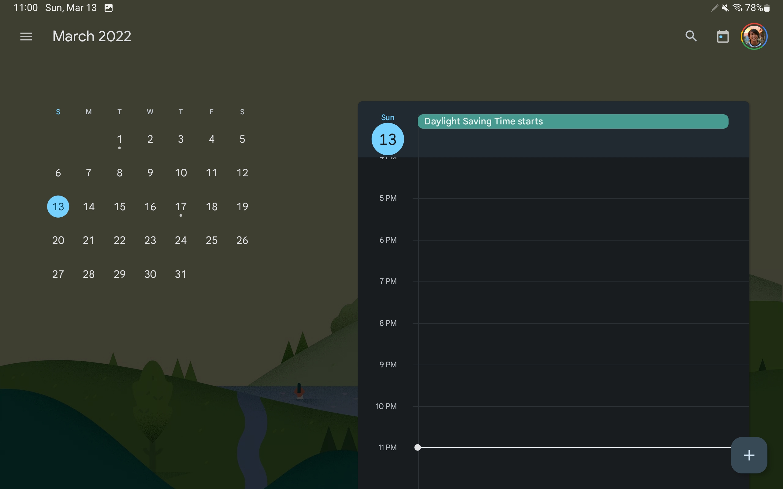
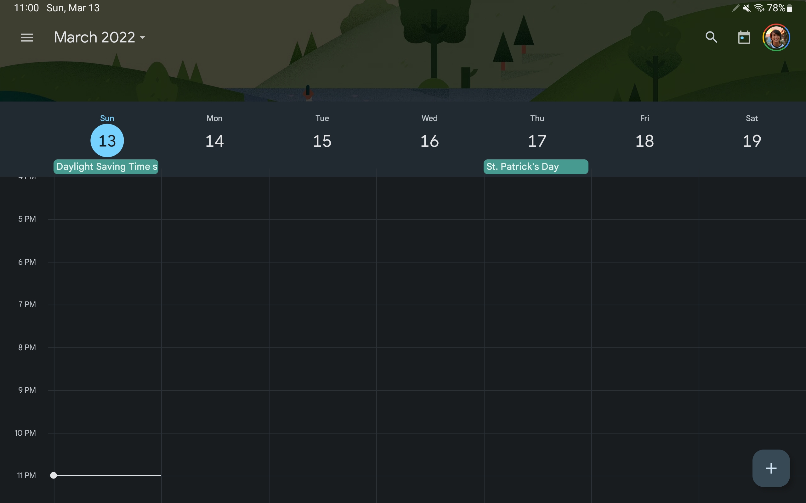
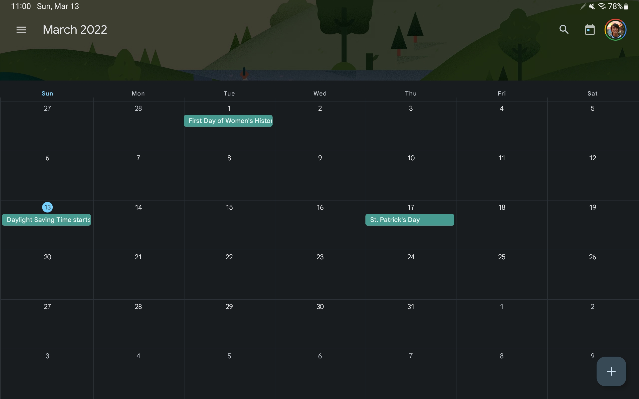
On tablets, Google has moved Calendar’s Schedule, Day, Week, and Month views — 3 days not offered — to the app bar. The first three display an always-visible monthly calendar at the left. That column is also where events you open appear and remain until closed.
—Google Weather
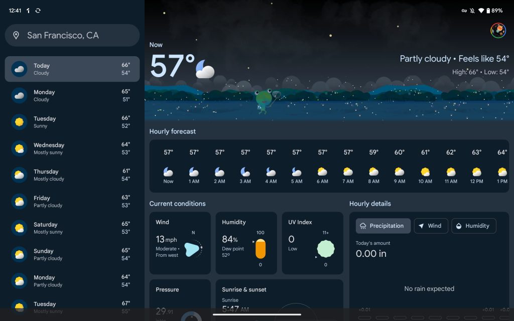
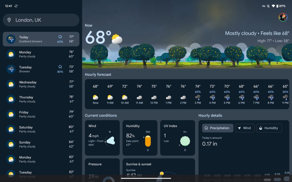
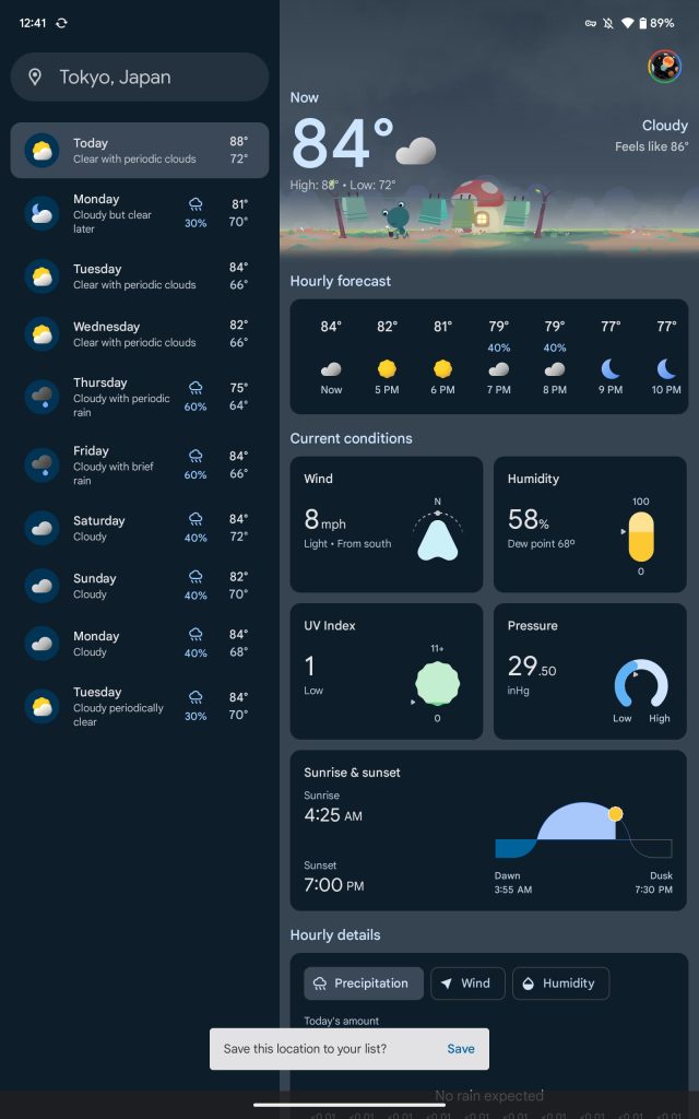
Google Weather features a sidebar where the 10-day forecast appears with high/low and condition. A search bar at the top notes your current location with a tap showing saved cites.
A “Now” section consists of the Froggy weather mascot with animations that reflect the current condition, like a shining sun and moving clouds. You also get the “feels like” temperature here.
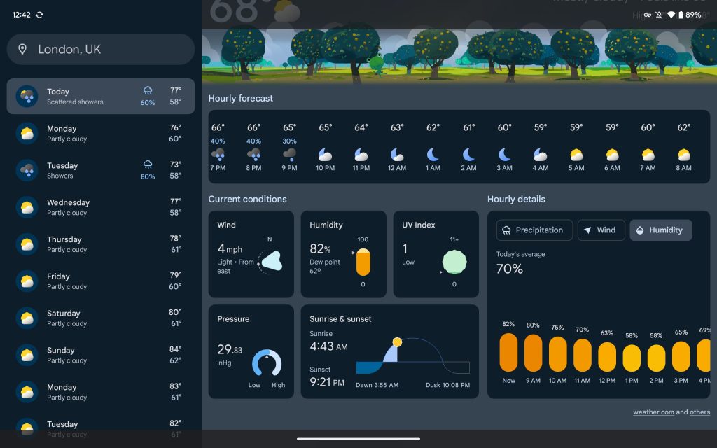
This is followed by a 24-hour forecast carousel with cards — Wind, Humidity, UV Index, Pressure, and Sunrise & sunset — for “Current conditions.” Next to that is “Hourly details” by Precipitation, Wind, and Humidity.
—Pixel Recorder
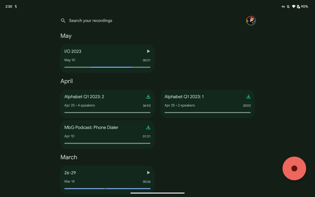
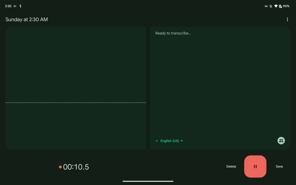
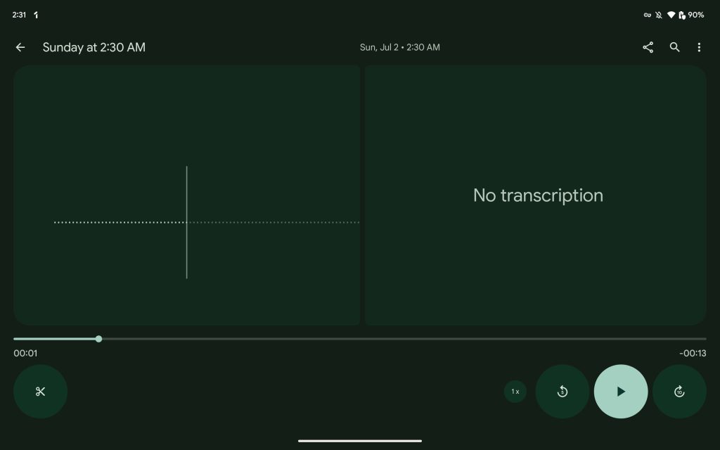
Recorder on the Pixel Tablet (and Fold) leverages dual-column layouts throughout the app. On the home screen (large FAB in the bottom-right corner), you can view more of your recordings per screen. It extends to the player and when recording for a side-by-side waveform and transcription.
~
—Google Home II
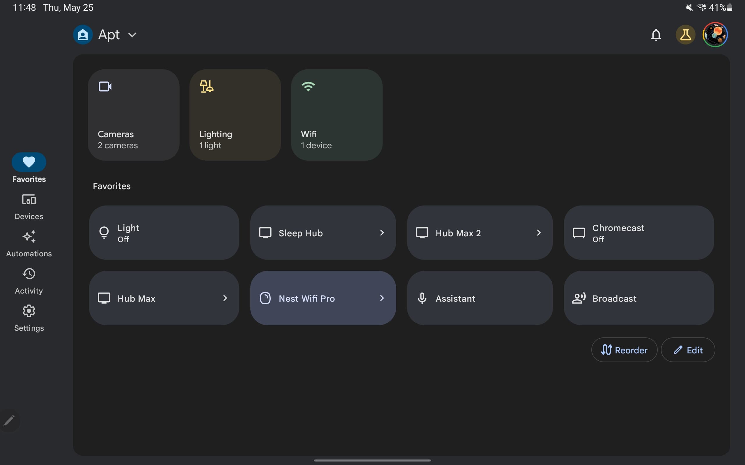
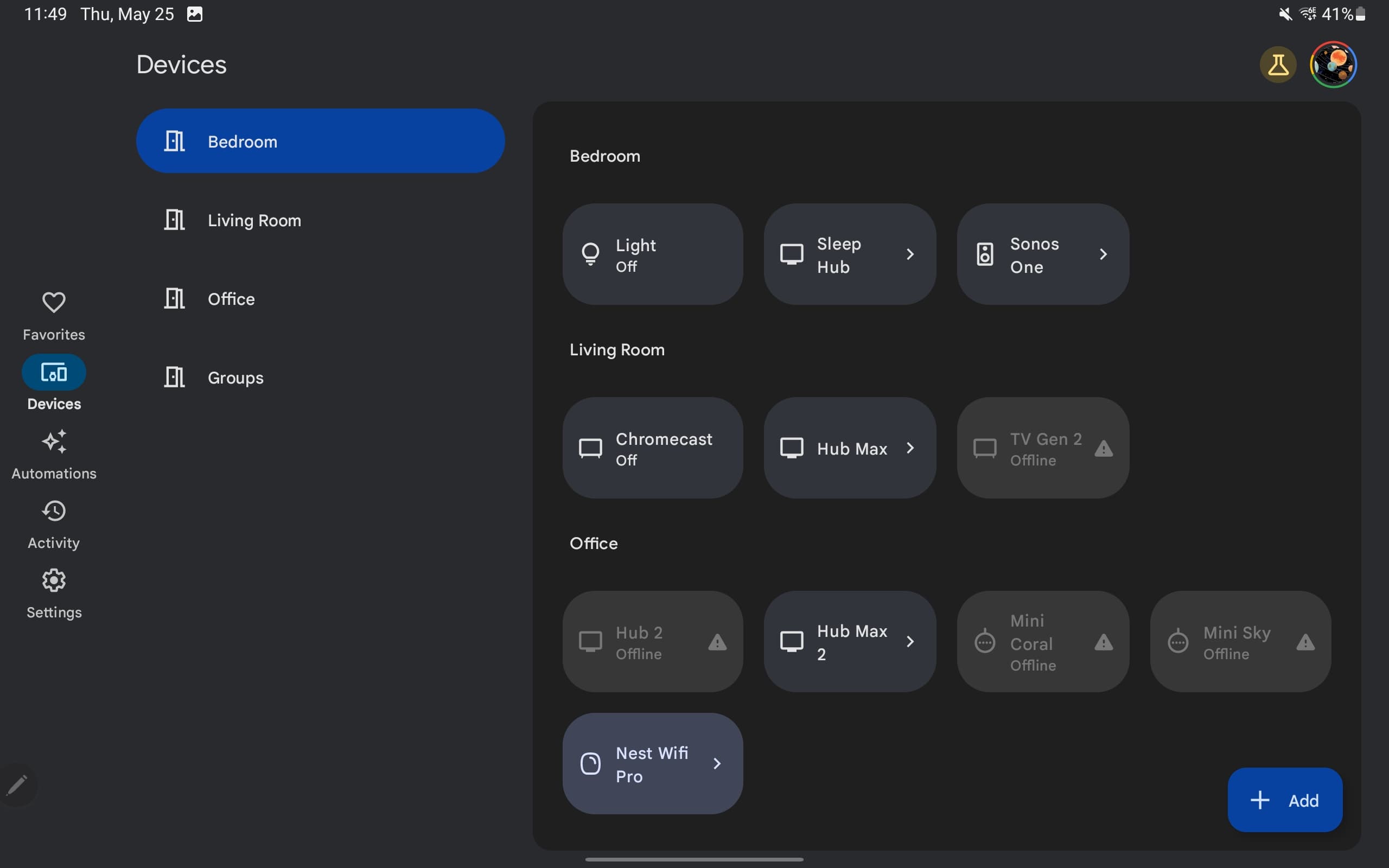
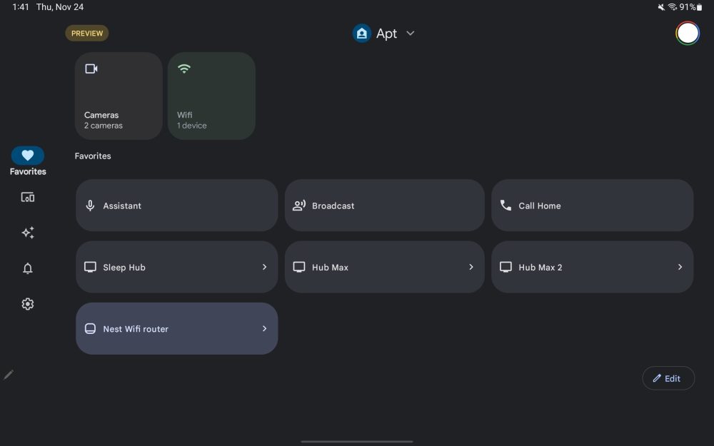
Update 6/11/23: In exiting preview, the Google Home app also rolled out some tweaks to the tablet UI. This includes placing the contents of each tab in a container, while there’s a secondary navigation drawer when viewing Spaces in the Favorites tab and in Devices.
—Gboard II
Following the large screen layout in October, Gboard now has a split keyboard that works quite well given how Android tablets are typically pretty wide. You have the ability to have keys duplicated on the left and write, while switching to the standard layout is quite fast.
~
—Google Drive
Update 4/4/23: Navigation rail with four tabs, navigation rail, and Create FAB. A search bar spans two-thirds of the screen, while settings and your account avatar appear at the top-right corner. Overall, it looks a lot like the desktop website.
—Google Keep III
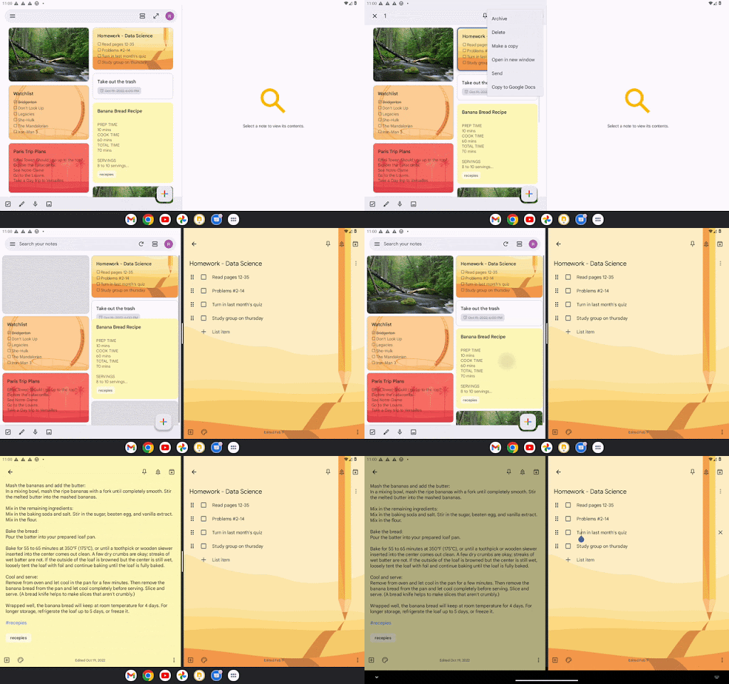
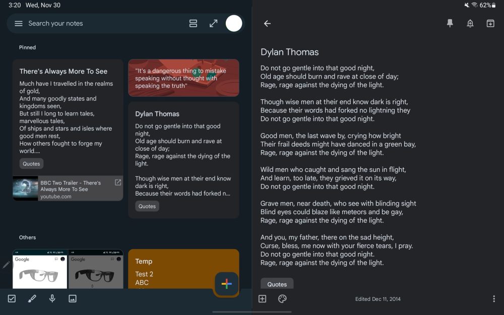
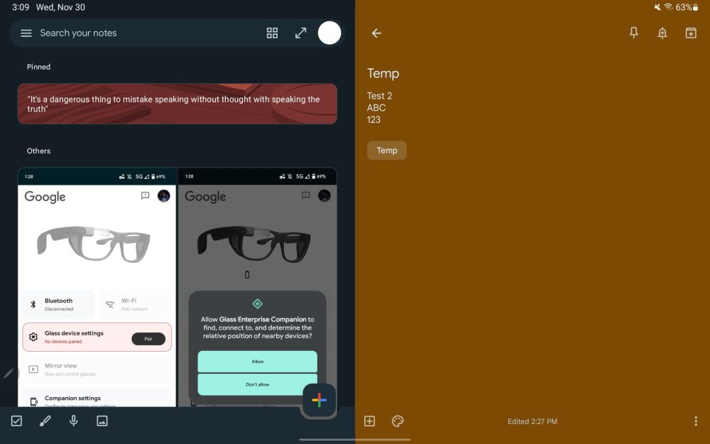
Long-press on notes to open side-by-side in a new window. There’s also the Single note widget.
—Google Contacts
Google Contacts has been updated with a navigation rail and dual-column UI where your list of people appears at the left and details are at the right. The search bar doesn’t span the entire width of your screen here. The app’s other tabs have not been updated.
~
—Google Meet
Update 12/21/22: Google Meet has a two-column UI in both portrait and landscape orientations. The homescreen shows your call history, as well as upcoming meetings, on the left. Tapping loads the contact details page on the right for a nice info-dense interface. This dual-column layout is also found in the Meet tab of the Gmail app.
The previous UI was just a stretched out list view that did not take advantage of the available screen real estate, especially in landscape.
~
—Google Docs, Sheets, Slides II
Update 12/9: Given the available screen real estate, Google is putting the live collaborator avatars into the app toolbar. To the right of the document name, you’ll see who is currently viewing a file, just like on the web. This information was previously housed in the overflow menu. This should apply to Google Docs, Sheets, and Slides.
—Google Keep II
Keep’s dual-pane redesign has widely rolled out with a key tweak that lets you quickly switch between the Full screen and Dual pane views. This button appears in the search field next to your profile avatar.
~
—Google app
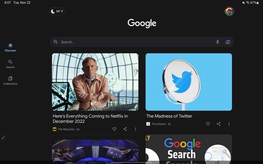
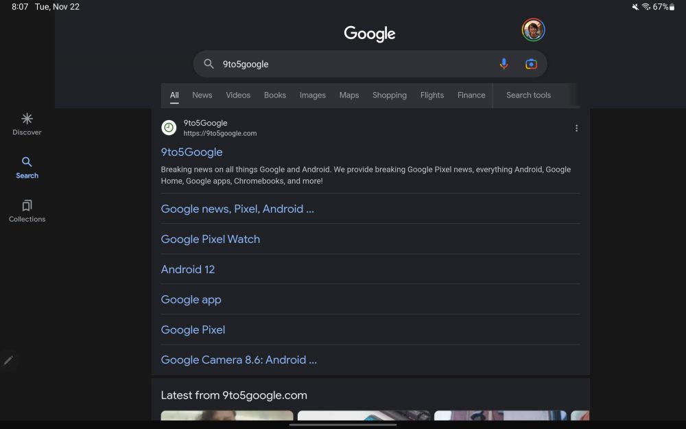
Update 11/24: The Google app has switched to (beta version 13.46) a navigation rail that’s positioned just above where you’d place your thumb rather than being centered, top, or bottom-aligned. It’s used for the Discover feed, Search results, and Collections tab.
This will presumably get updated to Material You in the future, while Google should play around with padding so there isn’t as much empty space and more content.
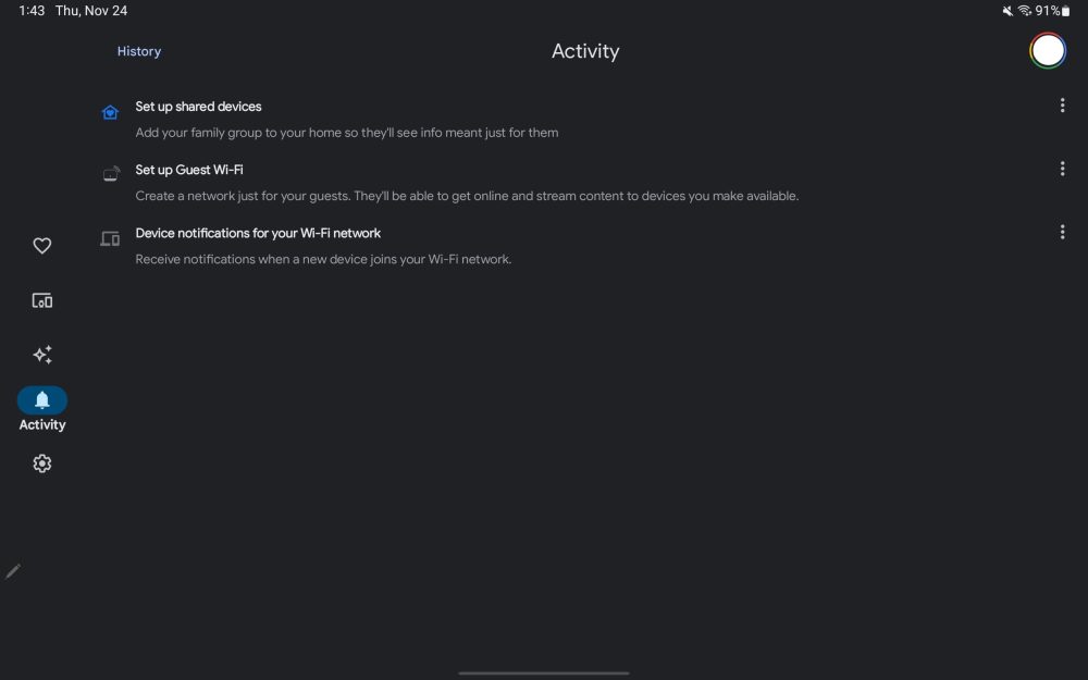
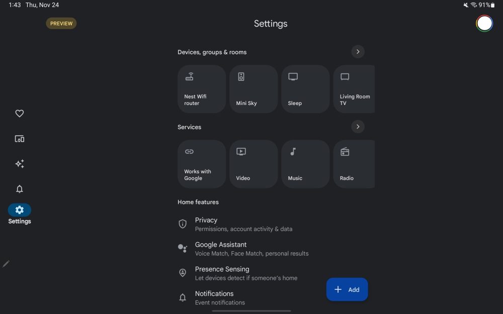
—Google Home
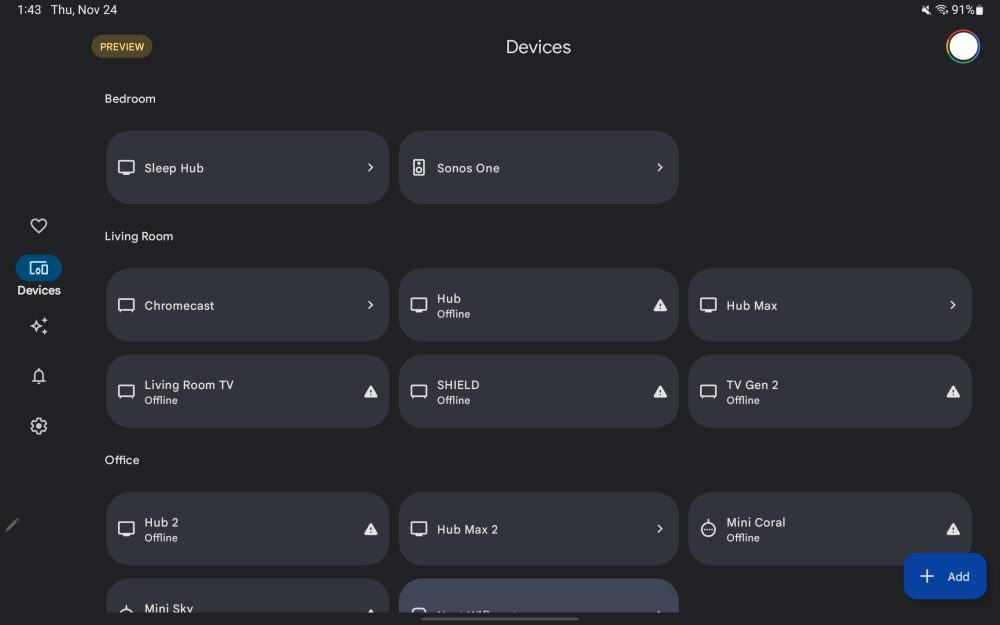
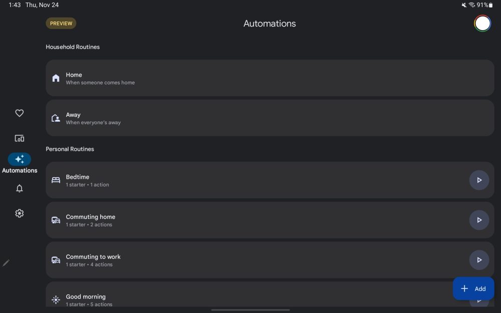
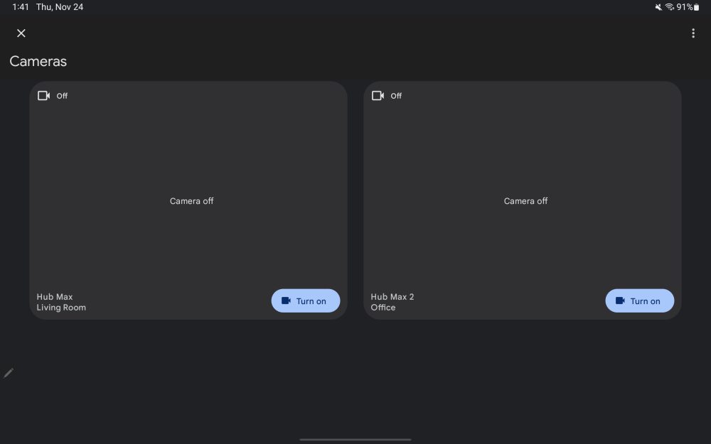
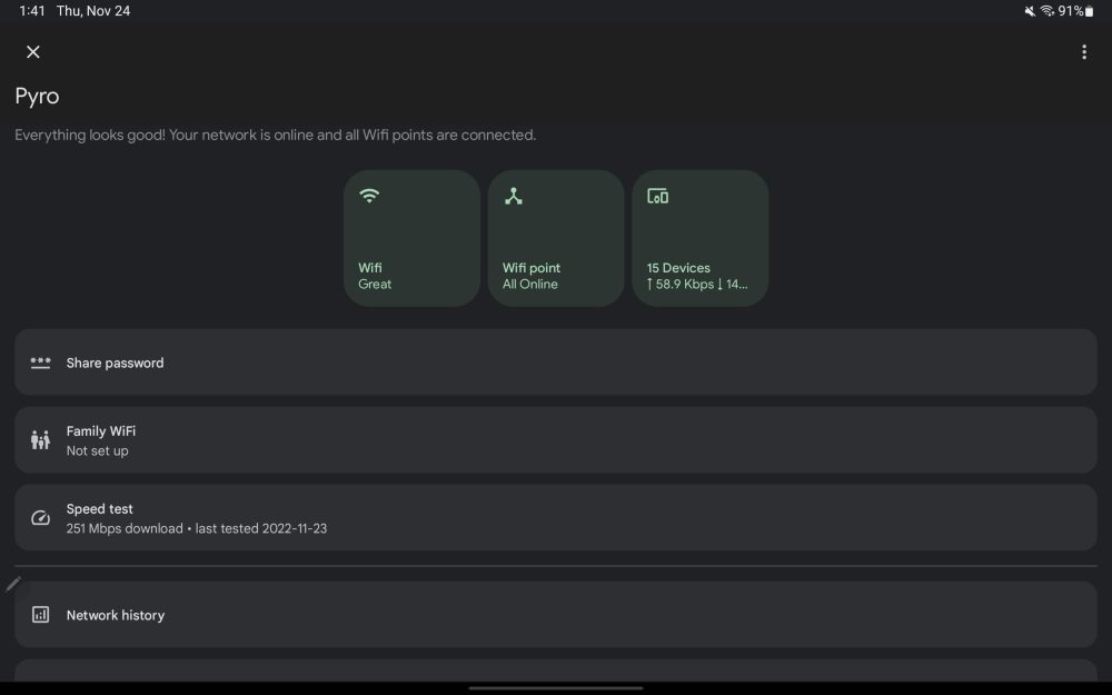
Currently in Public Preview, Google Home starts with a Material You navigation rail that makes use of pill-shaped indicators. You only see the text label of the current tab. In Favorites and Devices, Google switches to a three column layout for tiles. It’s up from two on the phone app, but a fourth would probably look fine, with such a view used by the Edit/Add favorites view.
Meanwhile, Automations and Activity use a single column layout that is too stretched out, while Google looks to have not yet optimized the Settings column with a lot of left/right padding.
The main views are mostly tablet-optimized, but going a level deeper into various device menus presents some issues that need to be adjusted and rethought before the stable launch. In comparison, the Google Home preview on iPad uses a bottom bar and it’s not that optimized.
~
—Google Drive, Docs, Slides
Update 11/18: Google Docs on Android is getting “full mouse support” that matches the website’s cursor experience.
For example, clicking and dragging across text will now select that specific text instead of panning the entire document.
In Drive, drag and drop can now be used to organize your files and folders, with Google noting how this “can be done either in the two-window view or in the single app view.”
Google Slides will support dragging text and images out of the app into others.
~
—Google One
Update 11/11: The Google One redesign is finally here with a navigation drawer replacing the awkward bottom bar on tablets that quite considerately cut into content. In portrait orientation, the app uses a navigation rail, but there’s otherwise enough space for the always-showing drawer.
Meanwhile, the Home feed features a new grid of cards for available Storage, Backup status, the Cleanup Tool, and VPN state. The tablet app now matches the Google One website.
—Google Keep I
Back in September, Google announced a dual pane layout for Keep that lets you simultaneously see your note list and actual contents. However, this side-by-side view requires a rather higher screen dp and we’ve only encountered it on a Chromebook so far. Otherwise, it’s quite nice.
~
—Google Sheets
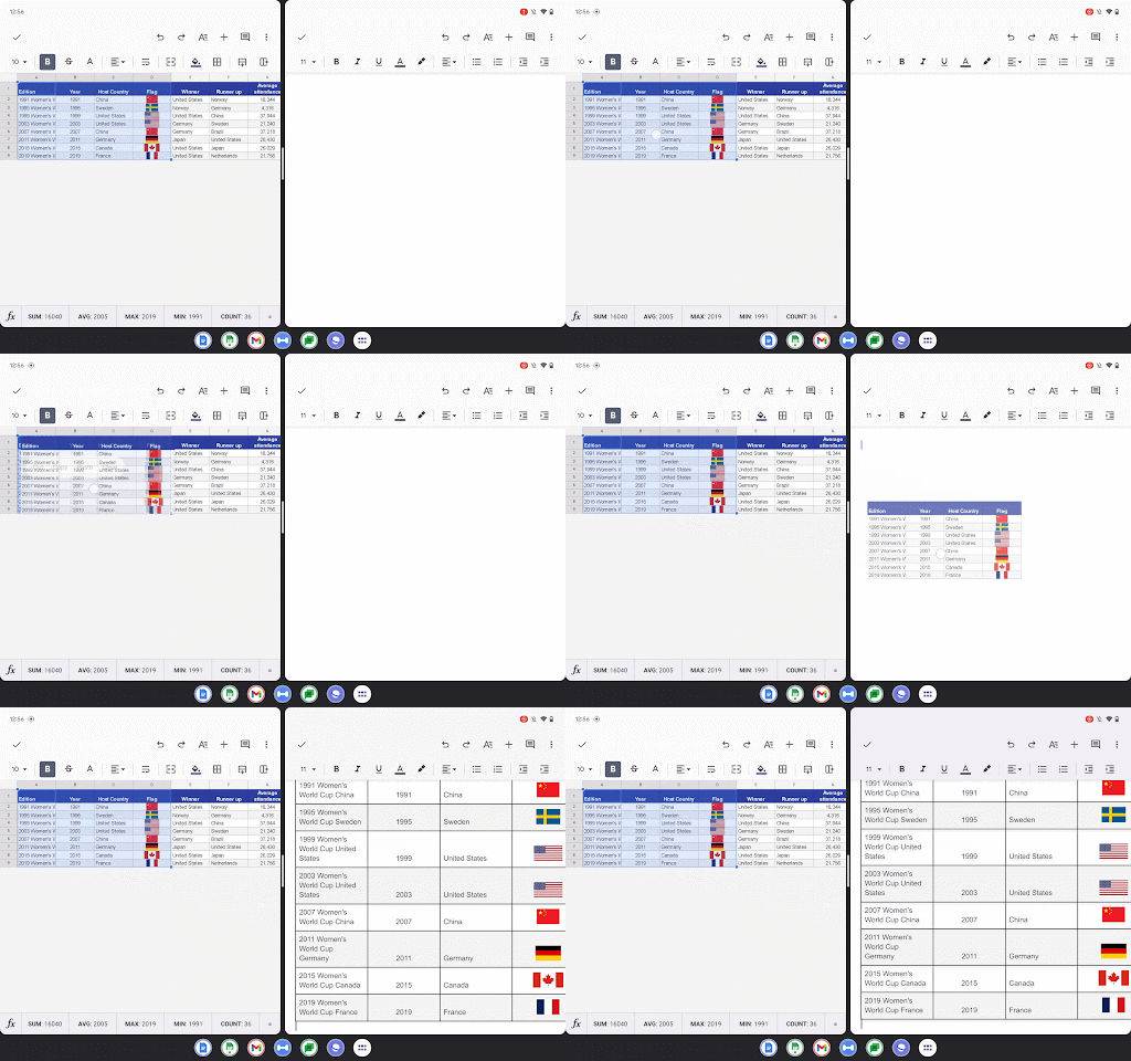
Update 10/22: Improvements to drag-and-drop in Google Sheets lets you drag, copy, and share charts and in-cell images to other apps, like Docs. Google is also rolling out link previews, like on the web, that “allows you to get context from linked content without bouncing between apps and screens.”
—Pixel Tablet preview: Google Home, Camera, One
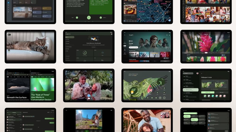
A handful of new designs were previewed at Made by Google 2022 with the Pixel Tablet tease:
- Google Home: Based on the upcoming redesign, we see a navigation rail with Favorites, Devices, Automations, Activity, and Settings. The Favorites tab clearly takes advantage of the additional space.
- Google Camera: Taking cues from version 8.7 on the Pixel 7 and 7 Pro, we have app controls housed at the left. This includes a top-left corner settings dropdown and a pill-shaped controller.
- Google One: Another look at the app, which looks like the website, and is still not yet live.
—Chrome II
Earlier this week, Google made official a Tab Grid for Chrome on Android. There’s also a gesture that lets you swipe across the Omnibox to quickly switch between tabs, and being able to load the desktop version of sites by default. Meanwhile, Tab Groups are coming soon to the large screen devices.
—Google Play Store II
The full Google Play tablet (and foldable) redesign that displays app screenshots, videos, and descriptions directly in the Apps and Games tabs/feeds will be available in 2023. Developers are advised to update their listings ahead of that.
—Gboard
Gboard’s new tablet layout actually takes advantage of the extra screen real estate provided by a large screen. No longer feeling like a stretched out phone experience, the background sheet and keys get taller by default (in landscape). There are new keys for Tab, Caps Lock, Hide Keyboard, and Left/Right arrow, while others have been moved around. These updates are available with version 12.3 (beta) of Gboard and newer.


~
—Google Play Store I
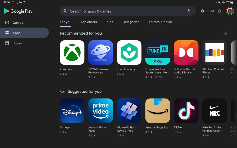
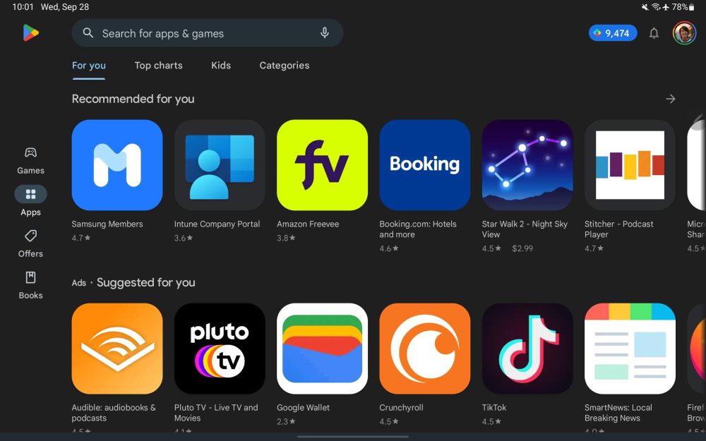
Update 9/30: Ahead of a broader redesign, Google has updated the Play Store with a navigation rail that is more compact than the previous drawer.
At the moment, this allows app icons to be larger but those carousels will soon make way for cards. Google Play has also tweaked the corner logo and search field to be more compact.
—Google Docs, Sheets, Slides I
Update 9/17: You can now open multiple instances of Google Docs, Sheets, and Slides (version 1.22.342.08.90+) to view them side-by-side. However, getting them to that state is a bit of a manual process.
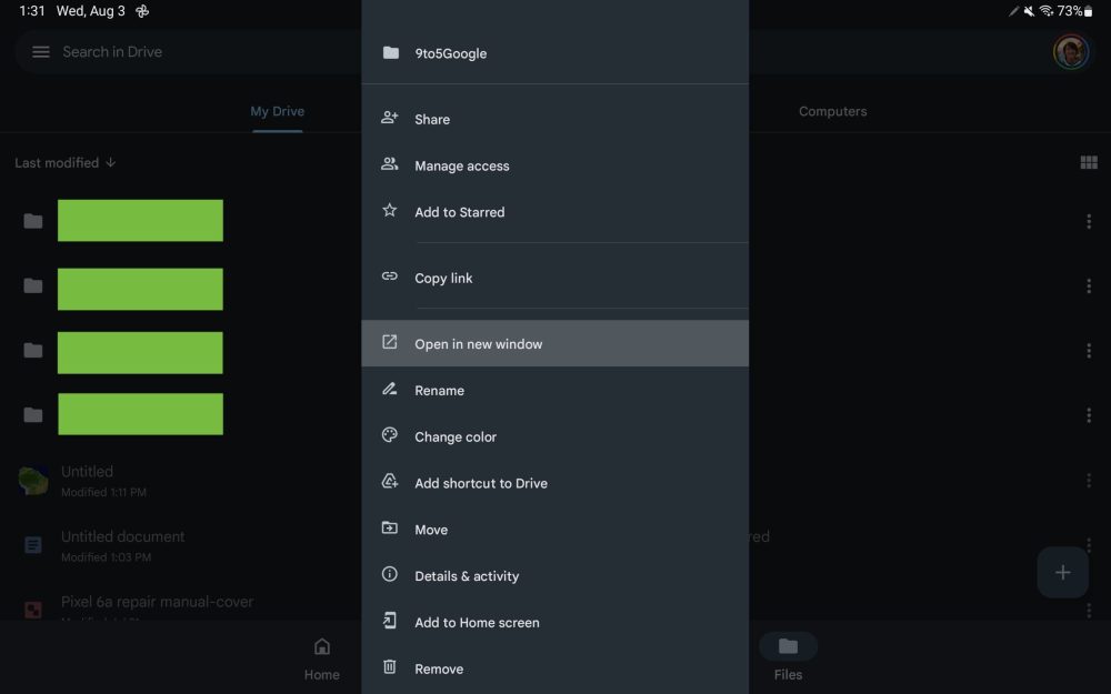
You open the first document and then go back to the Docs/Sheets/Slides app (using the system Recents multitasking menu) to launch the second. Reopen Recents and drag the first file to initiate split-screen. It’s not as easy as Drive’s “Open in new window” button, which has been renamed to “Open in split view” (and only works on folders).
—Google Drive and Keep widgets
Update 9/13: Google is optimizing widgets for Android tablets by making them larger given the additional screen real estate available. Drive (with version 2.22.357.1) adds a row of shortcuts to the Drive quick actions widget that creates a new document in Docs, Sheets, or Slides. This homescreen object is also notable for introducing a new circular configuration.
Meanwhile, the Google Keep (5.22.342.03.90) Note List widget gets rid of the right sidebar for a faux bottom bar in narrow configurations. This matches the Gmail widget and lets you see more notes. However, you can still get the old design by increasing the width.
—Google TV
Update 8/28: Google TV was one of the apps slated for a redesign at I/O. A tablet-optimized version is now available, but without the Material You stylings shown on-stage. The primary change is a navigation rail with centered tabs that replace the bottom bar. We’re seeing this new look with version 4.33.60.17, which is not yet widely rolled out, on a Chromebook.
Back in May, Google’s slides depicted a much wider rail with oblong indicators noting your current tab. Meanwhile, the Material You iteration looks to redesign the app bar so it’s more seamless. The existing design is an issue in the Your stuff page where top tabs are used.
—Google Drive, Docs, Sheets, Slides
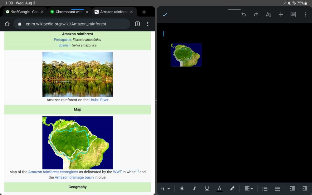
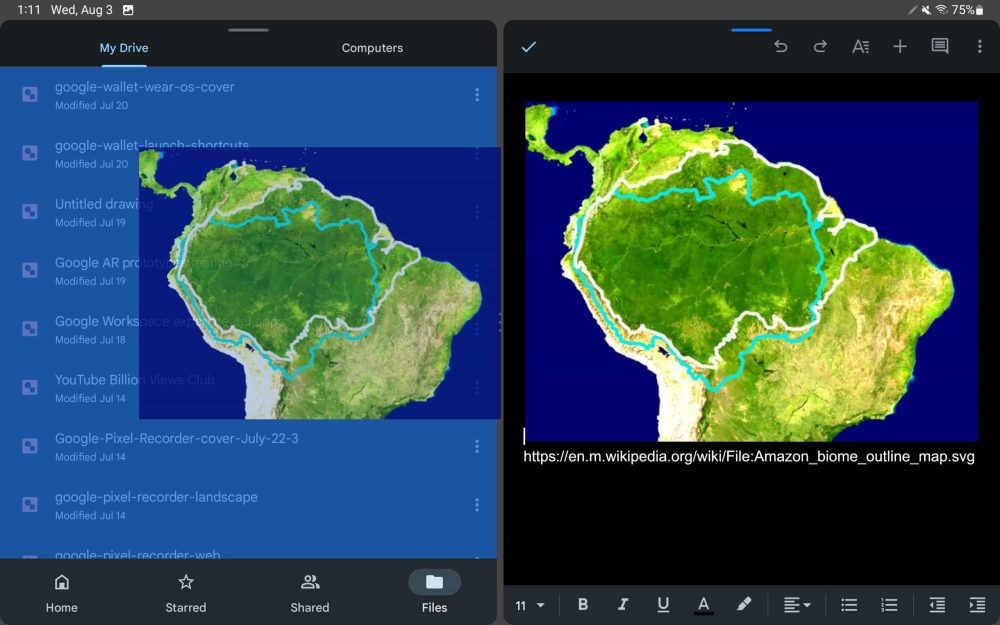
Update 8/3: Google announced last week that Drive and Docs/Sheets/Slides are getting tablet optimizations. Some of the features have rolled out, including the ability to:
- Drag images/text from another app (like Chrome) and drop into a document or spreadsheet cell. Similar to Google Keep.
- In Google Drive, you can upload files by dragging and dropping them in.
- You can open two Drive instances side-by-side by opening a folder’s overflow menu and selecting “Open in new window.”
- [Not live in our testing] “You can also add links to Drive files by dragging the file into an open app like Keep.”
- Physical keyboard shortcuts in Drive, Docs, and Slides to select, cut, copy, paste, undo and redo.
—YouTube Music
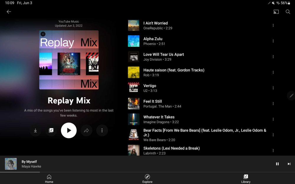
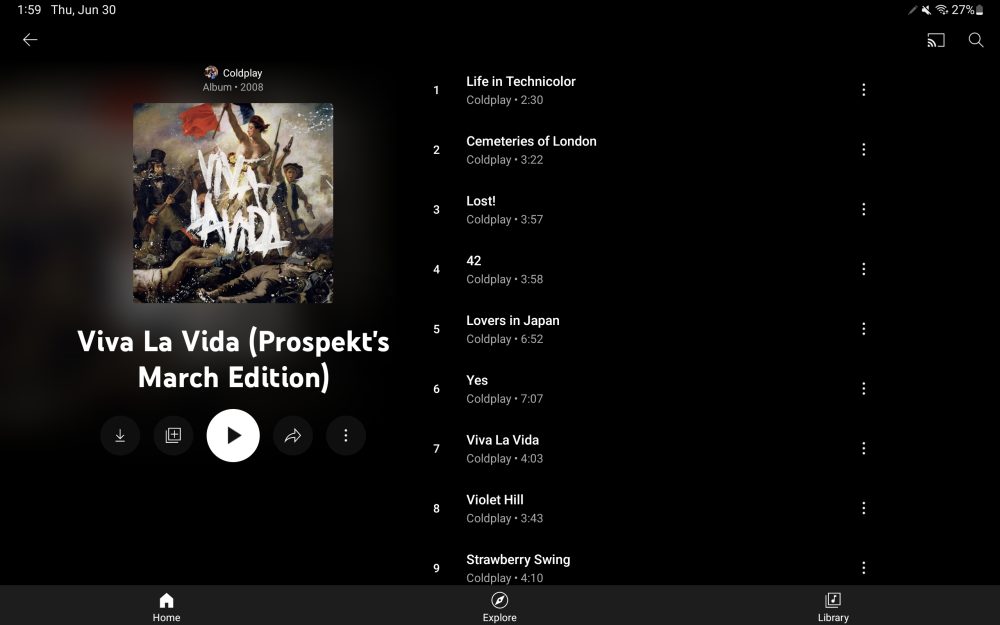
Update 6/6: The tablet optimization announced for YouTube Music at I/O 2022 is now rolled out. It sees the Android app on large screens get a redesigned playlist view, which is a big part of the service. There’s a two-column UI where cover art and other details appear at the left and the song list is on the other side. [Update 6/30: The redesign was introduced to albums later on.]
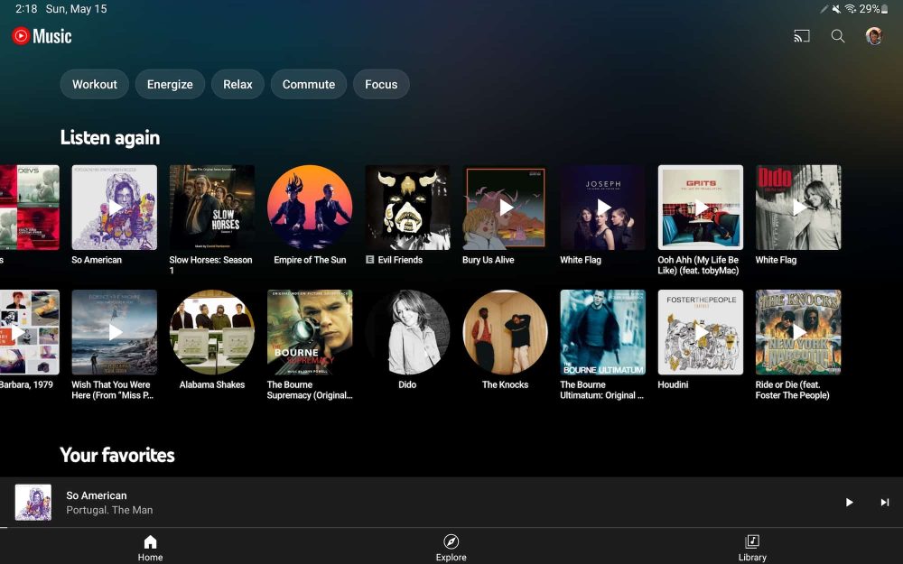
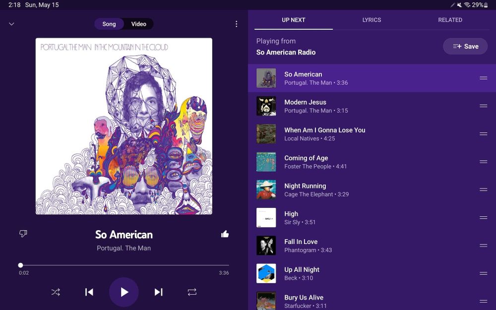
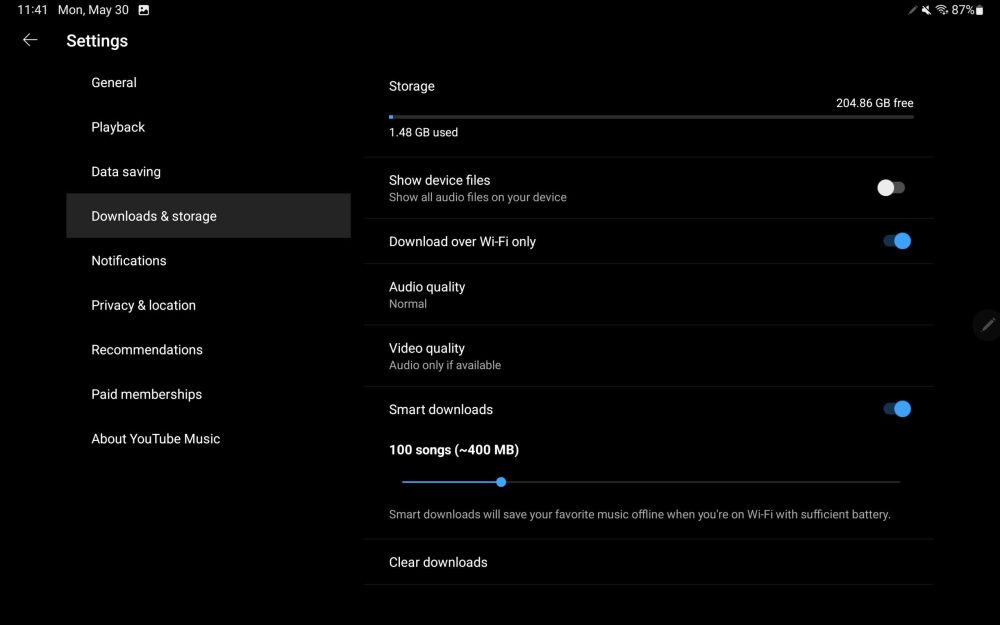
This is just the latest in tablet update for YouTube Music, with that team starting earlier this year on the Home feed to let you see more content in carousels (Listen again, Your favorites, Mixed for you, etc.) without having to scroll. Other optimizations exist in Now Playing (two-column view with controls at the left and your Up next queue at the right) and side-by-side settings.
—Clock
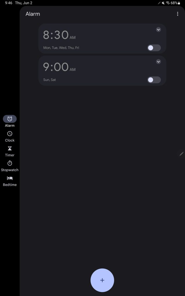
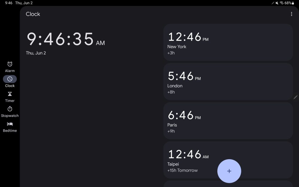
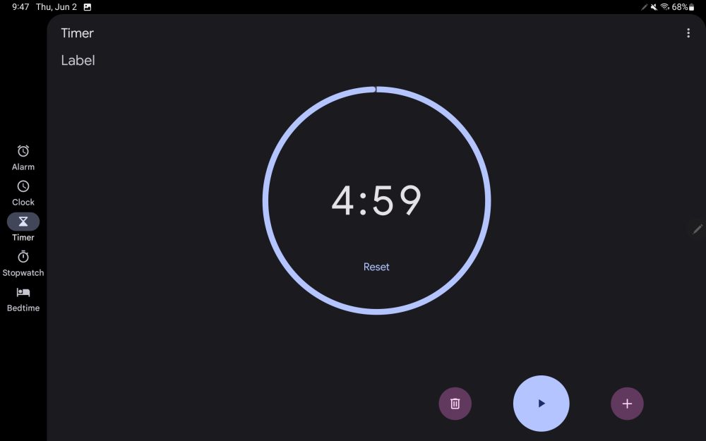
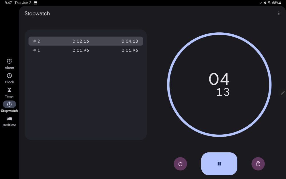
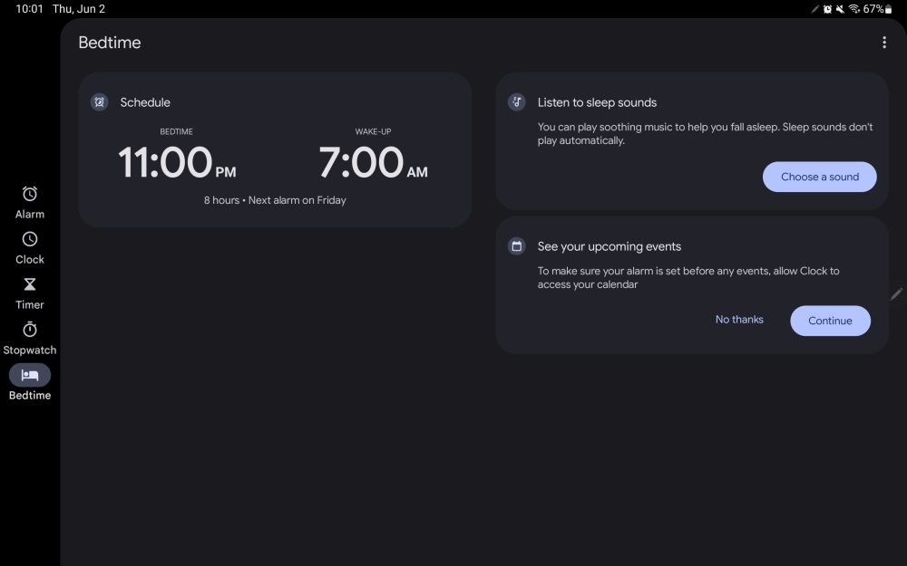
Update 6/3: Google Clock 7.2 starts by introducing a left-sided navigation rail on tablets that gives the app more vertical space as a result. The other big change is the use of two-column layouts, when in landscape orientation, throughout the application.
—Calculator
Update 5/25: Version 8.2 of Google’s Calculator app brings a two-column layout where you can always see your calculation “History” on tablets and other large screen devices. Other parts of the UI are shrunken down accordingly and this is particularly suited for multitasking.
—Google Lens
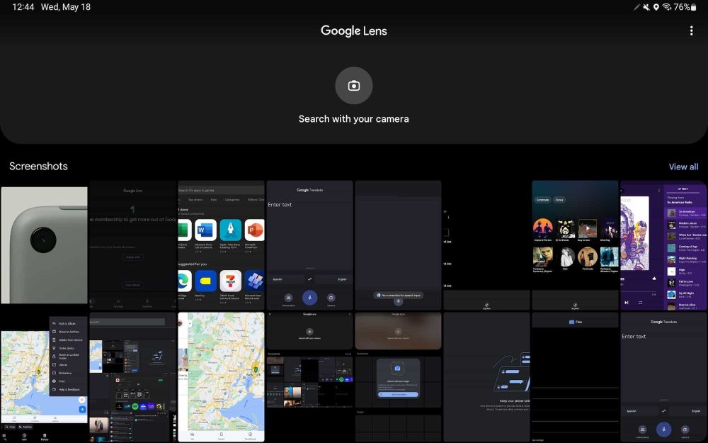
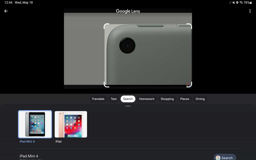
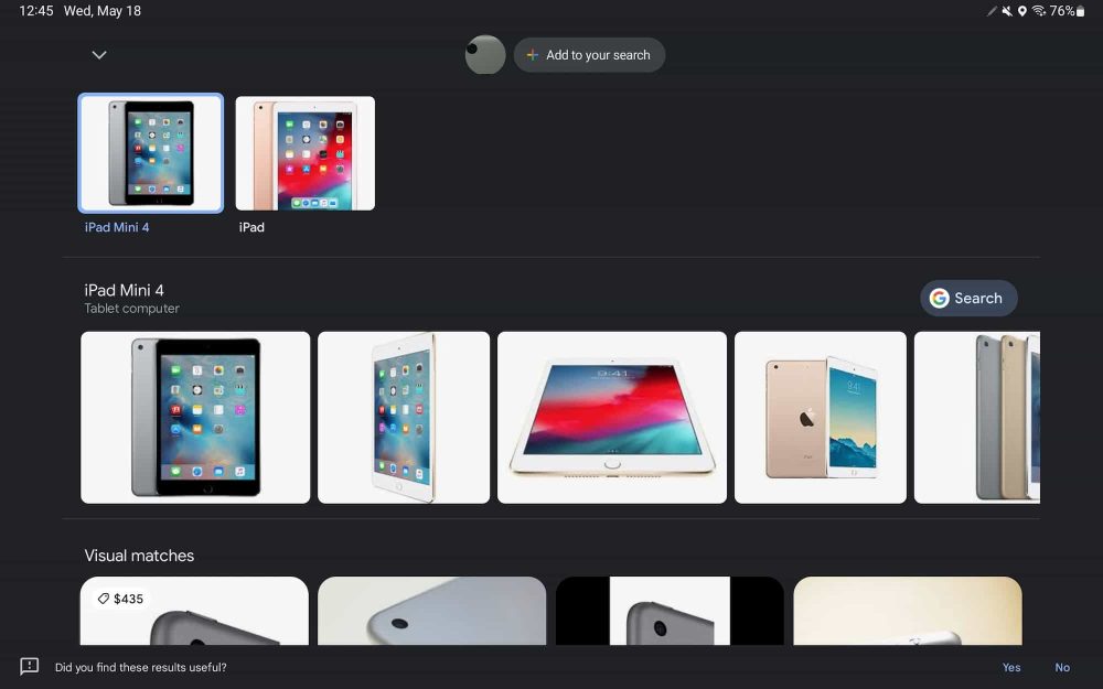
Update 5/18: Version 13.19 of the Google app lets Google Lens open in landscape mode. The visual search tool was previously restricted to portrait orientation on Android.
—Google Photos
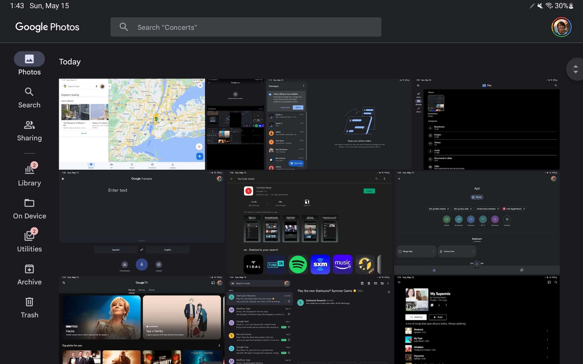
Google’s premier tablet app on Android is Google Photos, and this update rolled out in January of 2021. It’s not too different from the web UI. A navigation rail on the left edge means you can see slightly more vertical content, while more tabs can be shown – compared to a bottom bar – without looking cramped. In addition to Photos, Search, Sharing, and Library, you have quick access to On Device, Utilities, Archive, and Trash. One small Material You tweak that Google made in recent months is a pill-shaped indicator to note what tab you’re viewing instead of just highlighting the icon.
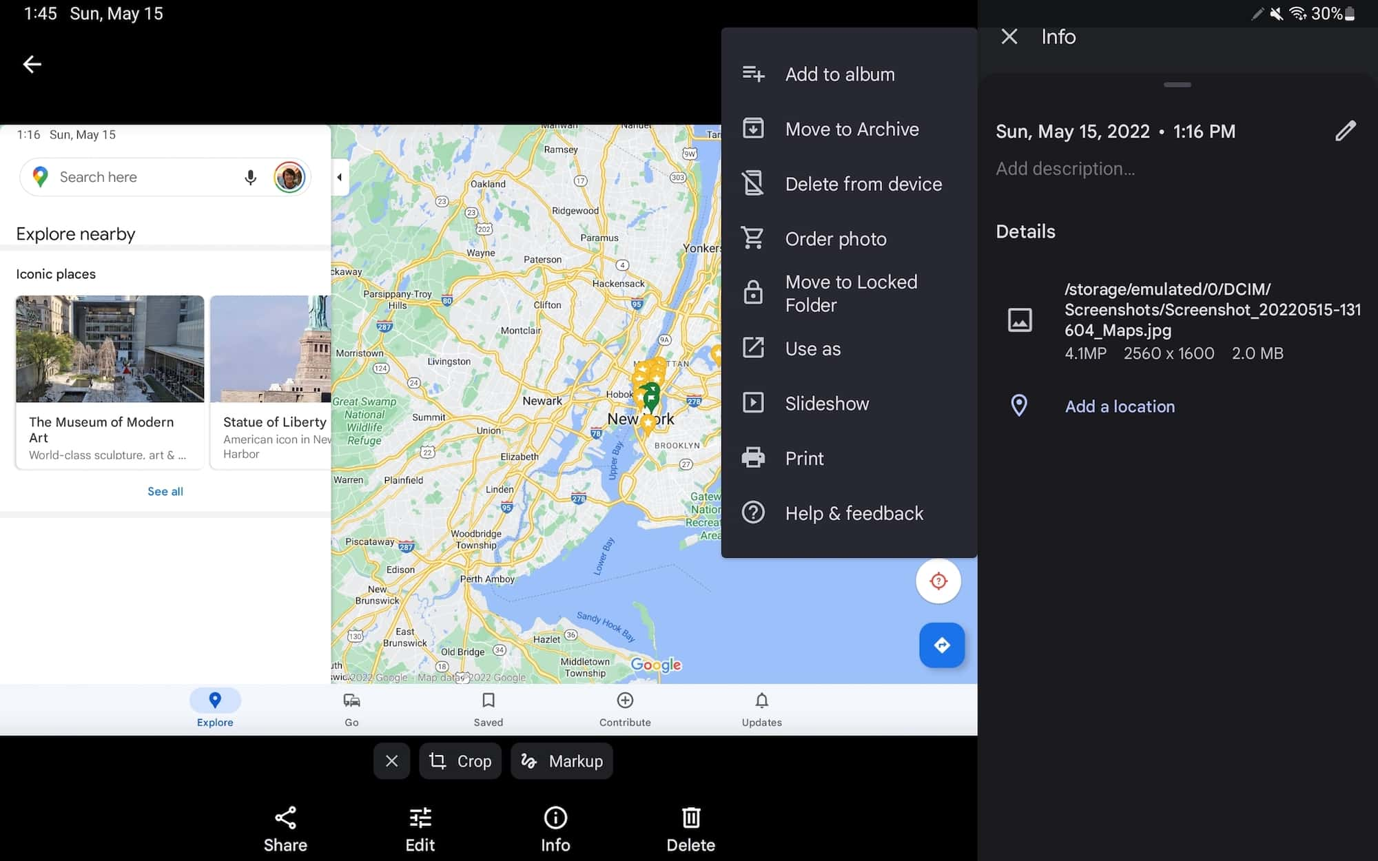
At the top of the screen, next to “Google Photos,” is a search bar with rounded corners. When viewing a photo fullscreen, swiping up reveals a right-hand pane while the overflow in the top-right corner of the viewer shows actions with accompanying icons.
—Google Calendar
Top comment by PurplePumpkin
As an android tablet owner, I am excited to see such efforts being made by Google. Hope Google will bring a nicer environment for android tablets.
I’ve already opined how Google Calendar is my favorite tablet app, primarily because of the great Day and Schedule views where you see the entire month on the left with a list of events next to it while illustrations liven up the background. It does not appear that the company is planning any changes.
While there’s obvious reuse from the website, the Calendar team has meaningfully differentiated the app for tablets, and that’s surprisingly a rare occurrence for Google.
—Chrome I
Chrome on Android tablets is nearly identical to the desktop interface given the use of tab strips and Omnibox layout. There’s also support for multiple windows to aid multitasking.
—YouTube
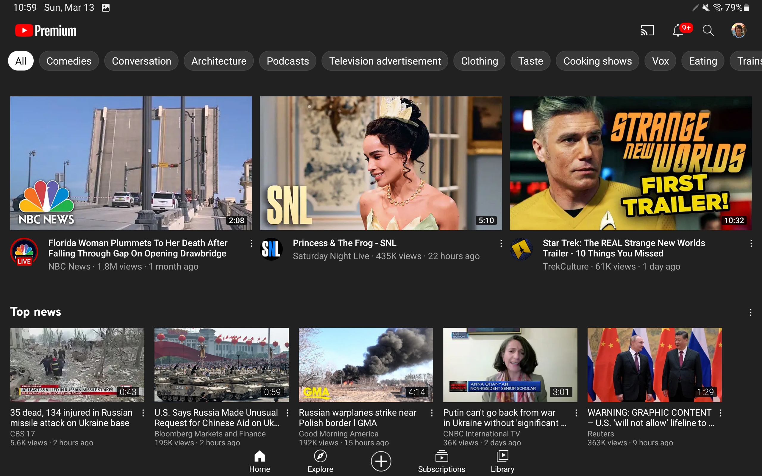
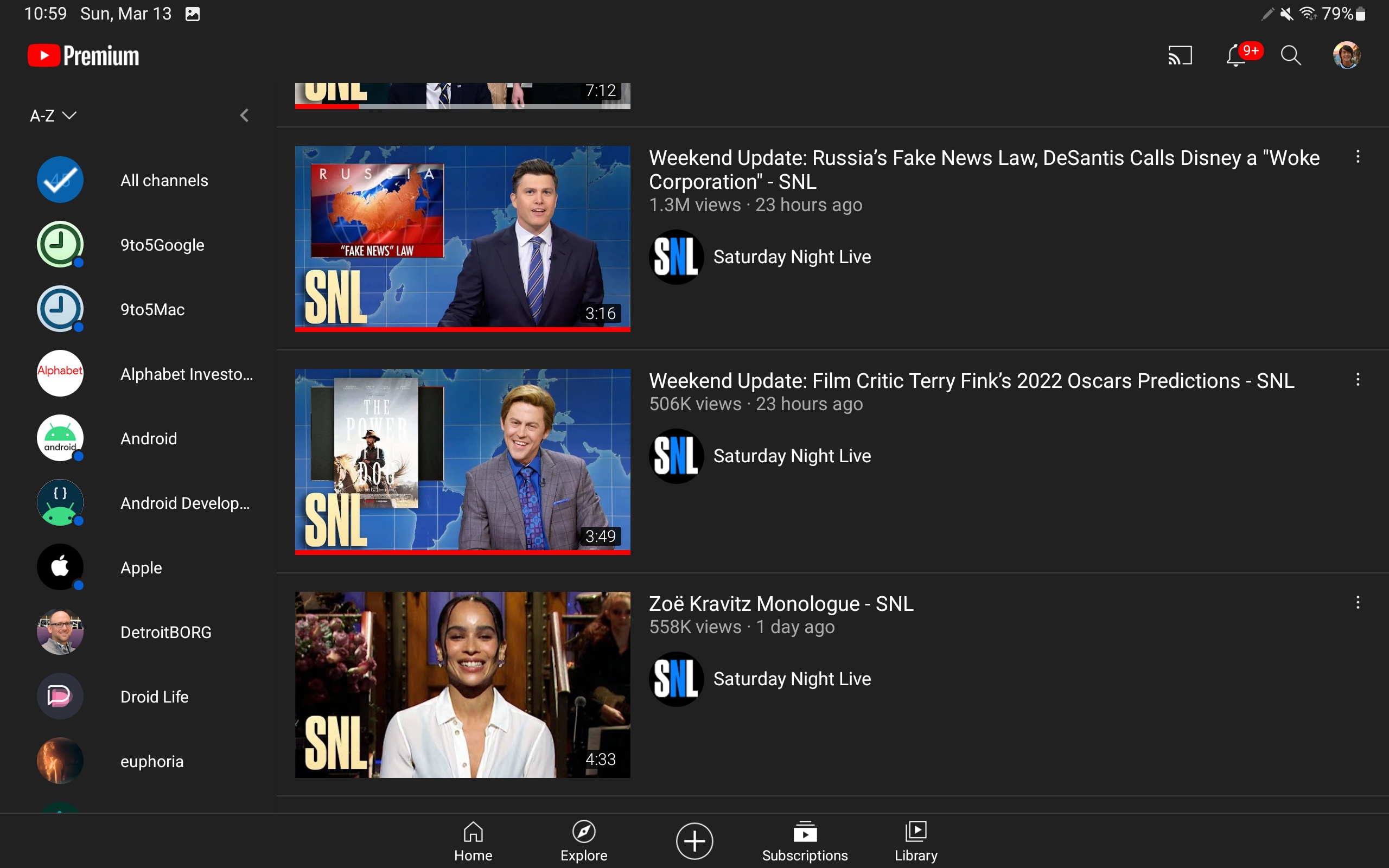
YouTube is fairly well-optimized for tablets with two-column views throughout, and Google’s I/O preview only showed the player screen. It could always switch to a navigation rail.

—Google Translate
Translate already has the tablet optimizations touted on stage. In general, it’s better for this app to be sparse and have a lot of spacing, given its nature as a (physically) shared interface/tool.
—Files by Google
- Navigation rail
—Google Podcasts
- Two-column view
Future Google tablet app updates

Google Translate: See aboveMaps: See abovePhotos: See above- Family Link: Instead of a navigation rail, Family Link looks to be using an always-showing navigation drawer.

Google Home: Centered navigation rail, though it looks ridiculous with just two tabs. A two-column layout could be better.Gmail: Navigation rail with a drawer button at the top to see your folders and labels.Google TV: Navigation rail while you can make out the upcoming Highlights news feed as part of that broader Material You redesign.
- Messages: Two-column layout, though it’s unclear if the UI shown above is more meant for foldables rather than tablets that require Device pairing, like Messages for web.

Google One: Navigation drawer with heavy use of cards in the app body.YouTube Music: See aboveGoogle Lens: Visual search today on tablets only works in portrait orientation.- Google Duo: Centralized controls.
- Google Play: Like Photos, there’s a navigation rail and top search field. Cards are used to show various lists and promotions.

Chrome: See above- [Repeat] Messages
- [Unclear] Play Store search or Entertainment Space.
YouTube: See above
Google Calculator: Two-column layout.Google Clock: Navigation rail paired with two-column layout.
FTC: We use income earning auto affiliate links. More.












Comments