For the last decade, I’ve been a diehard Android user, with the only iOS device really in my personal lineup being an iPad Pro. But, this week, I took delivery of an iPhone 15 Pro, and after a day using it, I’ve got… well, a whole lot of thoughts.
To address the elephant in the room, I have no plans to switch to iPhone. But, as someone who talks about Android and reviews new devices for a living, I think it’s important to have some level of perspective on both sides, so I always try to keep an iPhone around. My last iPhone purchase was 2017’s iPhone X, which just lost updates and, frankly, just doesn’t keep up at this point. So, with USB-C finally on board, I figured now was as good a time as any to take another peek inside of Apple’s walled garden.
After a day, I’ve got my iPhone set up fresh, I’ve been able to spend some time exploring iOS 17, setting up my apps, and diving into a bit of iMessage too. So, here are a few things I liked, and a few things I hate about the iPhone 15 Pro.
What I liked
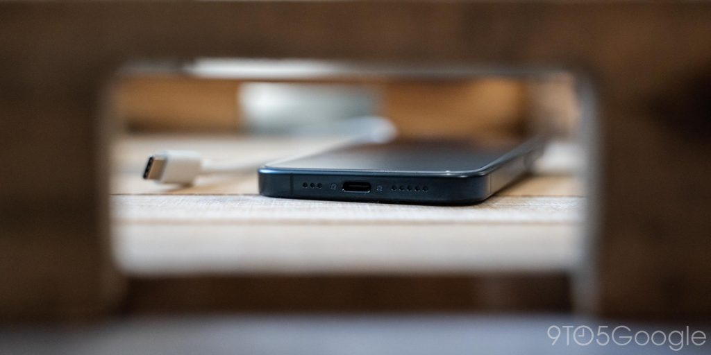
First and foremost, USB-C.
Finally.
One of my biggest qualms over the years with bringing iOS devices into my rotation has been with the annoyance of bringing another cable type around with me. I always have too many cables in my bag, but with the iPhone 15 finally getting USB-C, I don’t have to bring a Lighting cable around. Being able to charge up my iPhone last night with the same USB-C cable I have in my living room for all of my Android phones just filled me with pure delight.
Also, there’s the Action Button.
Apple’s big new “Pro” feature on a hardware level is the new Action Button, which replaces the mute switch. And I quite like it! Honestly, I’m shocked this isn’t something more Android makers have done over the years, because it feels like something Android would do. The level of customization available is surprising for an Apple product, but really, I just use it to open the camera, because Apple still doesn’t support the double-tap gesture on the power button to open the camera that feels just so natural and useful on Android.
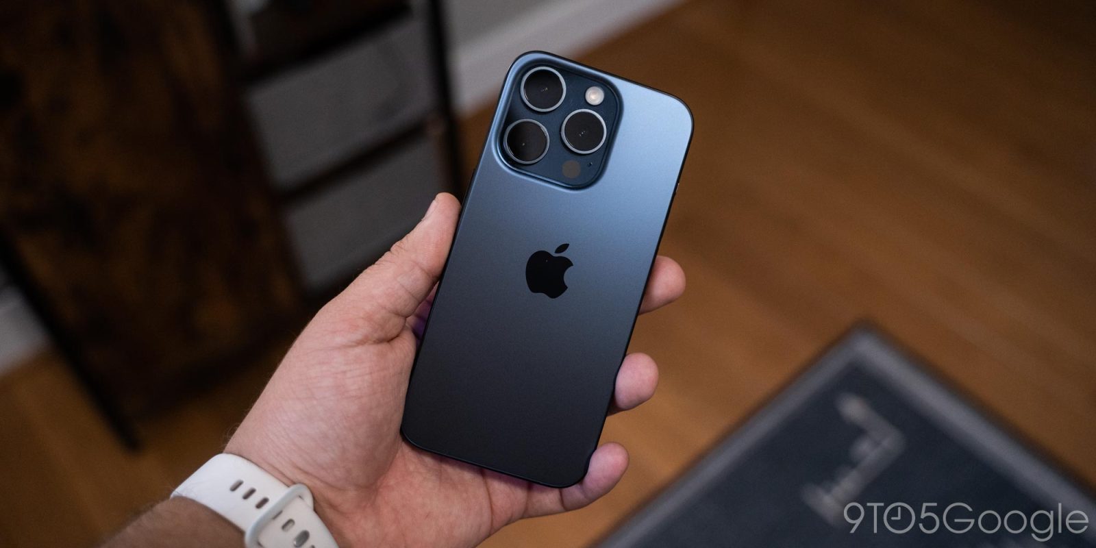
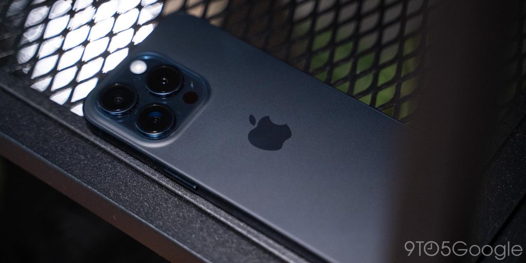
Apple’s hardware is also a delight. The new blue titanium looks great, of course until it meets fingerprints. But, even then, I’m a fan. This is well-done hardware across the board.
There were also some parts to the software that I’ve been absolutely delighted by. iOS 17’s new notification sounds are great, and iMessage, admittedly, is a great messaging app. Someone reacted to my message with a “haha” and the notification sound was a little “haha.” That’s fun!
Apple should still do RCS.
But anyway, back to the good stuff. It felt like apps installed impossibly quickly from the App Store, even on the same network as I used my Android phones. I don’t really know why, but it was unexpected and weirdly satisfying.
Apple’s password autofill is drastically better than Android’s. My success rate on getting apps to trigger autofill was something like 90%, versus the 75% or so I usually see on Android. Apple’s manual trigger for autofill is also just way more reliable than Android’s.
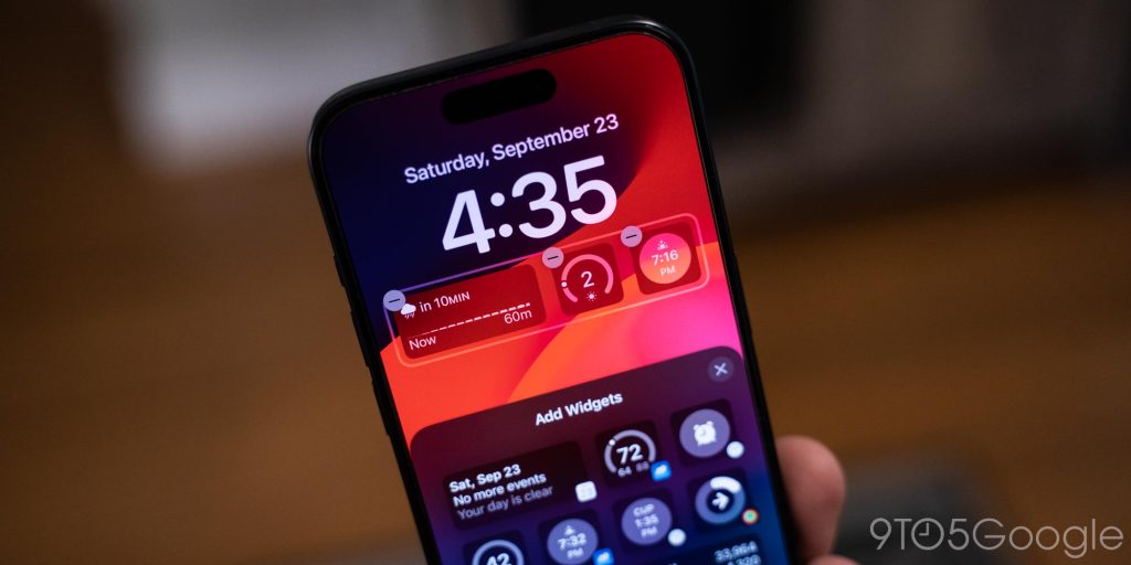
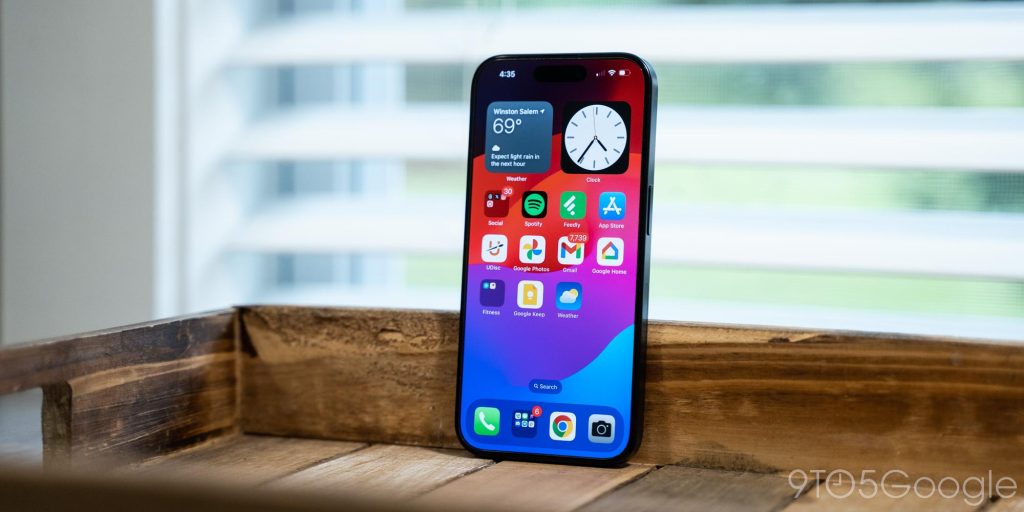
I also quite like iOS’s modern lockscreen. I’ve not dived into the multiple setups just yet, but even just the ability to have a few widgets out there, and customize the clockface so in-depth is great. Android 14 is making some improvements here, but I think Apple still absolutely holds the lead for now.
What I hated
But, while there were some highlights, my first day also showed, and reaffirmed, so many things that I hate about iOS and the iPhone.
And yes, that starts with the homescreen.
I still hate the iPhone homescreen with a passion. It’s definitely gotten better over the years, with the ability to add widgets, as well as with the “App Library,” Apple’s attempt to one-up Android’s app drawer because it admitted it needed one, but has an ego too big to admit Android’s simple approach is better. But, still, I just can’t stand it. Here are a few reasons why.
- It’s horrible that, even with an app drawer, Apple just spills all of your apps on the homescreen in no logical order. Android manufacturers (and you know who you are), please stop copying this too.
- For a company as obsessed with “Reachability” as Apple, it’s mind-numbingly stupid that you still can’t have apps at the bottom of the homescreen. Don’t have enough apps and widgets to push things down? Well, it’s at the top, whether you like it or not!
- I hate going into the Settings app just to change my wallpaper. It absolutely should be possible from the long-press menu that literally already exists in iOS.
Please, please let me turn off notification dots. I don’t need to constantly be reminded that I’m bad at managing my email.I’m happy to be proven wrong here, as I was completely unaware there’s a setting to turn this off. That said, it’s frustrating this can only be done on an app-by-app basis.
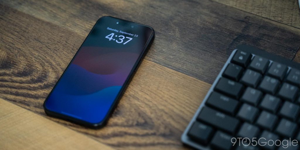
Outside of the homescreen, I also don’t like Apple’s version of the always-on display.
I get why some people might like the “seamlessness” of a color AOD turning on, but I just think it’s confusing when you see it on a table. “Did I leave me phone on?” has been a constant thought for me. You can turn off the color, but the default setting is, I think, a bad experience.
As a slightly random thing, it’s quite annoying that, on iPhone, I can set up my Capital One card for Apple Pay NFC with just a security code, but on Android, Capital One requires that I use the app and often my driver’s license to approve the addition to Google Wallet. That’s quite a double standard.
Something else that was a little frustrating during setup was how many iOS apps still just explain how you can adjust a setting instead of deep linking to the section itself. Chrome can link you out to default browser settings, but 1Password doesn’t let you click a button to skip straight to the password/autofill page. That seems inconsistent and annoying, and more than anything just a bad experience for users.
I also wanted to talk about iCloud for a minute. I just can’t stand so much of what Apple does here.
I have owned two Apple devices over the past six years, and my measly 5GB of storage is completely full. Apple is being quite predatory with this, and there’s really no good reason for it (besides the obvious, services revenue). While this is only a minor inconvenience for me since, really, nothing iCloud is storing is actually all that meaningful to me, it’s a painful restriction for others. Just this week I had to help someone who couldn’t figure out why her emails weren’t working, only to have to tell her that her iCloud was full, and she either needed to delete photos (that vast majority of her 5GB), or pay up for more storage. That’s just cruel!
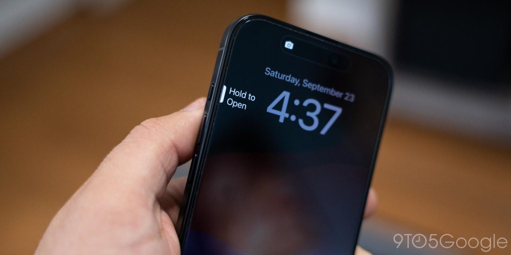
I’ve also got a weird relationship with the Action Button, because, while it’s a thoughtful and well-done addition, it could be so much more. Why can I only use this for one thing? I should be able to have three actions – single tap, long press, double tap. At the very least, add a double-tap option, especially when this is replacing the mute switch. I also don’t like holding the button to do the action, I just want to tap the button.
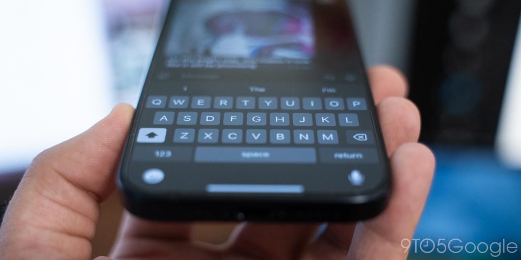
Another irritation was the keyboard. Apple’s stock keyboard doesn’t have any basic punctuation visible until you switch layouts, which is annoying, and probably a big reason so many people forget to use punctuation nowadays.
Anyway, those are my assorted thoughts on the iPhone after a day of use, but I’ll certainly have more to say in the weeks and months to come. Stay tuned!
This Week’s Top Stories
Android 14 QPR1 is here
The first beta release of Android 14 QPR1 launched this week and it brings several new features to the table. You can read our coverage below, but after having run it since Wednesday, I’ve got to say, this first release is quite buggy, so maybe hold off on updating.
- Google rolling out Android 14 QPR1 Beta 1 for Pixel
- Here’s everything new in Android 14 QPR1 Beta 1 [Gallery]
- Android 14 QPR1 Beta 1 adds new ‘Metro’ lockscreen clock
- Android 14 QPR1 adding ‘repair mode’ to Pixel phones, copying Samsung
- Google Pixel phones will show battery cycle counts starting with Android 14 QPR1
- Android 14 QPR1: Pixel Fold can move apps from the inner to outer screen
- Pixel Fold and Tablet can soon force apps to go fullscreen – here’s what that looks like
- Using my Pixel as a webcam on Android 14 QPR1 is a game-changer
- Google is putting search at the center of Android 14 QPR1
Google continues its RCS push
Top comment by Lee Woods
I have to admit that as a Pixel user I definitely wish that Google had never gotten rid of the Squeeze capability for launching the Google Assistant or other actions and they also need to bring back the Bump functionality to exchange contact information.
This week Google launched the latest in its “Get the Message” RCS campaign, comparing Apple’s reliance on SMS to an old-school pager. Meanwhile, T-Mobile leaned further into RCS.
More Top Stories
- Google emailing 40% off discount codes for Pixel Buds Pro
- New Google Messages forwarding UI lets you send to multiple contacts
- Sources: Pixel Watch 2 getting Fitbit revamp, thermometer, Personal Safety upgrade
- Nest Hub Max ending Google Meet and Zoom support in September
- Here are all of the Google Pixel 8 colors [Gallery]
- Google Pixel 8a allegedly leaks with rounded design [Gallery]
- Google TV’s next chip upgrade is coming
- Google’s Taylor Swift puzzle is nearing completion hours after it all began; how to join
From the rest of 9to5
9to5Mac: iPhone 15 Pro Max vs. DSLR photos: Real-world camera comparison
9to5Toys: AirPods Pro 2 with USB-C already on sale at $200
Electrek: The Electrek review: Luna’s Talaria xXx – super fun eMoto that defies categories
FTC: We use income earning auto affiliate links. More.


Comments