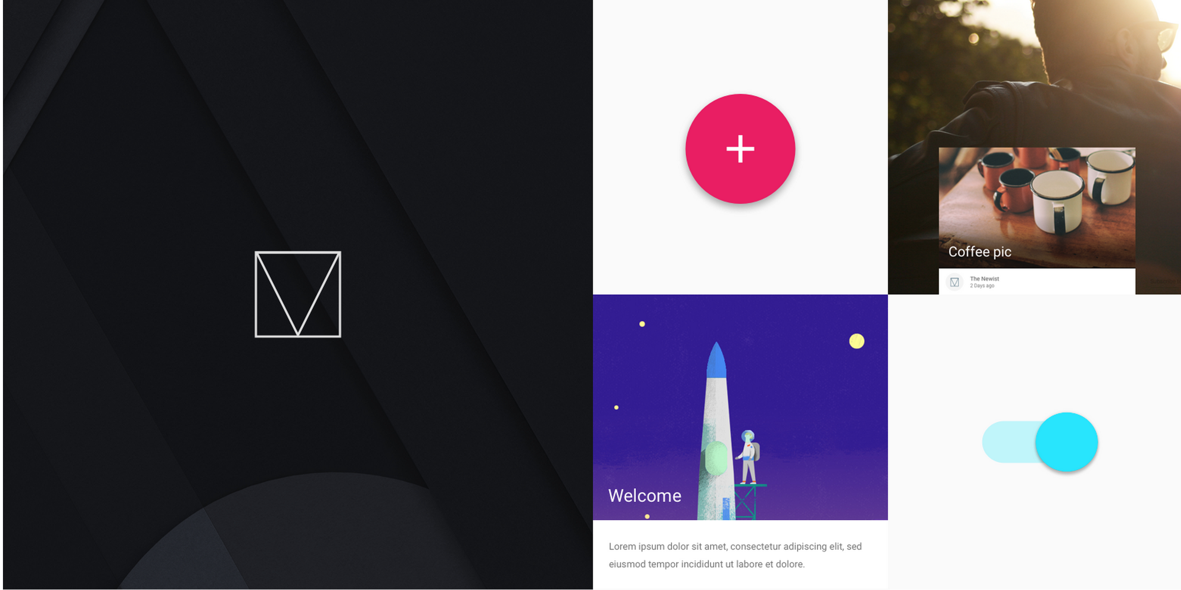
Material Design


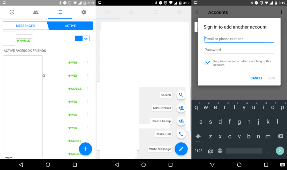
Facebook is testing a minor Material Design-inspired refresh for its messaging app, Messenger. The addition of the floating action button (FAB) is the biggest and most notable change, but there are some other minor design tweaks and a new feature that allows multiple user sign-ins.


The ESPN app on Android is notorious for sluggish performance and feeling like a web wrapper. Good news: an update today vastly improves performance and gives it a Material Design refresh. Version 4.7.1 also brings support for Marshmallow’s permission model for users on 6.0 devices.

Google looks to be rolling out a redesigned version of Google Maps on the web that introduces a tweaked user interface that in many ways mirrors its mobile app experience on both Android and iOS. As pictured above, Maps gets a redesigned menu/sidebar/search UI that is clearly inspired by Material Design and the user interface of its mobile apps.
Expand
Expanding
Close
Google has this morning pushed an update to AdSense for iOS, bringing many features that other apps in the Mountain View company’s catalog received months ago. While it may not be the most popular app outside of publishing and creative circles, the AdSense app has today been updated with support for Native iPhone 6 and 6 Plus resolution, Material Design, and more.
Rounding out the update is support for Hindi and Malay, a new icon for the Home Screen, more metrics, and a today center widget. The last of these, in case you aren’t aware, is a new widget for the Today section of Notification Center. On it, you’ll find four metrics for quick access: Today so far, Page views, Clicks, and Page RPM. It also tells you when the widget was last updated.
While Google’s apps for iOS have always been known for being well-polished (and sometimes just generally better than their Android counterparts), they usually come at a much slower pace. AdSense 3.0 for Android with many of the same new features was released on Android four weeks ago, and you can read more about that update here.
Here’s the full change log:
What’s New in Version 3.0
This time we’re bringing you:
– Support for Hindi and Malay;
– Native iPhone 6 and 6+ resolution;
– A today center widget;
– Our lovely new AdSense logo;
– More metrics!
– A little something we like to call Material Design.
Head over to the App Store to grab the latest version for free.

Whether or not you believe Starbucks coffee tastes burnt (I don’t), there’s always a reason to be happy when a popular app from a major company adopts Google’s new Material Design language. That’s just what the company did today with a new update.
Starbucks version 3.2 for Android is a gentle introduction to Material Design — the app continues to fall in line with the muted colors of the Starbucks brand, not too bright and bold like many early Material Design apps I’ve seen, and animations are subtle, like how the hamburger menu icon shifts during the transition of opening and closing the menu. Small details like elements appearing to open from a touch point remind you that it’s Material. It looks good.
Sadly, however, the app still lacks the new Order & Pay functionality Starbucks recently added to its iOS app and began promoting in stores, which allows customers to order menu items from their phone and pick them up when they arrive. Starbucks still labels that functionality as being in beta, though, so I’ll give them some slack. As a Starbucks loyalist I’m just glad to see them recognizing Android as a legitimate place to have a presence.
This update also brings added menu details so you can see all the menu items currently available at US stores (PSL, anyone?), and the obligatory “bug fixes.” It’s available on Google Play now.

AdSense, Google’s publisher ad network used by millions of websites across the web, has just seen its Android app brought up to the company’s Material design language standards.
The app itself is mostly read-only, meaning you can quickly see data on your performance like how much money you’ve made from your ad placements over different time periods, but you cannot create new ads to place on your site from within the app. That would be cumbersome from a mobile device, though, as it requires copying and pasting HTML code into your site’s backend.
AdSense 3.0 also brings with it a new logo the company unveiled back in June. It looks like this:
![]()
And for the curious, here’s what the app looked like before today’s update:

The update hasn’t propagated completely in Google Play yet, but it’s available as a direct download through APKMirror right now.
Material Design brought a lot of changes with Android Lollipop, but there’s nothing that says things can’t be improved. Designer Miroslav Vitula thinks he can improve the rotation animations in Android, specifically giving the OS a smooth transition not unlike the one found in iOS. Here’s what he had to say about his concept:
There are a bunch of smooth interactions in Android but sadly, rotation isn’t one of them. I’ve been craving the “smooth rotation” (as seen on iOS) since ICS. Well, let’s hope that one day, this will become an actual thing.
The example he uses is the Google+ app, which offers several Material Design tabs along the top as well as a cover image and a profile picture. As you can see below, rotating the device would smoothly transition between the two views. This would perhaps be nicest on big-screen devices like the Nexus 6 which are more enjoyable to use in landscape.
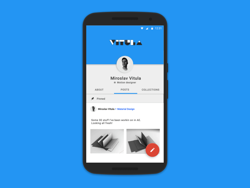
Like he says, hopefully this could one day be reality.

Google today has released version 2.0 of AdWords Express for Android. For those unfamiliar with the app, AdWords Express allows users to quickly create ads via their smartphone. Google says ads can be created in less than 15 minutes, and advertisers only pay when potential customers click the ad. Today, AdWords Express has been updated with a new, Material Design interface to fall more in line with Google’s other applications for Android.
Google Developers, the team at Google which creates tools and learning materials for developers to take advantage of, has released a front-end web framework for building sites to the Material Design specification.

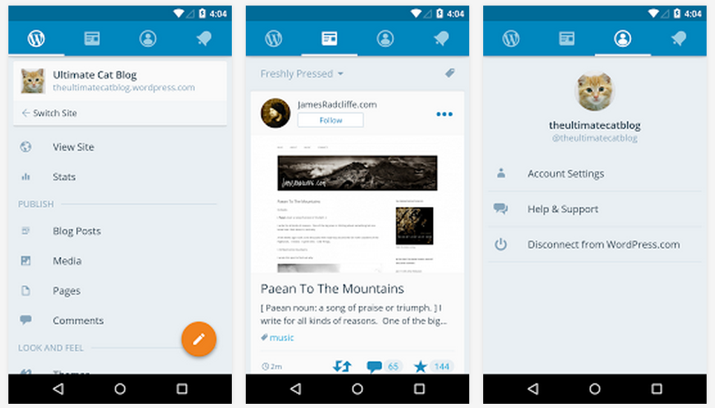
WordPress, the popular content management system which powers approximately 19% of all websites on the Internet (including this one), has released version 4.2 of its Android app with some nice new changes.

Better late than never – PC gamers will be happy to know that Android version 2.0.7 of the popular Steam social network and game distribution store brings with it a complete redesign of the app to follow Google’s Material Design guidelines.
As always, you won’t be doing any gaming from this app as Steam doesn’t sell mobile games and won’t stream desktop games to mobile devices, but you can do just about everything else; purchase games, message friends, access the Steam Guard authenticator, and more. We’ll keep you posted if we notice any other major changes.
For reference, here’s a taste of what the app looked like prior to this update:


If you’ve had any doubts about how far Android has come since 4.0 Ice Cream Sandwich, let these two (horrifying) screenshots serve as a reminder.
The update hasn’t propagated across Google Play yet, but if you head over to APK Mirror you can download it now (click here).
Beleaguered media darling Medium, a platform for anyone to write and share stories amongst its large community, has finally released its Android app to Google Play. The app works on devices running 4.4 KitKat and above, and features all the Material Design goodness you’ve come to expect since Lollipop – so it wasn’t just a port of the company’s iOS app.

Well this is an interesting change for Google. The company is one-by-one rolling out updates to its in-house Android apps that include splash screens. These screens (screenshots via a user on Reddit) are displayed during the 2-3 seconds between tapping an apps’ icon and the app actually loading.

Dropbox fans, you’re in luck – version 3.0.0 is completely redesigned to follow Google’s Material Design guidelines.


Burner, the popular app for creating throwaway phone numbers that can be used for making calls and sending text messages, has received a large update to its Android app today. The new app has three key additions, so let’s go through them.
The first major change you’ll notice upon updating the app is that it’s been completely redesigned. FABs (floating action buttons), new colors, transitions – the app now adheres to Google’s Material Design guidelines. You can see what the new app looks like above, but here’s a taste of what the app looked like before today’s update:
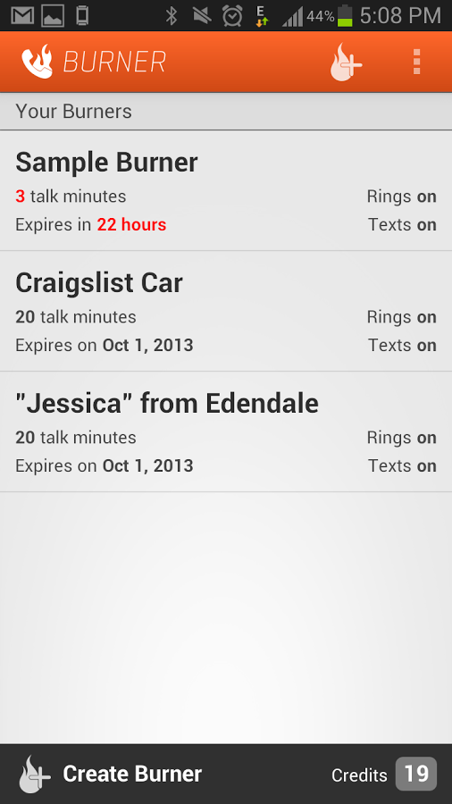
The next big change is the addition of unified inboxes. These will come in handy for Burner users who have more than one number in the app, placing all messages and missed calls into one inbox with color-coding so as you scroll through all your calls and messages or start replying to one, you’ll know which Burner number the message came through.
Finally, there’s now also an Android Wear app. But don’t worry, there’s no keyboard access – the app allows you to view notifications and messages, and reply using voice commands.
The company behind the app says that this update was built upon the feedback they’ve received from users, and that this is just the beginning of “a ton of new features that will be coming to Android.”


Last year, Google launched the Topeka web app as an “Open Source example” of what material design should look like on the web, and now they’re doing much the same—but for Android. The company took to its Android Developers’ blog to announce the Android version of Topeka, which the company hopes will help demonstrate the same Material Design principles for its mobile platform.
Today, we’re publishing a new material design example: The Android version of Topeka. It demonstrates that the same branding and material design principles can be used to create a consistent experience across platforms.
Like the Topeka web app, you can find Topeka for Android on GitHub. Within, you’ll find many examples of transition implementation, Material animations, vector drawables for displaying icons, unit and instrumentation tests, and more.

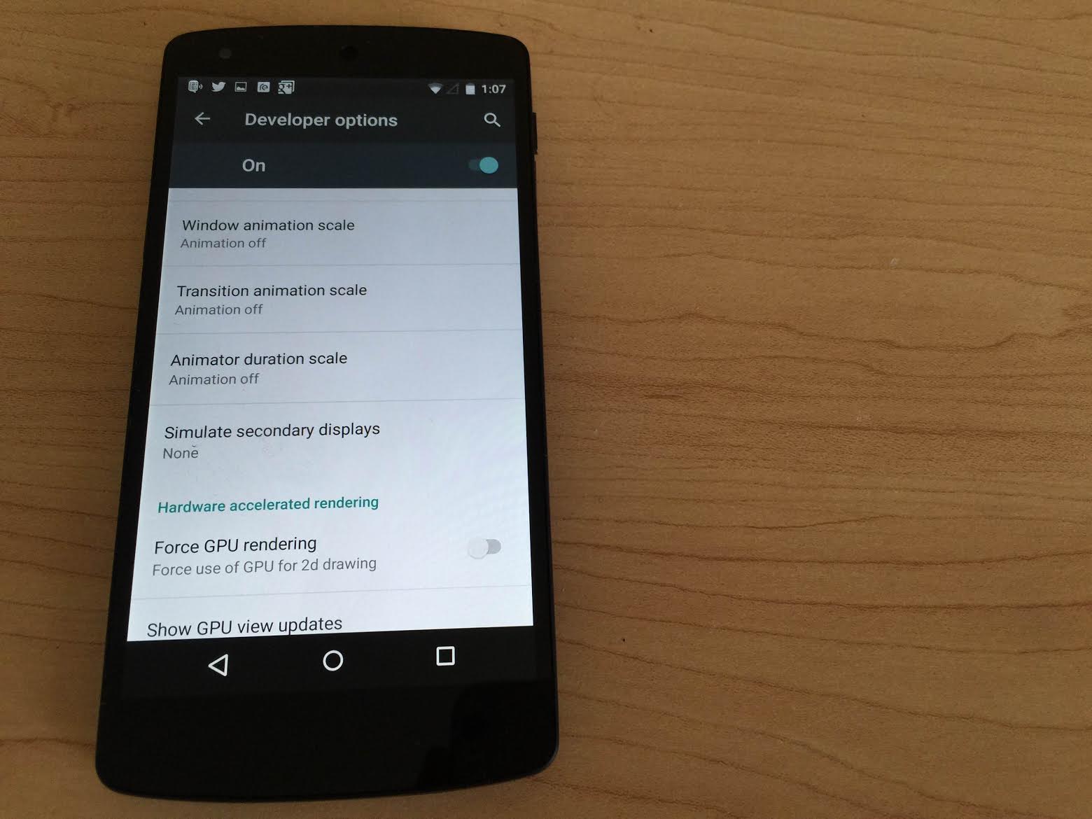
If you’re anything like me, the transitions and animations present in recent iterations of the popular smartphone operating systems can be both beautiful and nauseating at the same time. The extra time allotted for an app to fly up from the bottom of the screen can also make your phone feel a little bit slower than it really is. For these reasons, whenever I get a new phone I make sure to reduce the animations as much as I can while still getting a pleasant navigation experience, and with lots of people installing Android M soon I thought I’d show you how to do it yourself.
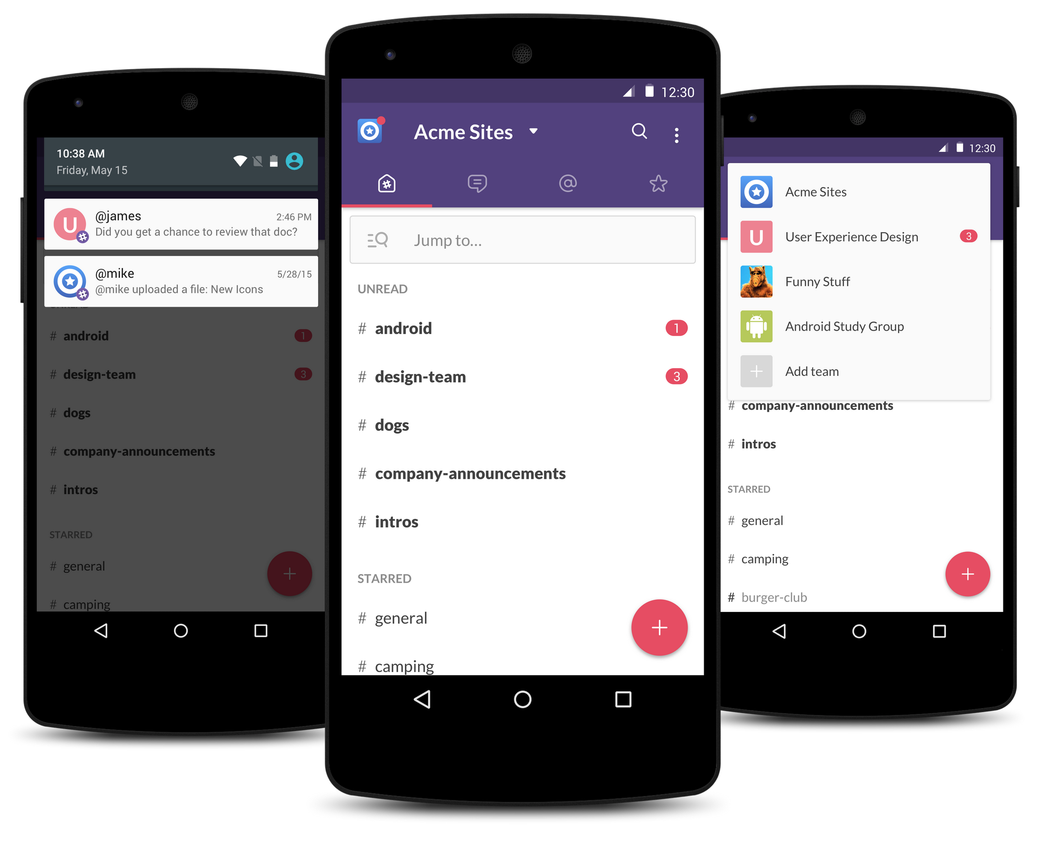
Slack, the workplace communication service that has taken the corporate communications space by storm, has released what is says is a “better, faster, and all around Android-ier” Slack app for Android, rewritten from the ground up. The biggest changes to come with this new version are a faster user experience for navigating around the app and the introduction of new user interface elements which follow the Material Design guidelines set forth by Google.
[youtube https://www.youtube.com/watch?v=Xtu7ZOQScrI]
As part of Google I/O week, the company is highlighting a number of Play Store apps that use Material Design in different ways. To do this, Google is launching the Material Design Showcase on the Play Store and issuing Material Design Awards to select apps for the first time.
Expand
Expanding
Close

Almost a year after Google took the wraps off of Material Design at I/O 2014, the Mountain View company has today updated its Developers website with a visual overhaul to bring its appearance in line with that of Android Lollipop. This isn’t the first of Google’s properties to get the new design (as we saw Google Play Music get a redesign in May), but it’s yet another one of Google’s properties that is falling in line with the new look.
Expand
Expanding
Close

Google Maps was updated to version 9.9 today, and with this incremental update comes an actual Google Maps app on Android Wear devices (surprise, surprise?), a translucent status bar (finally!), and more…
Expand
Expanding
Close

Old on the left, new on the right
It appears that Google is testing a new design for the header of its mobile search website, featuring a much more spread-out interface including a larger text entry box, navigation tabs, and Google logo. The size and placement of the actual search results seem to be identical, however…
If you head over to the web version of Google Play Music, you’ll notice that it has received a major interface refresh to be more in line with Google’s Material Design efforts. The interface is very similar to the Play Music Android app, just with some optimization for the desktop.
WhatsApp got Material Design in beta a few versions ago (and most avid users of the service have probably been on that version for a while), but now the official Play Store listing has been updated to version 2.12.84, bringing Material Design with it.
Other than a visual overhaul, this version doesn’t appear to pack any substantial changes. It was just recently, however, that the app was updated to bring voice calling to all users—another feature that WhatsApp had been testing for months before it was pushed to the masses.
You can grab the latest version of WhatsApp on the Play Store for free.