For years now, the Android community has cried out for dark themes in applications and the system throughout, all while Google continued to slap more and more white themes basically everywhere. Slowly but surely, though, we’ve been seeing more Google dark mode apps in tons of apps and services. Here’s every Google dark mode app available today including Android, YouTube, Calendar, Chrome, and many more.
Before we get into apps that support dark mode, why do we even care about it so much? A lot of it comes down to personal preference, as many users simply prefer the look of a dark interface. In the late hours of the day, a largely dark theme also helps out with eye strain. A huge plus on Android, too, is that, as Google has explicitly confirmed, it can save battery life big time.
The reasons for apps to adopt a dark theme go on from there, and we’re glad to see Google dark mode finally arriving on apps. This list contains every Google app that currently has a dark mode, and the list will be continually updated as new ones are added as well. If we’ve missed any, drop a comment below and let us know!
Google app Dark Mode
Update 5/19
The Google app has been one bizarre omission from this list of apps that support dark mode. In May 2020, that’s finally changed as Google has officially announced the rollout of dark mode for its app on Android and iOS. The rollout started May 19th and was said to arrive for all users within a week.
For Android 10+ and iOS 13+ users, the Google app follows the system theme for dark or light mode. For older OS versions, though, there’s still a way to trigger the change. Simply go to the “More” tab > Settings > General > Theme. From there, you’ll be able to switch between dark and light.

YouTube TV Dark Mode
Update 5/19
YouTube TV matched up with the video-sharing platform it derives its name from by adding a dark mode in April of 2020. Android users on the latest update from the Play Store can tap the Profile Picture and then tap Settings > Dark Theme to turn on the theme. For those on Android 10 and above, the setting should follow the system toggle too.
Google Play Store Dark Mode
One of the last major apps to lack an official dark mode following the Android 10 update has been the Google Play Store. As of October 2, a server-side update started rolling out to give the app a dark theme to all users. As per usual, the dark mode for the Play Store uses a dark gray color instead of true black, and it respects the Android 10 system toggle. Notably, there is no manual toggle for the Play Store’s dark mode.

Google Voice Dark Mode
Google Voice picked up its dark mode just as the month of October kicked off with version 2019.40. It also started rolling out via the Play Store just a few days later. By default, the dark mode on Google Voice follows the Android 10 system theme, but the same functionality hasn’t rolled out to the iOS or web apps just yet.
On the Android app, you can access the dark mode by heading to Settings > Theme.
Google Fi Dark Mode
Google’s own cellular service, Fi, has seen some big changes recently including a proper unlimited plan. Another of those changes is a dark mode in the Android app which started rolling out in early October. The design syncs with Android 10’s default theme and uses the usual dark grey look instead of pure black.
The dark theme for Google Fi also extends to the app’s homescreen widget and all four tabs including the shop and support. You can head to Settings > App theme to adjust the manual toggle.
Google Duo Dark Mode
Camera apps don’t typically get an extensive dark mode, but Google’s video calling app Duo recently added support for dark mode on Android. This, of course, means you’ll see a dark gray theme in the settings and also when looking for contacts, but it won’t affect the calling interface itself. Users can manually access this toggle in Settings > Choose Theme. By default, it follows the system theme on Android 10.
Google Recorder Dark Mode
As a part of our huge collection of Pixel 4 leaks over the past few months, we were able to first share Google’s new voice recorder application that’s debuting with the new phone. As a system app, it of course also supports a dark theme. Under Settings > Choose theme, you can select from the dark or light themes and, by default, it follows the system-wide toggle in Android 10. It’s a dark gray theme as usual, which extends to the player and main menu, too.

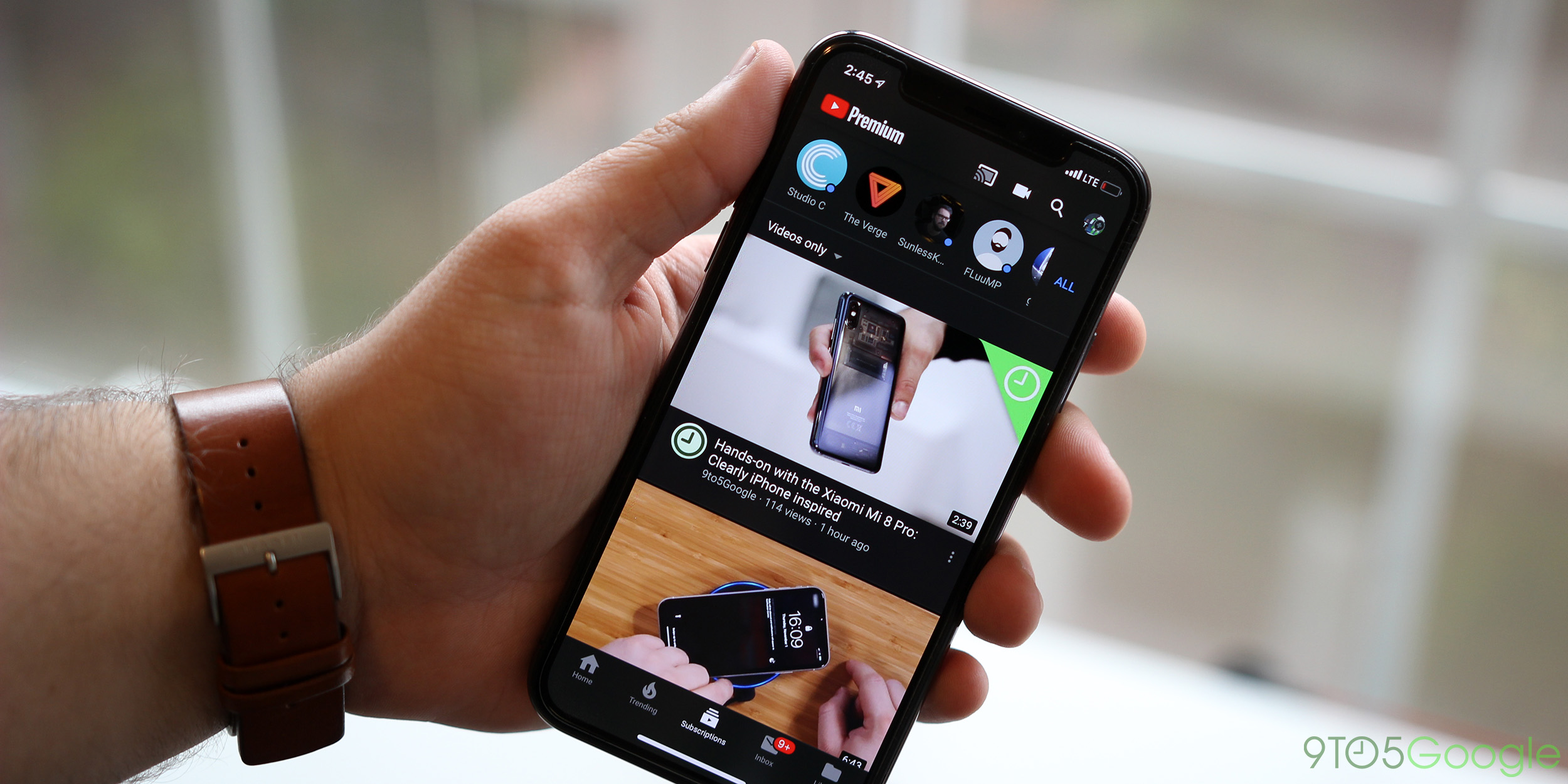
YouTube Dark Mode
One of the Google apps spearheading the dark mode trend is YouTube. The world’s biggest video service added an official dark mode on the web and iOS app several months ago, and it finally arrived on Android recently as well.

Once flipped on, YouTube’s dark mode doesn’t use a true black theme, but rather the same gray shade we’ve seen in other Google dark mode apps. The theme extends to pretty much every section of the app and desktop website from comments to menus and more. On the desktop you can toggle the feature on by clicking your Profile Icon > Dark Theme > Toggle On. As of October, there’s also evidence that Google is delivering support for the system-wide theme on Android 10.
- Upcoming
Android Messages Dark Mode
Google’s Android Messages app has quietly become a central spot for a lot of the company’s new initiatives, and it was one of the first with dark mode.

Messages’ dark mode also covers the majority of the applications, including the primary interface, individual messages, and menus. A lot of the accent colors don’t get changed when you switch from white to dark, but it looks good either way. Switching is as easy as accessing the three-dot menu in Messages and tapping “Enable Dark Mode.” An update to the beta channel in late September also finally added support for Android 10’s system-wide theme for the app’s dark mode and removed the manual toggle from the overflow menu.
Gmail for Android and iOS Dark Mode
One of the most anticipated dark mode additions to Google’s portfolio has been Gmail, and it’s finally happened for the iOS and Android apps. Rolling out as of September 24, the Gmail dark mode is hitting all users on both Android and iOS over the course of roughly two weeks. The app respects the Android 10 and iOS 13 system-wide toggles for dark theme just like many other Google apps. In the Android app, at least, there’s also a manual toggle for the functionality if users prefer to stick with either light or dark modes at all times.

Google Assistant Dark Mode
While elements of the Google app such as Discover have had a dark mode for some time, the core app and Google Assistant lacked the darker color scheme. That changed in late September as beta users of the Google app on Android started noting a dark theme within the app.
The dark theme for the Google app and Google Assistant is responsive to the system-wide themes on Android 10 and also Android Pie, but can be manually adjusted in the app’s settings as well. Stay tuned for more details as the dark theme makes its way to the stable channel.

- Previous
Android 10 Dark Mode
As we saw through the various beta releases, Android 10 has a dark mode as one of its biggest features. This dark theme applies through almost the entire system including notifications, the Settings app, and also affects a lot of apps on the device. As you’ll see elsewhere on this list, a lot of Google’s applications respond to this system-wide toggle and change their themes. Slowly but surely, a lot of third-party apps are also adding the functionality.

To enable the Android 10 dark theme on a Pixel smartphone, simply pull down the notification shade and tap the “Dark Theme” toggle. If it’s not there, you can also head to Settings > Display and look for the Dark Theme toggle there. A limited dark theme is also available on Android Pie.
Here are some third-party apps that support Android 10’s dark theme toggle
Files by Google Dark Mode
Originally designed as an app for Android Go smartphones, Files by Google has evolved into one of the best file managers on Android. In a recent update, the app added support for a dark theme that uses a mix of dark gray and pure black. The theme affects the entire app and can be triggered by the system-wide dark theme. Alternatively, there’s a manual toggle in the settings for Files by Google.

Gallery Go Dark Mode
Google’s lightweight “Go” family of apps now includes a version of Google Photos. Gallery Go launched in late July and picked up its dark theme in an update just a few weeks later. Version 1.0.2 of the app delivers a dark theme that respects the Android 10 system theme, and also has a manual toggle in the settings menu.

Google Fit Dark Mode
In Google Fit v2.16 for Android, the company delivered dark mode to give a break from the stark white theme the app has always used. The new theme can be manually be applied through the app’s settings, and it will also respect the system-wide setting in Android 10.
Like most other Google Apps, this isn’t a pure black theme, but rather a gray color that also sees the green and blue accent colors lightened to better fit with the darker background.

Google Photos Dark Mode
One of the most popular consumer services Google has ever had is Photos, and alongside the arrival of Android Q, the app is getting a dark theme. While it doesn’t affect any of your photos, Google Photos dark mode does give the background a gray color like a lot of other Google apps. That also covers all of the menus and settings for the app.
Unfortunately, though, dark mode for Photos only applies to Android 10. At the moment, it doesn’t reliably work on Android Pie, there’s no dedicated setting, and there’s no sign of the change on iOS either.

Google Sounds Dark Mode
As Google continues to implement dark mode in its system applications, the lesser-known Google Sounds app has updated with the new theme. For those not aware, this app is exclusively for Pixel owners and gives the ringtone interface a user-friendly makeover. The dark mode update arrived with version 2.1 of the app and respects Android 10’s system-wide dark mode. Notably, it features a true-black theme.

Google Keep Dark Mode
A favorite Google app for many users, especially on Android, is Google Keep. The simple note-taking app has a dark mode which isn’t triggered by the system as a whole, but rather by an “Enable Dark Theme” toggle in the app’s settings. The feature arrived in May as part of a server-side update on top of version 5.19.19.
Google Keep’s dark mode doesn’t use a black theme, but rather multiple shades of dark gray.

The dark mode for Google Keep is also starting to roll out to the web version of the app.
Google Drive Dark Mode
While many of Google’s Android apps are getting a dark mode that works on all versions of the OS, Google Drive isn’t one of them. One of the app’s most recent updates officially added support for dark mode after months of the feature in testing, but it seems to only work reliably on Android 10.
On that update, users should see Drive switch between dark and light themes based on the wider system settings. Some users do report that the theme works on Android Pie with dark mode settings enabled, but results vary from user to user. So far this new dark mode only seems to be available on Android, but Google Drive’s iOS and desktop clients will likely get the same theme eventually.

Google Calendar Dark Mode
If you’ve been wanting to keep track of your agenda without burning your eyes out at night, Google Calendar finally has an official dark mode. This new mode is available as an in-app setting on Android Nougat and newer. Simply heading to Settings > General > Theme will reveal the needed toggle.
On Android 10, Google Calendar’s dark mode respects the larger system-wide setting. In typical Google fashion, the app uses a couple of shades of gray to craft the theme without losing aspects of the design. Notably, the colors on your events remain largely the same.

Google Chrome Dark Mode
Over the course of a few months, we’ve seen Google start rolling out a dark mode for Google Chrome in several areas. First and foremost, this includes both desktop applications. On both macOS and Windows 10, there’s an easily accessible dark mode either already available or just about to hit prime time.
If you’re on macOS, running version 73 or older of the Chrome browser should enable dark mode on Google’s browser. To enable it, simply change your system toggle between the dark or light modes. Windows, on the other hand, is still in the process of rolling out. Version 74 of Google Chrome enables dark mode on Windows and also enables matching the system theme, but it’s still a bit finicky at times.
As we know, Google is slowly working on bringing dark mode to all of Android’s core applications, and this, of course, includes Chrome. Now, that functionality is starting to become available. While it’s still not available in the stable version, a recent Canary update revealed some flags to switch the theme. Once the flag is enabled, a dark mode toggle appears within Google Chrome’s “Basics” section of the Settings menu.
The latest versions of Google Chrome for Android also supports the dark theme in UI elements of the app as well as supported websites.
Google Calculator Dark Mode
In version 7.6 of Google’s Calculator app for Android, the company added an official dark mode toggle. The new toggle is found simply within the three-dot overflow menu in the top right corner of the app. Tapping “Choose Theme” brings up a small menu for manually switching between light or dark themes, as well as having it automatically set based on the battery saver. Unfortunately, this mode doesn’t respect the system-wide option from what we can tell.
Google Help Center Dark Mode (web)
In recent weeks, Google has expanded dark mode support to its online Help Center. The company’s vast library of tutorial and troubleshooting pages on the web now all support an official dark mode. This mode doesn’t use a true black, but rather a dark shade of gray which has white text and blue hyperlinks.

There are two ways to enable this dark mode on the Google Help Center. For one, you can amend “/?dark=1” to the end of any page you are on. However, the far easier method is to scroll down to the bottom of the page and press the toggle on the right-hand side of the display. The setting should stay in place even once you’ve left the page completely.
Google Discover Feed Dark Mode
After seeing tests ongoing for months, Google has finally added a proper dark theme to the Discover feed. Found on the left-most homescreen on plenty of Android smartphones including Google’s Pixel, the Discover feed’s new dark mode is one of the ones we’ve been waiting for.

Respecting the system-wide “night” mode, Discover’s theme is not a manual option. It will change with your wallpaper or based on the display setting. In previous versions, the “dark” theme left users with white backgrounds for text, so it’s nice to see a proper design finally available to everyone. If this option hasn’t hit your device, try uninstalling the Google app and reinstalling/updating it to force the change.
Google Play Games Dark Mode
The mostly-forgotten Google Play Games app has also picked up a dark mode in its latest update. This one doesn’t mirror the “night” mode, but it does trigger based on a manual setting
Once you’ve installed the latest update, access the overflow menu. From there, head to Settings > Dark Theme and toggle the setting on. It should change immediately from that point and, as usual, it extends throughout the entire application.
Google Phone Dark Mode
In the latest update to the Google Phone app, dark mode has finally been enabled. Google has been teasing this arrival for quite some time and now it’s finally here.

Dark mode within the Google Phone app hits all portions of the interface including the dialer, contacts, call history list, and menus. All of the colors match up with Google’s other Material Dark themes, and it’s notable that Google Phone and Google Contacts react to each other’s dark mode setting. If one is turned on, the other switches as well and vice versa.
The manual switch for turning on dark mode in the Google Phone app is found in Settings > Display options > Dark theme.
Google Contacts Dark Mode
With version 3.2 of Google Contacts, an official dark mode has been added to the app. This hits the entire interface from your list of contacts down to the details of the contact itself.

To enable dark mode on Google Contacts, you’ll need to have the latest version. Once updated, there should be a “Turn Dark Theme on” toggle within the side menu. Alternatively, switching on the “Night Mode” within developer options will automatically turn on Contacts dark theme, presumably with other apps eventually doing the same.
Gboard Dark Mode
Google’s Gboard is arguably one of the best keyboard apps available for Android, and the addition of themes played a huge role in that. With themes, you can also enable a dark mode.

Of course, enabling dark mode in Gboard isn’t as “official” as some of the other apps on this list. However, the end result is the same, if not a little better. By heading into Gboard’s settings, you can visit the themes section to pick from over a dozen color themes. This includes 5 options that fit the dark theme criteria, some even including true-black themes that are ideal for OLED displays.
Google News Dark Mode
One of the most common cases for using a dark theme is when consuming content in the evening. It puts much less strain on the eye in a dark environment, and that’s exactly why Google News was a prime target for a dark theme.

In a recent update, Google added a dark theme to Google News. It hits the entire interface once turned on and even has some customizations. In the settings, you can opt to turn the dark mode on at all times, automatically at night, or when battery saver mode is turned on. That backs up the company’s findings that dark made enables better battery life. It also respects the system theme starting with Android 10.
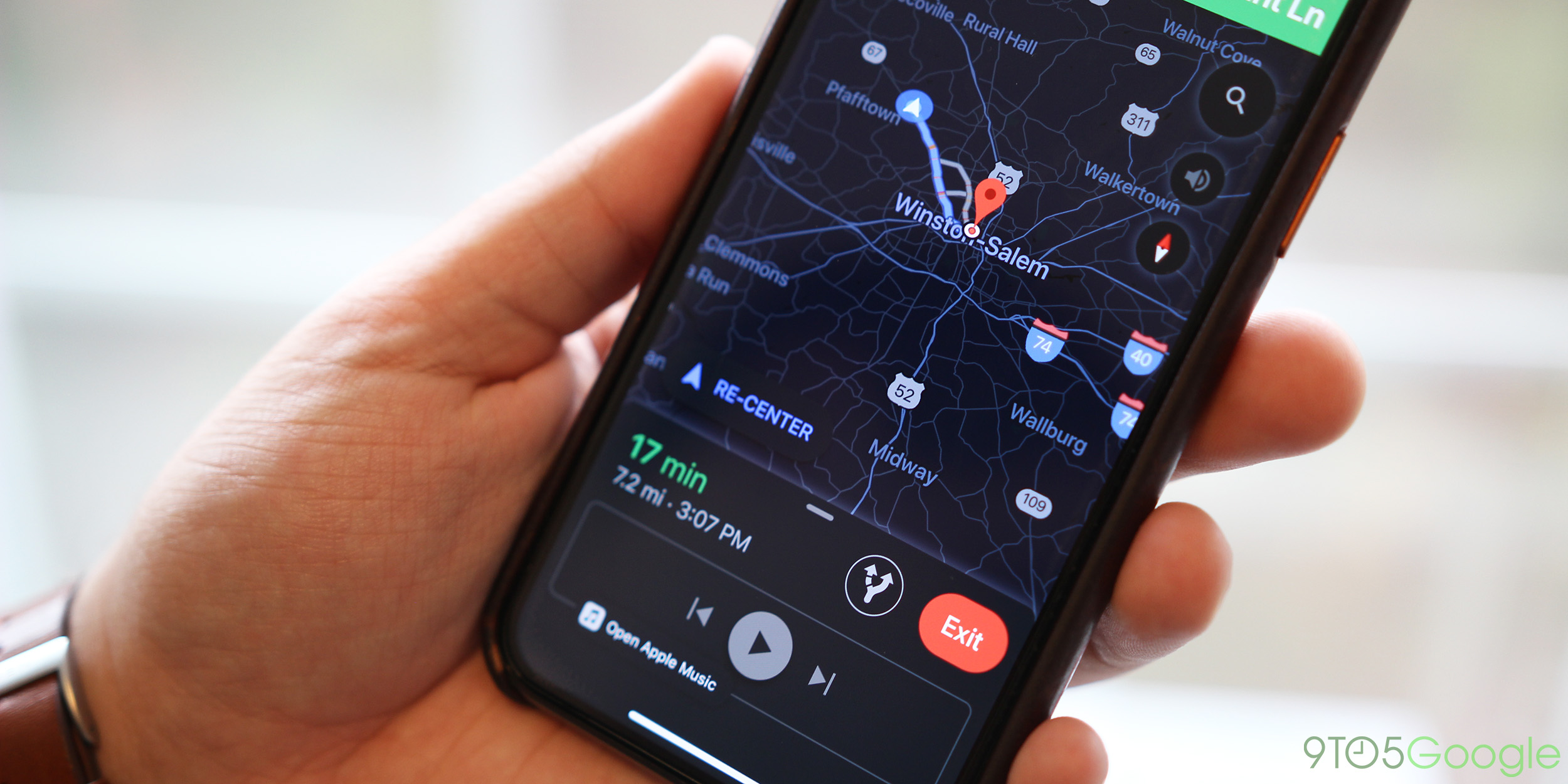
Google Maps Dark Mode (Navigation)
Another place where you’ll find a Google dark mode is on Google Maps. This isn’t an app-wide dark mode, but rather appears solely on the navigation method of the app.

Primarily, you’ll still be dealing with a white theme within the app, but you can toggle the “Night” mode and leave it on at all times. This is especially handy at night, but it looks great at all hours of the day. You’ll be able to leave the dark mode on 24/7 in both the Android and iOS versions of the app. We’ve got a handy tutorial below on how to do so.
Google has teased a real dark mode for the Android app, but it’s yet to arrive.
Gmail Dark Mode (web)
For years now, Gmail has supported custom themes, and thanks to that, its web version has pretty much always supported a dark theme. Unfortunately, it’s also one of the more limited options on this list.

When applied, Gmail’s dark theme on the web only covers the general interface. Once you open up an email or click on a menu, you’ll still see white interface elements. One can hope that Google will update the experience to improve this, but for now, it is what it is.
To enable this, you’ll need to hit the settings button in Gmail’s web interface and click on “Themes.” Under the collection of pictures, you’ll see the Default white theme, with a “Dark” option next to it. Simply tap on that option and hit “Save.”

Google Authenticator Dark Mode
If you use 2-step authentication, and you very much should, Google Authenticator is a convenient way to keep track of the required codes. In a recent update, Google added a dark mode to this app.

With a quick toggle in the overflow menu, you can turn on a Google dark mode for Authenticator. Like others on this list, it isn’t a true-black theme, but it does look great and encompasses the entire interface, excluding a few menus.
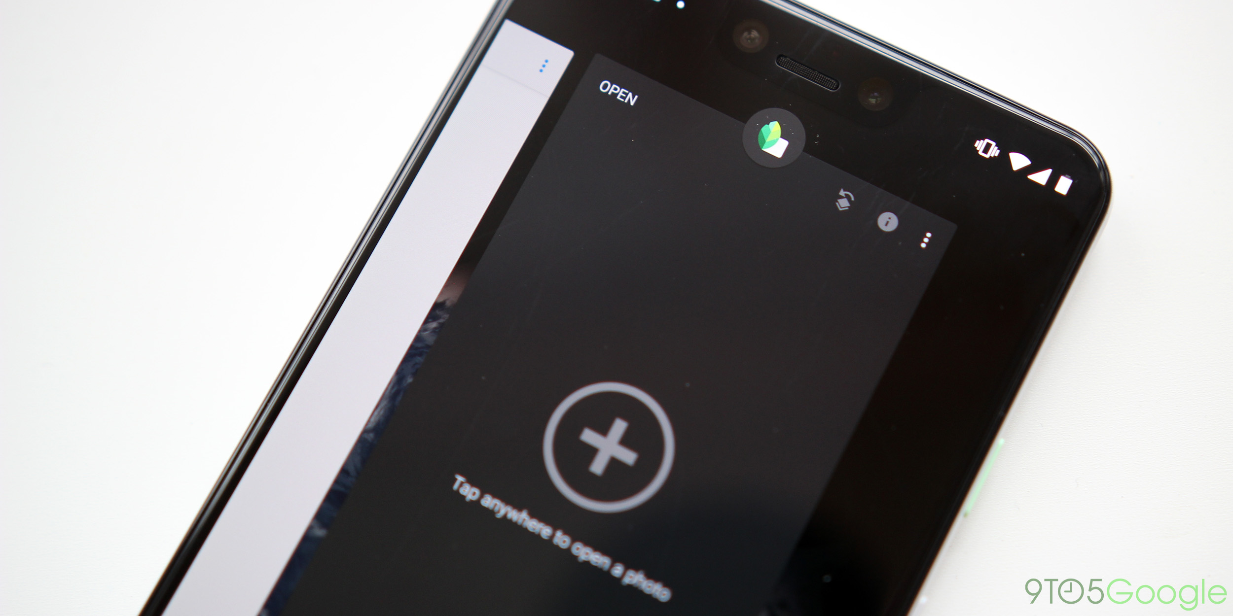
Snapseed Dark Mode
Google’s popular photo editing app, Snapseed, is another place where there’s a dark theme toggle, proving especially handy when trying to focus on editing photos. It gives off the same look as Adobe’s Photoshop.

To enable a dark theme in Snapseed, you’ll want to head into the app’s settings, and the first option gives you a simple dark theme toggle. Flip that on and you’ll be presented immediately with a dark version of the interface which uses the same off-black as Google’s other dark themes.
YouTube TV Dark Mode (web)
While the standard YouTube app offers a dark mode on all platforms, YouTube TV offers it solely on the web. This theme is, like YouTube, service-wide. It encompasses the entire interface including all the menus. Personally, this is one of my favorite looking dark themes as it suits the YouTube TV interface very well.

Currently, it’s unclear if YouTube TV will extend this theme to its Android and iOS applications, but we can certainly hope that it’ll arrive sometime soon. To enable YouTube TV’s dark mode, click on your Profile > Settings > Dark Theme > Toggle On.

What are the next Google dark mode apps?
Clearly, Google isn’t slowing down with adding dark themes to its various applications, and that’s a huge win for everyone. What’s next? Well, we’ve got a few apps to keep an eye on. Stay tuned!
Check out 9to5Google on YouTube for more news:
FTC: We use income earning auto affiliate links. More.


Comments