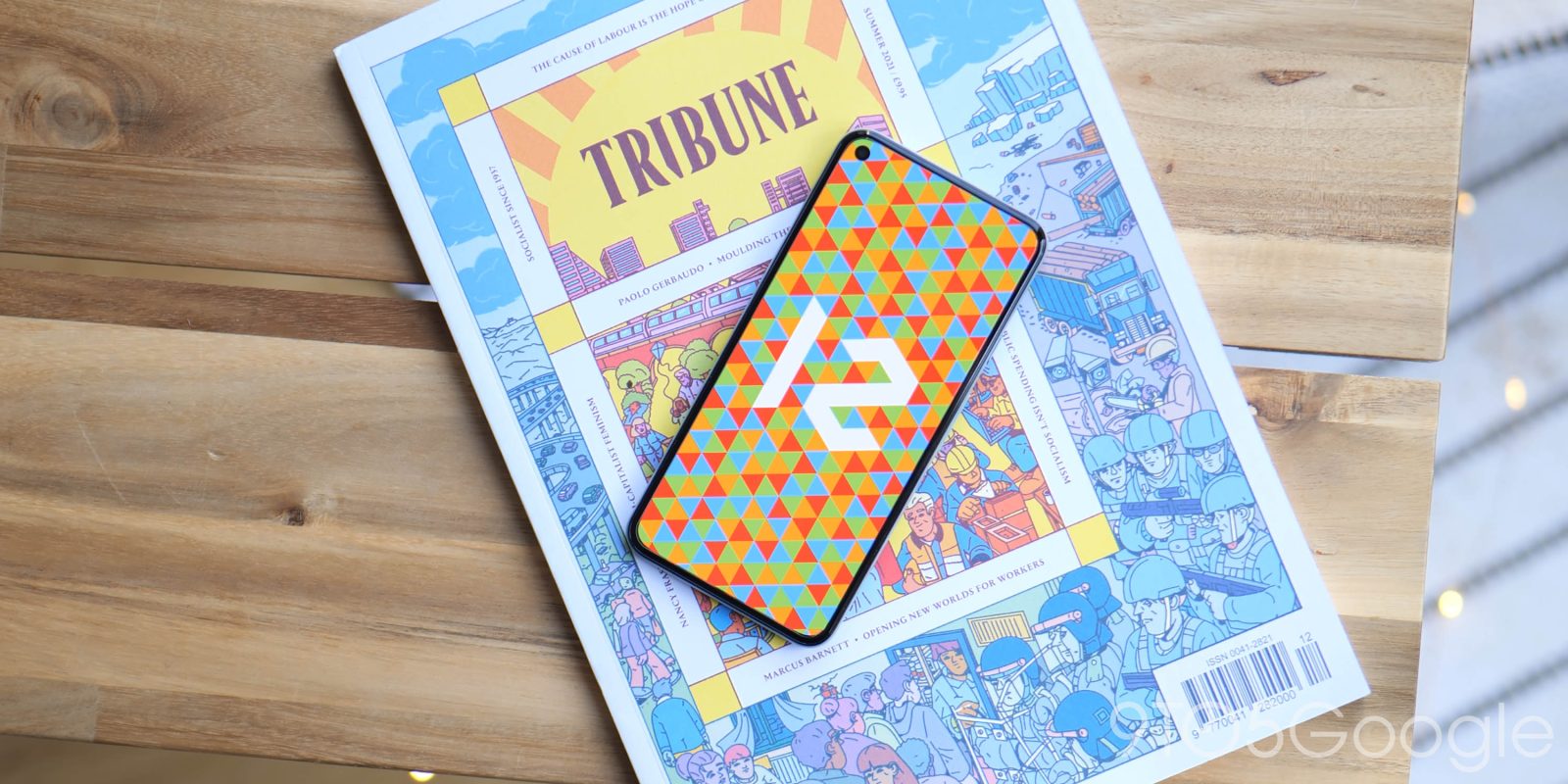
We’ve had some time to dive deep into the Android 12 Previews and Android 12 Betas over the past few months. Now that the stable release has dropped and is available on Pixel hardware, we’re going to dig even deeper and share every new feature and change we’ve found in Android 12 — the biggest overhaul to the world’s most popular mobile OS.
While there are much more than just cosmetic changes in Android 12, we’ll just be focusing on all of the end-user facing tweaks and alterations. There are mountains of under-the-hood improvements that will undoubtedly enhance your overall experience, but they can be much harder to pinpoint or define how they benefit your day-to-day experience.
The vast majority of new additions, features, and enhancements in Android 12 are instantly obvious in the design, interface, and operation of what is, frankly, a massive update over the minor update that was Android 11 overhaul — which was effectively Android 10+ or Android 10 Lite.
Our goal is to cover as many of the new features that have been slowly introduced and refined over the Android 12 Developer Preview phase — and the associated public-facing Beta program. If you’ve already been updating your device since the very first beta or even the previews, then there likely won’t be any surprises right out of the gate, but there may be some tweaks and enhancements you simply weren’t aware of or haven’t even used yet.
The early phases of the Developer and Beta program even saw some new features that have since been added to Android 11, courtesy of the immensely popular Pixel Feature Drop series. Even so, here is every new user-facing feature, alteration, design change, or tweak in Android 12.
Navigate this guide
Video — Hands-on with every MAJOR new change and feature in Android 12!
Subscribe to the official 9to5Google YouTube channel
To makes things a little easier to digest, we have categorized everything into sections and sub-sections that cover things such as cosmetic alterations, UI, and usability changes. For feature seekers, this is one of the most extensive references for all things Android 12 that you’ll find anywhere online.
Material You
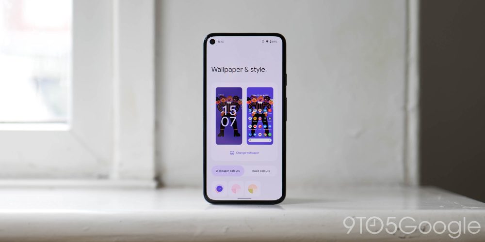
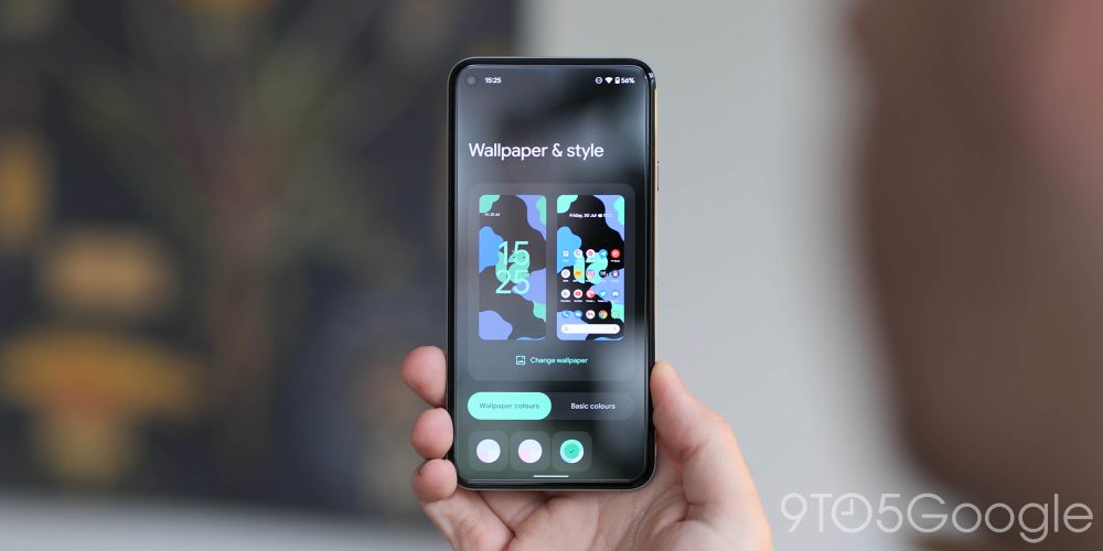
A huge component of the Android 12 update is the Material You theming which is likely the most obvious and prominent change once you have updated your Pixel (or other OEM device, for that matter). Although Material You theming and some of the changes expand way beyond just your homescreen, we’ll cover what is instantly available. Developers will need to make their apps compatible with the Dynamic Color tweaks of Material You. This enables things like color accenting and app UI tuning/adjustments based upon your preset Pixel wallpaper.
It’s not clear whether Material You will be available as part of Android 12 on other OEM hardware, or if it will be exclusively available on Google Pixel smartphones. At least until we get clarification, no other Android phones offer Material You at this early stage.
The crux of everything in Material You starts with your on-device wallpaper. Unlike in years gone by, almost all facets of your device will adopt colors and hues determined by the colors in your wallpaper choice. You can adjust this, but it remains the most prominent aspect of Android 12 from the get-go. Everything from menu items to accenting of notifications and more. It all starts with your wallpaper — but you can select from four basic colors if you prefer.
• Wallpaper & style app redesign
To coincide with the reliance on your wallpaper for on-device theming, the Wallpaper & style app has been completely revamped. If anything, it’s stripped back and minimal, and that means certain features have been removed, but you can change wallpaper for your lockscreen or homescreen, enable and disable the system-wide dark theme, enable Themed icons, and tune the app grid.
• Themed icons
Google has produced neat themed icons that will adhere to the Dynamic Color theming portion of Material You. The line-style icons encompass almost all of the first-party Google applications and help complement the rest of your system theme.
• Media notifications themed by system accent color
In Android 11, the notification shade media player would theme based upon the album art of the music playing, but in Android 12, the accenting is pre-determined by your device theme.
• Customization features removed
Some customization features including the ability to adjust your status bar icons and on-device font have been unceremoniously removed as part of the wider Material You theming setup. This is a pain point and one that we hope will be improved with future updates and maybe even the Android 13 update…watch this space.
• Google logo adheres with Material You tweaks
Provided you have the “Themed icons” setting enabled and use the Pixel Launcher, the Google logo on the Search bar widget will change and adjust based upon your preset theme. The four colors of the “G” logo will be replaced with various shades and tones.
The default or “stock” keyboard on Pixel devices and many Android devices is getting a Material You makeover that includes notable tweaks to the colors and accenting. No features are affected, instead this is a fine tuning to adhere with the rest of the Dynamic Color tweaks. It’s more prominent if you have key borders enabled and if using the system light theme.
Although technically part of the Android 12 Beta program, Google Camera 8.3 adds a few touches to ensure that it too adheres to the Dynamic Color theming as part of Material You. Dividing lines have been removed from the Settings page, while the actual button to open the full settings menu is now in text format rather than using a “gear” icon as it previously had. All text is now updated to the Google Sans Text format, too.
UI changes
• Pixel Launcher adds more grid options1
Alongside a new 4×4 app grid option, you’ve got the ability to use a 4×5 grid option, too. Android 11 offers Default (5×5), 4×4, 3×3, and 2×2 grid sizes, which gives you even more options for the perfect homescreen layout to suit your taste.
• Toggles showing recent camera and microphone access1
As part of a wider tune-up of on-device privacy within Android, a key feature in Android 12 is that of notifications when an app or service has accessed the camera or microphone. These status bar icons will appear in the upper right portion of the status bar with an icon to indicate just what hardware has been accessed. When minimized, you’ll see a green dot in the top right corner of your display to denote ongoing access to the mic and camera.
Over the course of the Android 12 betas, the Settings menu evolved into something more akin to that of OneUI. The main section headings are larger with a more prominent search bar and user avatar. All elements are shifted down, likely to help aid one-handed usage.
Mainly seen in menus and menu subsections, Android 12 has added an overscroll feature that unfortunately can’t be disabled. This slight stretch effect is most prominent when reaching the end of a list and just indicates that you cannot scroll further.
• Battery menu progress bar with added tweaks
When you dive into the settings menu and access the battery section, Android 12 replaces the usual battery-shaped icon with a simple progress bar. The new bar shows a percentage above and a “time remaining” estimate, but it’s all on one line. It’s tough to call it an upgrade, but it does provide a slick and clean look.
• Full page Settings tweaks for specific sections
Within Settings, specific sections are now being treated to a new full-page tweak that includes new animations and icons to indicate which features are being activated.
• Higher-level toggles
Some Settings pages within Android 12 feature a more prominent toggle to indicate if activated or deactivated on your device. Accenting allows you to quickly find an activation toggle with any and all further settings found beneath.
With app notifications, Google has decided to make the app icon on the leftmost side of the notification considerably larger, especially when the notification is minimized. When expanded, it’s only slightly bigger, but in both cases, it now has an inversed icon. There is also a dedicated snooze button for notifications for greater prominence.
• Notifications more compact when in landscape mode
Google has reduced the whitespace on notifications when viewing in landscape mode in Android 12. This does bring about some problems with regard to the UI, but less of your display is alloted to the pop-ups and things such as Smart Reply options.
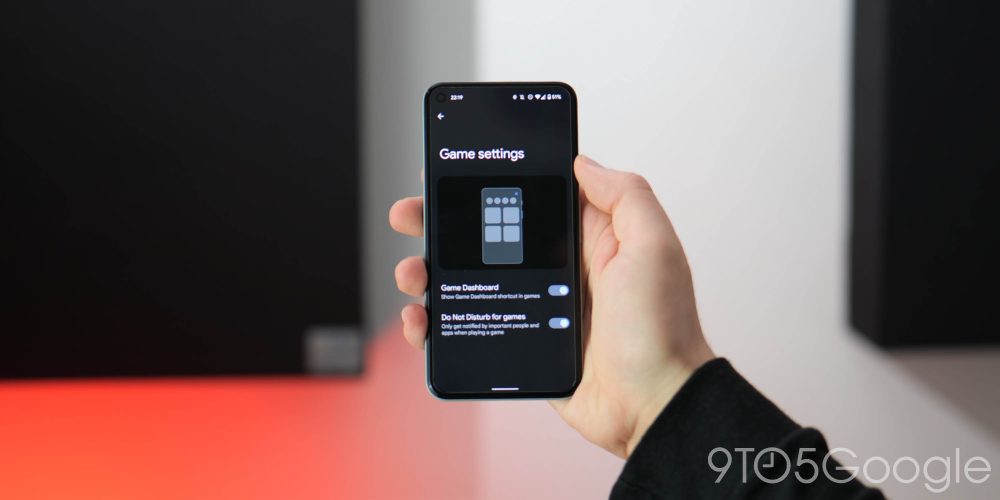
A long-awaited feature is being added in Android 12 with the Game Dashboard providing a dedicated toolset for mobile gamers. You can find it within the Notifications > Do Not Disturb > Schedules > Gaming. From here you can toggle the Android 12 Game Dashboard on and enable the shortcut within games. This pop-up includes the ability to quickly screenshot or record your screen, monitor the in-game framerate, and even start YouTube livestreams.
• Quick setting icon redesign
Gone are the small circular Quick Setting icons/toggles in Android 12 in favor of pill-shaped elongated buttons. It’s a big departure and one that people may not initially favor, but it’s a new look all the same.
• Google Pay/Wallet quick settings tile + lockscreen icon
Google Pay is getting detached from the Cards & Passes power button gesture first introduced in Android 11. A new “Wallet” quick toggle houses your cards and passes while quick access is offered on the lockscreen via a new button.
• Smart home controls now in Quick Settings
Because of the removal of the Cards & Passes section, which previously housed your smart home controls, there is a new home in the Quick Settings panel. A new toggle called “Device controls” houses all of your smart home devices and associated buttons.
• New guidelines when moving icons/widgets on Pixel Launcher
Moving widgets and icons around your homescreen now loads guidelines or guide markers to help you place things perfectly. The “Remove” and “Uninstall” icons are now also easier to spot with outlines indicating that you can drag app icons upward to remove or delete from your device.
• Updated unified volume slider
The updated design slims down the volume bar and puts it on a floating white or black window. Any subsequent sliders, such as for a Cast device, show up next to the regular volume slider. Only one can be interacted with at once, though.
A brand new pop-up gives you access to larger and more obvious buttons including for Emergency, Power Off, and Restart. Lockdown will also be visible if you have the mode activated in your device settings.
• App shortcut menu theming + widgets shortcut
When pressing and holding an app icon, the pop-up menu has now received a makeover with rounded corners and more obvious separation between options. On top of that, with compatible apps or apps that have widgets available, you’ll be able to directly access these from the new menu.
• Unified Internet and Calls plus SMS section within Network and Internet
Android 12 now features a unified internet section that includes a new pop-up when activating the quick toggle along with a wider Settings menu section. This houses all of your data connection including Wi-Fi and mobile signal.
• Safety & emergency gets dedicated Settings section
All of your on-device Medical information, Emergency contacts, Emergency SOS, Car crash detection, and Crisis alerts settings now have a new home in a top level Settings menu.
• Brand new device setup experience
A new setup experience present in Android 12 gives a mostly visual refresh to the setup experience that we’ll see on Pixel phones going forward. Google has put further emphasis on teaching navigation gestures with a lengthy tutorial on how to use the gestures. There’s even a little Easter egg with the initial startup screen having haptic feedback as shapes reach the extremities of your display.
The new Android 12 Easter egg isn’t huge by previous metrics but when heading to Settings > About phone > Android version > Tap Android version 3x > easter egg. This will open to a view of your wallpaper covered by a Material You style clock widget showing the current time. By grabbing the minute hand and spinning it to 12:00, a circle appears over the clock, complete with the stylized “12” of Android 12.
Usability changes

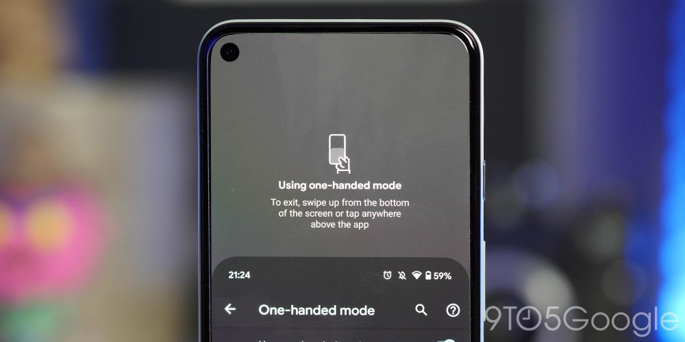
Somewhat copying the way in which iOS handles things with Reachability, Android 12 is finally bringing a dedicated one-handed mode for improved single-hand use. You can find it in Settings > System > Gestures > One-handed mode. It will only work with Gesture navigation, and to access, you can swipe down on the gesture bar. The app UI will slide down, allowing you to access all of the upper extremities without needing to stretch upward.
• Display cutout tool for Pixel 4a, 4a 5G, 5, 5a with 5G
A new setting in Developer options allows you to hide the upper left punch hole notch on the Pixel 4a through Pixel 5a with 5G. Enabling applies a black bar to the status bar that works to partially hide the Pixel 4a, 4a 5G, and 5’s hole punch. The time, notifications, and other system icons remain in place with the new darker background.
• Markup tool gains emoji and text stickers
You’re now able to add text and emoji to screenshots and images in Android 12, in a change that might relegate some image editing apps to the sideline. Once you tap “Edit,” you’re greeted with a near-identical UI as before. However, undo/redo has been moved to the top bar next to Share and Trash. The first tool at the bottom is crop, which is no longer always-active in the preview. You can add text with the keyboard automatically opening and seven colors available. Emoji stickers are a huge addition with all your on-device options available.
• Editor available for any image from Share Sheet
The markup tool has received a fair amount of attention in Android 12 gaining new features, but it is now available in full when hitting the “Edit” button from the Share Sheet.
• Screenshot markup tool adds more fonts + new animation
When taking a screenshot, the markup tool is now more unified with the system tool including adding a limited selection of fonts and emoji picker plus on top of that there is a slightly updated animation when it comes on screen.
Users are now able to use magnification on either the entire display, as has always been available, or just a small portion of it. This works with a floating window that can be moved around on the display to magnify a certain area. It’s a little tricky to get set up, but it works very well after you get the hang of it. The floating magnification window in Android 12 is a square that can be moved to focus on specific parts of the display, regardless of the app you’re in. As you reach the corners and sides, you can continue to slide your finger to focus on the edges of the display.
A new “Reduce Bright Colors” toggle is available within the Quick Settings panel and allows you to quickly reduce brightness to a preset level of your own choosing. You’re also able to enable a quick two-swipe gesture or volume key shortcut to enable.
• Screen timeout joins Screen attention
The Screen timeout settings and adjustments are now part of the wider Screen attention menu in Android 12.
• Enable or disable specific app media controls
The media resumption controls are now a little more customizable with the ability to remove apps completely from the notification shade player if you so wish. We can see this being pretty popular if you would rather have just your core media controls in the one place. When using headphones, for instance, only those apps you have “allowed” will be able to resume playing or be found within the media control panel of your Quick Settings.
• Nearby Share can send Wi-Fi passwords
Expanding upon the Wi-Fi sharing feature introduced back with Android 10, when viewing network access settings, you’re able to invite Android phones to connect using Nearby Share. This is great if you can’t scan the QR code and speeds up the process of getting people connected to a Wi-Fi network.
• Tapping icons in notification shade expands notification
As simple as it is easy to access, just tapping the actual app icon in your notification shade will expand or collapse.
• Picture-in-picture tweaks and new gestures
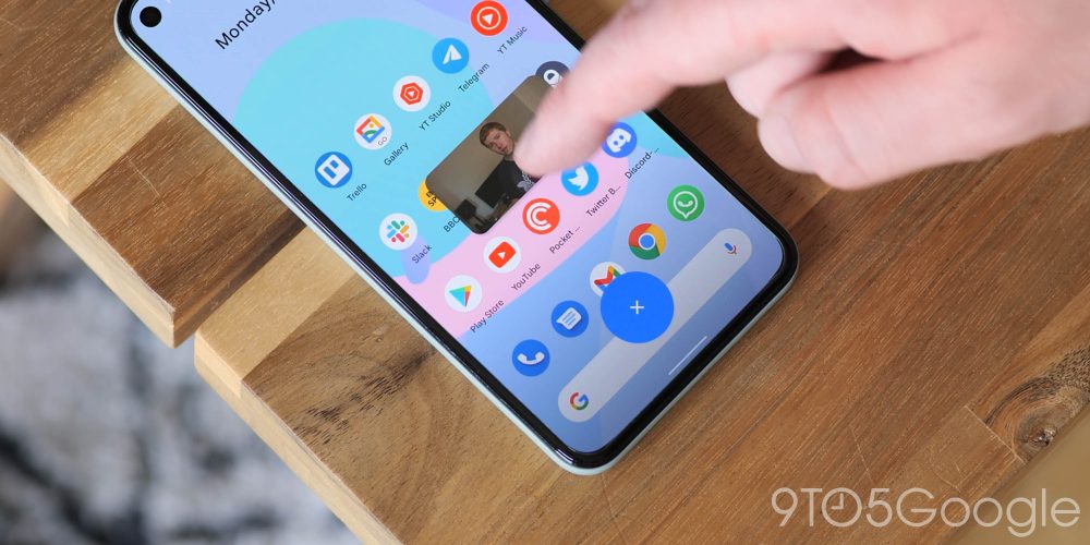
For a start, gone are the sharp corners in favor of rounded, bubbly corners. Dragging downward to dismiss pops up a new icon in which you “place” the player to dismiss. The picture-in-picture window can also now be “stashed” to the left or right side of the screen, where it will continue playing while being less disruptive. A single tap of the window shows playback controls like play/pause, skip, and more. Double-tapping the window switches back and forth between a small window size and a larger one. Or if you’re looking for more refined window size controls, you can now use pinch-to-zoom to resize the window.
• Picture-in-picture loses corner expansion gesture
Unfortunately, with the introduction of new PiP tweaks and gestures, you’re no longer able to drag the corners of the window to increase size. The pinch-to-zoom gesture is the replacement, which is more accurate and less frustrating.
• Verified links open directly in apps
“Verified links” are the URLs that the app specifically says should be opened in the app. In past versions of Android, these are the links that would allow an app to show up in the “open with” dialog. Now, those links will open directly in the app without asking you.
• Swipe away screenshot previews
Overdue but still appreciated, when taking a screenshot, you can just swipe it away to dismiss.
• Emergency SOS
You’re now able to press the power button quickly five times or more to have your device emit a loud sound and countdown alarm before calling emergency services or a predetermined number of your choice. This will call for help, but your device will need to be unlocked if you choose a number that is not directly to emergency services.
• Alarm tile in Quick Settings
In Android 12, when you fully expand the notification shade, the alarm icon in the status bar no longer appears. Instead, a new Alarm tile in the Quick Settings toggle takes over. Tapping just takes you into your Clock settings for tweaking rather than enabing/disabling.
• Hold for Assistant new power button gesture
While we have lost Active Edge on newer Pixels in favor of the edge swipe gesture, Google has added the Hold for Assistant ability, allowing you to access the voice AI with a long press of the power button. Disabling simply reinstates the traditional power menu, but when enabled you will have to press the volume up and power key to access the shutdown controls.
The Conversations widget has a pretty simple but useful premise. The widget can tap into an ongoing message thread from different apps on your device including SMS/RCS from Google Messages, groups and individual messages in Telegram, and more. You can pick just about any conversation of a chat room and add directly to your home screen for quick access.
• Quick tap/double-tap gesture
Beginning life as “Columbus” way back when, Quick Tap is now available in Android 12 and allows you to tap the back of your phone to activate things like take a screenshot, open an app of your choosing, launch the Google Assistant, Play/Pause media, expand the notification shade and more.
The Privacy dashboard accessible from Settings gives you a “simple and clear timeline view of the last 24 hour accesses to location, microphone, and camera.” Google added it in response to users wanting insight into what data apps are accessing. As such, developers are able to “share more context” about their own application’s usage through a new permissions API.
• Quick Settings toggles to disable microphone/camera access
As part of the wider privacy settings, microphone and camera access toggles are now part of Quick Settings and allow you to just revoke access to the hardware for added peace of mind.
• Internet Quick Settings tile controls all connections, Wi-Fi, data and more
The new “internet” toggle within Quick Settings replaces the old “Wi-Fi” toggle and gives direct access to all data connections on your handset. The pop-up includes the ability to quickly switch network, disable Wi-Fi, and there’s also a handy reset button to restart all devices connections in the event of problems or issues.
• Link-sharing in Recents menu
The process of sharing a website link is being streamlined even further in Android 12 with a new icon/toggle in the Recent apps menu that lets you quickly share a page or copy the link itself. Tapping the icon will add up to three recent contacts with a “More” tab at the bottom of your display and you’re even able to drag directly into this section if you wish.
• Image sharing direct from Recent apps menu
Like the link-sharing feature, when viewing webpages or some select apps with images. You’ll see an image icon that you can tap to share in-page media. Tapping elevates and zooms in on the photo with top shortcuts for Lens, Copy, Share, and Save. You can also drag and drop after tapping the image icon too.
• Auto-rotate can now use selfie camera to detect device orientation
Using the front-facing camera you can enable face detection for more accurate device auto-rotate detection. To enable head to Settings > Display > Auto-rotate screen.

• Scrolling screenshots with compatible apps
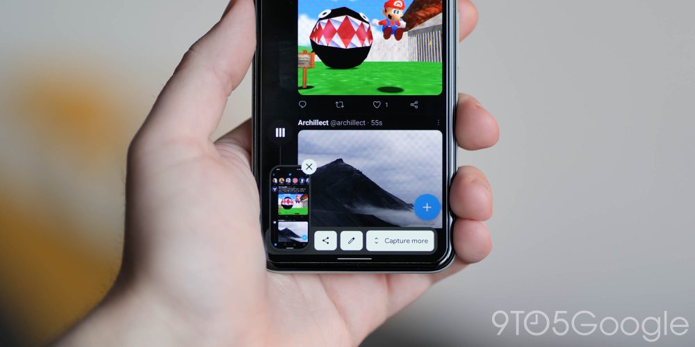
Another one of those “finally” moments for the AOSP build of Android as scrolling screenshots are now live in Android 12. However, it only works with compatible apps. At the moment things are a little limited with websites not working and the only expanded menus within Android, allowing you to grab longer screens. If the option is available, when you initiate a screenshot you’ll see a “Capture More” button that will grab everything out of view, and when complete you’ll be able to crop as you see fit before the image is saved.
• Markup tool gains adjustment tabs adhering to MY theming
When using the markup tool and adjusting or cropping an image, thanks to the Material You theming and Dynamic Color, the grip tabs will now adhere to your system theming settings.
• Ongoing call chip for Google Phone app
Provided you’re in a call using the Google Phone app, you’ll now get an ongoing call chip in the upper left of your status bar that will show a cumulative call time. This appears to replace the old Bubble that more naturally fits with the rest of the Android 12 Material You redesign. Just tapping will open the call again.
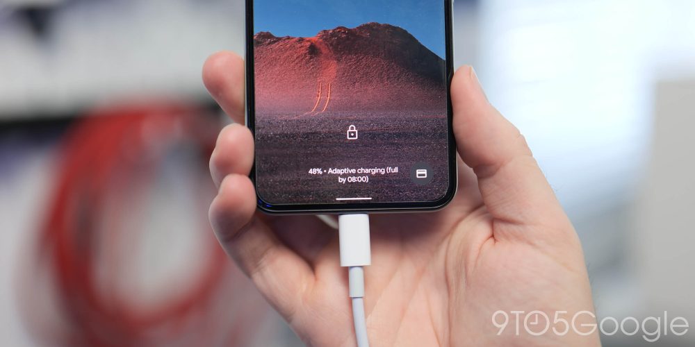
Adaptive charging slows the charging speed between 80% and 100% overnight to help reduce the wear and tear on your device battery. This has been tweaked in Android 12 to more closely match when your upcoming alarm is set to go off. It’s likely anecdotal, but we can definitely see devices reaching 100% more slowly when placed on charge overnight.
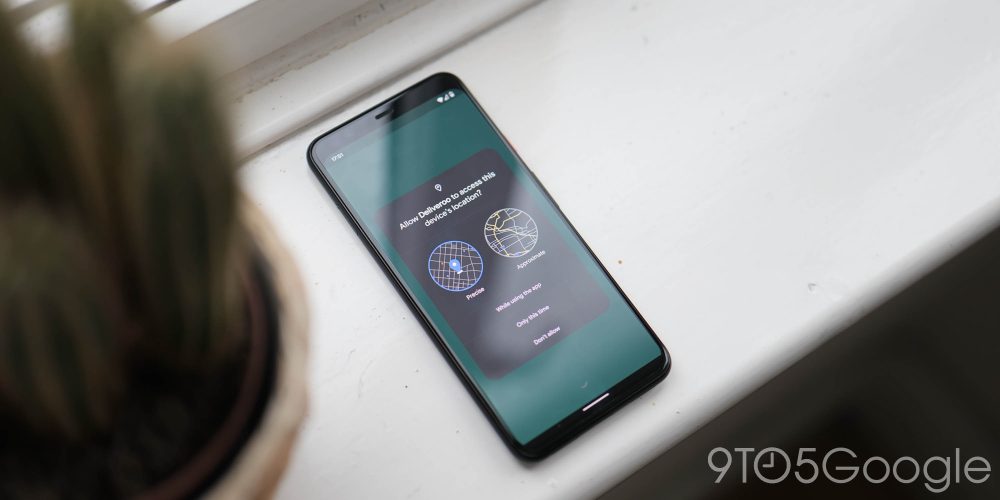
• Approximate location and precise location controls on an app-by-app basis
As part of the permissions settings, you’re now able to give access to an “approximate location” or “precise location” with a new pop-up window to indicate the differences with a neat graphic.
• Face controls with Android Accessibility Suite update
Expanding on the growing suite of accessibility features Android 12, a new “Camera Switch” allows you to control your phone with facial expressions via the selfie camera. The facial expressions that can be performed include opening your mouth, smiling, raising your eyebrows, and looking left, right, or up. The feature will, by default, ask for the user to set expressions for next, select, and “pause,” which stops the phone from recognizing other gestures temporarily. Other actions include previous, touch & hold, scroll forward/backward, home, back, notifications, quick settings, and overview/multitasking.
After being spotted in progress with previous beta releases, the universal device search feature is now fully live and working in Android 12 within the Pixel Launcher app drawer. When swiping up into the app drawer while using the default Pixel Launcher, you can use the top search bar widget to locally search for apps, contacts, and more with ease.
• Nearby Share redesign + tweaks
Making it even easier to share things with Android users in your vicinity, the Nearby Share pop-up now includes an “Everyone” toggle when you tap the Quick Settings toggle. This replaces the “All contacts” option, which is now just “Contacts” rather than “Some Contacts” seen prior. The pop UI is also more rounded to better suit the rest of the Material You makeover with animations subtly indicating or highlighting your preference.
Cosmetic changes

• Larger lockscreen clock and UI changes
We’ve seen Google tweak and tune the lockscreen with almost every single Android release. In Android 12, the lockscreen clock and associated UI has received its most substantial update in years.
• Notification shade/lockscreen media player UI tweaks
The media player has seen quite a few changes in Android 12, especially as it is now more compact than before. As part of the wider Material You and Dynamic Color tweaks, the player no longer has accents determined by the album art on playing media. Instead, it is styled according to your system accenting that fits with the rest of your UI.
• Wider app shortcut menu
When pressing and holding an app icon, the app shortcut menu is marginally larger than it was previously. This makes it slightly easier to toggle certain sections and shortcuts where available.
• Pill-shaped settings toggles
Android 12 introduces new, larger pill-shaped notification shade toggles that has a knock-on effect on the rest of this section of your device. As each toggle is larger, there is less room for toggles within this section. You’re limited to just four at a glance, with full expansion allowing eight total toggles.
When adding an app-specific widget to your homescreen or launcher pages, Android 12 introduces a new widget selection list with collapsible sections that hide a carousel for each individual app widget. Each widget is previewed to give you an indication of what it will look like on your homescreen.
• Lockscreen PIN and pattern entry tweaks
When entering the lockscreen PIN entry screen, the keypad has received a major overhaul. The design follows or adheres to your Material You theming but with large circular keys that will change shape when pressed. This also extends to pattern locks that include thicker lines and paths when unlocking via this method.
• Floating app icons in the Recents menu
App icons in the multi-tasking Recents menu now appear above the preview screen of an already opened app rather than being attached or overlapping the preview window.
The dark theme has been tuned yet again with another Android release with a deeper grayscale used for Settings menus and subsections, while the notification shade uses a similar mixture of colors, AMOLED black, and grayscale colors to separate and indicate section boundaries.
• Dark mode toast pop-up messages
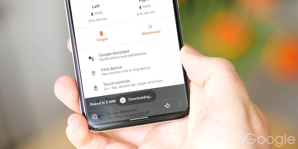
Part of the wider dark theme tuning, toast messages now adhere to your system theme preferences. Toast messages, for those not versed with the admittedly somewhat obscure term, are those little pop-ups that appear at the bottom of the screen with messages. While minor, it’s a feature that has been overdue in Android 12.
• Count for bundled notifications
Bundled notifications include a new Material You counter that appears in a colorful pill background for when you have multiple waiting notifications from one specific application. This makes it much easier to see just how many messages you have to read from messaging apps, but it works across a wide range of on-device applications and system notifications.
Google has added a number of new widgets that are specifically designed for usage with Android 12 and rely heavily upon the new update. However, non-themed app widgets are also seeing changes and tweaks with softer corners and rounded edges to better fit with the rest of the massive UI overhaul.
• Toggles in Quick Settings now show on/off labels
Simple but effective, when you activate or deactivate a toggle in the Quick Settings panel, each icon — along with the color hue to indicate — a label explicitly states whether something is set to “on” or “off.”
• Reduce brightness renamed Extra dim
A “Reduce brightness” quick toggle was added in the early phases of the Android 12 Developer Preview but later on, this was renamed to “Extra dim.” This simply tunes down the brightness of your display to a preset luminance of your choosing with a single button press.


• Launch splash screen for all apps with animated icons for some
When launching an app from cold or for the first time, you’ll be greeted with a full-screen launch splash screen, with selected or supported apps including an animated version of the app icon in question. Apps not updated to support an animated icon will briefly show the app icon on a white or black background — alternatively, some apps like Twitter may launch with a splash screen based upon the icon color.
• Rounded corners and bubbly UI elements
Say goodbye to sharp corners and say hello to soft edges and more bubbly UI elements. This includes areas such as the volume toolbar, UI sliders, and many areas of the Settings menus.
• Partitioned app shortcuts on app long press
When initiating an app icon, long press to activate the floating mini menu, quick actions now have lined separators or partitions to indicate each option.
• Clipboard notifications and sourced toast pop-ups
As part of the focus on privacy and transparency in Android 12, when an app accesses your clipboard you’ll get a toast message to notify you of this change.
• New charging wave animations
When plugging your Pixel device in via USB-C or when using a wireless charger with supported Pixel devices, you’ll now see new “wave” charging animations. Plugging in a USB-C cable initiates a subtle hued color wave that will expand from the bottom of your display from where the cable is plugged. While placement on a Qi wireless charger will see a wave or ripple effect begin in the middle of your display and expand outwards with battery percentages shown in text form. If your device is powered off, a new mini-wave style animation will display and include the battery percentage.
• Ripple animation with certain UI interactions
A fairly substantial but not instantly identifiable change is how Android 12 handles UI interactions in certain areas of the system. Tapping or toggling menus initiates a “ripple” animation to indicate that you have made an adjustment or interacted with a portion of Android 12.
• Pixel 4 new Face Unlock animation
As the only Pixel to include native Face Unlock, the Pixel 4 and 4 XL have gained a new wave animation that is similar to the charging indicators to confirm that your device has been unlocked using the biometric access method.
• New fingerprint unlock animation
Not to be left out, devices with a fingerprint scanner have now received a new animation when unlocking in Android 12. Tapping the fingerprint scanner to initiate an unlock will see the screen activate in a small circular wave until your entire homescreen is revealed.
• Smart replies now have squared off corners
A small but instantly noticeable change that feels somewhat out of sorts in the bubbly, rounded UI approach to Android 12. Smart Reply bubbles are not more squared off rather than being a pill shape in previous versions of Android.
• Styles & wallpapers renamed “Wallpaper & style”
Just a simple rename to the section that has actually been toned down quite extensively in favor of Material You.
• Compact Now Playing media center
When playing media in any application, the media player in the notification shade or at the lockscreen is now tuned and more compact than previously. Album art is larger but with a lower-right app icon indicating where the media is coming from. Controls and audio output switcher also decrease in size to allow the track name and album information to occupy a larger space.
• Bolder save icon in screenshot markup tool
The “Done” button in the screenshot markup tool has been replaced with a “Save” button, which is larger and is themed by your system accent color.
• Homescreen folder tweaks to icon preview layout
Icon folders on the Pixel Launcher homescreen no longer crops or clips hidden icons, with clearer indication of what icons are in a folder.
• Larger Pixel Launcher search bar with microphone + Lens logos
The Search bar pinned to the bottom of each page of the Pixel Launcher is now slightly thicker and includes a microphone logo and Lens icon rather than the abstract Google Assistant logo to indicate that voice and image searches are available.
• Pixel Tips app redesign
The app has seen some renovations with a new tiled layout that has icons for specific on-device sections — likely to make things easier to find or understand for newbies.
• Monochrome Settings menu icons
Gone are the colorful Settings menu sub-section icons from Android 11 in favor of a flatter, monochrome look with the circular outlines removed for line-style icons.
• Updated toggles in Settings app sections
Within Settings menu sub-sections, the toggles have been updated with an enclosed indicator within a pill-shaped toggle. The color of toggles will now also adhere to your system accent theming.
• At a Glance renamed “Live space”
A fixture in the Pixel Launcher that was once exclusive has now been renamed from “At a Glance” to “Live space.”
• Now Playing uses Google Sans Text in subtle change
The “Now Playing” feature in Android 12 now utilizes the Google Sans Text font which is very subtle but noticeable when certain characters such as “G” or “Q” are spotted.
• Padlock icon on lockscreen moves position
The padlock icon to indicate that your device is securely locked has now been shifted into a more central position from the lower position where it has lived for quite a while now.
• “Device Personalization Services” renamed “Privacy Compute Core”
“Device Personalization Services” is the method through which Google delivers and updates features like Now Playing (on Pixel), Live Caption, and smart actions in notifications to Android devices. This app, updated via the Play Store, is now being renamed to “Android System Intelligence,” at least on Google Pixel phones.
• Emergency screen tweaks
When launching the “Emergency” screen from the extended power menu, the iccons now include sliders and more rounded corners to access the local emergency services or access your personal information.
• New additional device setup screen
If you are setting up another Android device or restoring from a backup from a device running Android 12, the setup screen has had a redesign to fit more in with the Material You aesthetic. Text is larger and the padlock button has been moved to an upper left position, while the shape match verification has moved down the display and has a new warning message. This could easily be a feature that you never access in Android 12.
What is your favorite new addition or feature within Android 12?
That just about covers every new “user-facing” feature and change that you’ll likely see or encounter in the full release of Android 12 for Google Pixel phones. Naturally, there are tons of under-the-hood improvements and enhancements that along with these new additions make Android 12 the biggest upgrade in a long, long time. While the Android 11 update was modest at best compared to the huge overall from Android 10, Android 12 is probably the biggest shift and revamp of the mobile OS since Marshmallow.
If you haven’t already installed it, we have a handy guide showing you just how to get the latest version on your Pixel here so that you can enjoy all the latest new features as part of this, frankly, massive Android update.
If you have been enrolled in the previous Android 12 Beta program or ran the Developer Previews, and, therefore, know the new features inside out and used them to death, then let us know your favorites down in the comments section below. Also, we know it’s early, but are there any missing features here that you’d like or want to see from the rumored “Android 12.1” or Android 13, now that Snow Cone is has been served with plenty of flavor? Let us know that, too.
FTC: We use income earning auto affiliate links. More.


Comments